
Vastzetter met teksteigenschappen
The Text Properties Docker allows you to edit text properties of text objects currently selected with either the Gereedschap voor selectie van vormen or Hulpmiddel Tekst. See Werken met tekst for an overview of all text features.
The docker has three tabs: Paragraph, Character and Preset.
Paragraph will edit the default properties for the whole paragraph, and contains both Paragraph Properties and Character Properties. These can be edited with both tools.
Character will edit the properties for the selected word or range and edits only Character Properties. These are only available when editing with the Hulpmiddel Tekst.
Finally, Preset allows you to create and apply style presets onto the text. See Voorinstellingen van stijl. for more information.
By default, the first two tabs will show only a handful of basic properties, while all other properties are only shown when they are currently set, or inherited.
The revert button left of a given property will give an indicator of whether a property is changed, and clicking it will undo said change. When a mixture of style properties are selected, you will see a multi-headed arrow, while the control itself will show the default or inherited value. Modifying the control will set the same value on all properties, while clicking the revert button will unset the property on all text.
New properties can be added with the add property drop down below. The text input allows for searching the current text properties, with each property having a number of alternate keywords. For example, typing “underline” will list the Tekstdecoratie, which the Underline option is part of. Selecting Text Decoration will add the property to the list, so it can be set.
The visibility state of each property can be configured by pressing the configure button next to the add property dropdown. When the default visibility is set to “always show” and none of the individual properties are set to show conditionally, the add property dropdown is replaced with a filter input. The current visibility states are possible:
- Standaard volgen
The property will follow the default visibility state at the top of the configuration window.
- Altijd zichtbaar
The property will always be visible.
- Indien gezet
The property will be visible only when set.
- Wanneer relevant
The property will be visible when it is set or when it is inherited.
- Nooit weergeven
The property is never shown.
Overerving
Krita’s text shape uses CSS, and thus allows for properties to be inherited. This means that properties like the font size can be set over a whole text shape, and ranges of text within the shape will default to the inherited value if it is not explicitly set on the range.
Inheritance is useful because it allows us to only set the properties that are important on a given section. So, we can emphasis a range of text with italics in the Character tab, and then use the Paragraph tab to change the font size or font family on the whole text without losing the emphasis on the range of text.
Conversely, some properties do not inherit at all, Basislijnverschuiving for example. These properties usually get added on top of one another, but the precise behaviour is described in their entry.
Font-Relative Units
Some properties allow for font-relative units. The meaning of these units also depends on inheritance mechanics. All font-relative units will try to use the current font metrics. However, when said font metric is Em and the property being edited is Tekengrootte, it will be relative to the inherited font size. Similar with Lh and Lijnhoogte.
Font relative units are particularly useful for Afstand tussen letters, which is often done relative to the Em size. Similarly, it is very common to have super scripted text to be set to 0.5 Em (so it is half the regular font size), or to have Shape Padding to be 1 Ex.
- Em
The current font size (or inherited font size in the case of Font Size).
- Ex
The current x height. This metric is retrieved from the font, and affected by font size.
- Cap
The current capital height. This metric is retrieved from the font, and affected by font size.
- Lh
The line height. This is either relative to the current line height or, in the case of Lijnhoogte, the inherited line height.
- Ic
Relative to ideographic character Advance. The advance of a single CJK character.
- Ch
Advance of the number ‘0’.
Character Properties
Character properties are properties that can be applied on a range of text or the whole paragraph.
Tekengrootte
Font size allows setting the size of the characters. Particularly it scales the whole font so that its design size (the “em size”) is the same as the font size.
When using Font-Relative Units, font size will always use the inherited font size and family as the reference font. This can be used to ensure a range of the text is always a bit bigger or a bit smaller than the surrounding text, which can be useful for superscript or titling.
By default, this property is always visible.
Aanpassen van tekengrootte
Font size adjust allows setting a ratio that the x-height must be matched by. The x-height is the height of the small latin x in Latin fonts, and it is a value that is derived from the font metrics.
This is particularly useful with font-fallback, but can also be useful in general to force some consistency into the x-height. There’s a calculate button, which allows you to calculate the font-size ratio of the current font family.
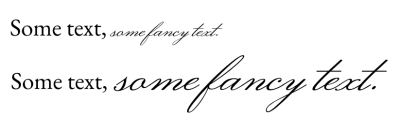
Script fonts frequently have a much smaller x-height than typical body text fonts. By using Font Size Adjust and pressing calculate, we can set the text to have a similarly sized x-height.
Lettertypefamilie
Font family allows selecting a list of fonts that should be used for the current text. The first item in the list is the primary font used, while each subsequent font may be used as a fallback.
Many fonts only have glyphs for a subset of unicode, so controlling fallback can allow us to select fonts that seem to be in a similar tradition, like using a Serif Latin font for a Naskh Arabic font.
See Lettertypefamilies for more information about the font picker and font families.
By default, this property is always visible.
Lettertypestijl
Lettertypestijl biedt het instellen van de substijl van de gegeven lettertypefamilie, zoals cursief en vet.
The main control is a drop down that shows a list of predefined styles. These are determined either by the fonts within a family, or by the instances inside a Variable Font. Clicking any of these will set the corresponding CSS properties for that style.
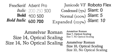
The image above showcases a number of styles. The top row shows the effects of width, weight and slant, while the bottom row shows the effect of toggling optical size at different font sizes.
When unfolding this property, the following settings are available:
- Gewicht
This controls the thickness of the glyph outlines.
- Vet synthetiseren
This allows synthesizing thick glyphs when there’s no support for bold in the font family.
- Breedte
This controls how much horizontal space a glyph takes. Not all fonts support this, and there’s no synthesis for this.
- Hellend
This can be either Normal, Italic or Oblique. The difference between Italic and Oblique is that the former corresponds to a glyph style reminiscent of the Italic calligraphy style, while the latter is a slanted version of the normal glyphs.
When Oblique is selected, the angle can also be configured. This is primarily for use with variable fonts that support the slant axis.
- Hellend synthetiseren
This allows synthesizing slanted glyphs where there’s no italic or oblique version of the glyphs available.
- Optische grootte
This determines whether the optical size axis in Variable Fonts will be synced to the font size. Note that Krita interprets the axis value to be in points.
Finally, there’s a place for the extra axes. These are for use with variable fonts, which can provide more configuration for the font style.
This property is, by default, always visible.
Afstand tussen letters
Letter spacing controls the spacing between visible clusters of characters. There are subtle differences in how letter spacing is implemented by programs that support CSS. Krita’s implementation follows CSS-Text-3 and thus does not apply to single characters. Letter spacing is mostly intended to apply to whole spans of characters.
Spatiëring tussen woorden
Word spacing controls the size of word separator characters, such as the space character. It also provides spacing for other word separator characters, like the Ethiopian word space, Aegean word separators, Ugaric word divider as well as Phoenician word separators.
Lijnhoogte
Line Height controls the line height used for the range of text. It does not work for pre-positioned SVG 1.1 text, but does apply for pre-formatted text that uses hard line breaks, or wrapped text.
- Normaal
When this is on, Krita will try to determine the line height by taking each character in a line, and determining its ascent, descent, and also the line gap metric. The maximum of these is used as the line height.
- Ln
Line Height has one unique unit: Ln, this is similar to “normal”, except it uses the font size.
All other units will define a fixed offset. Even the Font-Relative Units are fixed to the current font and size of the element the line height is defined on.
When using relative units, Line Height will take the current font size and family as reference. However, when using the line height unit, Line height will use the inherited line height as reference.
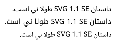
Regelafbreking
Line Break allows choosing a strictness for the line breaking algorithm. Mostly used for CJK scripts, requires Taal being set to work. Krita at this moment does not support Loose.
Woordafbreking
Bij woordafbreking is de nauwkeurige afstelling van de regelafbreking mogelijk waarbij alleen tussen twee woorden wordt afgebroken of dat er tussen twee karakters kan worden afgebroken. Dit is handig bij Koreaans en bij Ethiopisch.
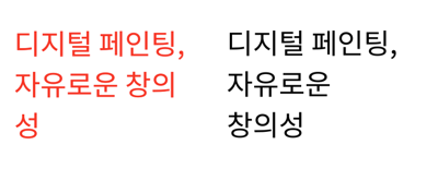
Krita slogan in Korean. On the left side there’s the default behaviour, which breaks after every hangul cluster. This looks rather old fashioned. By setting word break to Keep-all, breaks will happen only at word boundaries.
Teksttransformatie
Text Transform allows transforming the given range of characters, for example, by setting them uppercase, or switching out half-width forms for full-width forms. This is useful in that it is applied as a stylistic effect, meaning any text written is automatically transformed.
Text Transform is sensitive to the Taal being set. For example, the Turkish undotted i will be transformed with the I while regular i will be transformed to dotted I.
- Case
Whether to transform all text to upper or lower case. In the case of Capitalize the first letter after each word separator is uppercased, which the rest is lowercased.
- Volledige breedte
Full-width refers to the “Fullwidth” code points in the Halfwidth and Fullwidth unicode block. Toggling this will mean that proportional or halfwidth glyphs will be replaced with those fullwidth glyphs if possible. Typically, in vertical text, proportional glyphs are rotated, but when this isn’t possible or required, using full width glyphs can look a lot neater. The full width opentype feature does something similar, but not every font supports that.
- Volledige grootte van Kana
In Japanese Kana scripts, there are some instances of small and big kana, which have subtly different pronunciation. However, when the text is really small, it can be useful to replace small kana with big kana to aid in readability.
Tekstdecoratie
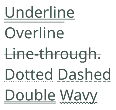
Sample showing all the possible decorations as well as the line styles.
Met tekstdecoratie kunnen onderstrepen, bovenstrepen en doorstrepen gemaakt worden.
- Lijn:
Toggles whether underline, overline or line through is enabled. Multiple can be enabled at once.
- Kleur:
Set the color of the underline. When unset, the color of the decoration will follow the text color.
- Stijl:
The style of the lines. Shared between all enabled lines, these can be made dashed, dotted, wavy and even double lines can be drawn.
Text Decoration does not inherit. Instead it is applied over each range of text it is defined on, with later defined text decoration being drawn on top of earlier defined text decoration.
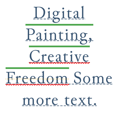
Nested text decorations definitions. While something this complicated is only possible with the SVG source editor, you can see a similar result if you define a text decoration on the paragraph, and one on a range of characters.
Positie onderstrepen
Specificeer de positie van de onderstreping voor tekstdecoratie.
- Horizontaal:
Behaviour in horizontal writing modes
- Automatisch
Underlines will be positioned according to the metrics of the font.
- Onderaan
Underlines will be aligned to the descender.
- Verticaal:
Behaviour in vertical writing modes.
- Verticaal links
Underlines will be at the left of the characters. Overlines at the right.
- Verticaal rechts
Underlines will be at the right of the characters, and overlines left.
Mogelijkheden van Opentype
Some fonts include OpenType features like kerning, ligatures or small caps, and can also involve a variety of alternative glyphs (or even contextual glyphs) so that complex joined scripts render correctly. The latter type is generally always enabled, and Krita provides control for the former.
OpenType Feature Settings
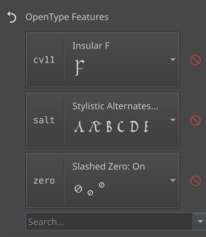
Some features enabled in the medievalist font “Junicode”. The first four letters are the “OpenType feature tag”, which is the way these features are stored in the font. The name can be retrieved from the font if defined, otherwise Krita will provide its own name.
This provides precise control over Open Type features. OpenType features are usually defined by tags, and whether they are on or off. The drop down will provide a list of features in the primary font in the Lettertypefamilie list.
For where it is feasible, a small preview is rendered, but for some features it can be hard to provide this.
Typing in a feature name or tag into the search will show a filtered list of all official features that match the search. This way, features that are not in the primary font can still be selected and enabled (which is useful when inheriting).
See also the Glyph Palet for an alternate way of selecting glyph alternates in the current text.
OpenType features, while they inherit, inherit as one list. If you want to give general hints for a given feature to be enabled over the whole text, use the Glyph properties:
Glyphs: ligaturen
Ligaturen in of uitschakelen en contextuele alternatieven op de tekst.
- Gemeenschappelijk
Enables liga and clig, which are commonly used ligatures.
- Discretionair
Enables dlig, which are ligatures of a more decorative nature.
- Historisch
Enables hlig, which is intended for old-fashioned ligatures.
- Contextuele alternatieven
Enables calt, which is frequently used by script fonts and decorative fonts to select appropriate glyphs depending on their context.
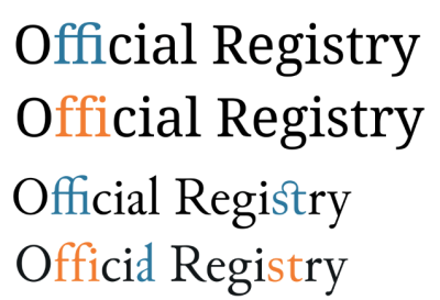
Ligatures in “Noto Serif” and “Junicode”, with the ligatures marked in blue, and the lack of ligatures marked in orange. “ffi” is a common ligature in Noto Serif, and contextual in Junicode, “st” is a discretionary ligature in Junicode and “al” is a historical ligature in Junicode.
Glyphs: positie
Schakel superscript of subscript in voor de tekst.
- Super
Enables superscript glyphs.
- Ondert
Enables subscript glyphs.
Showing sub and superscripts in the font “EB Garamond”.
Glyphs: numeriek
Getal-ferelateerde glyphvormen op de tekst inschakelen.
- Stijl
- Normaal
Does not explicitly enable either style, showing the font default.
- Lining
Requests figures that fit within an upper case text, using lnum.
- Old Style
Requests asks for figures that fit within an upper case text, using onum.
- Proportion
- Normaal
Does not explicitly enable either style, showing the font default.
- Proportioneel
Requests proportional figures, using pnum.
- Tabel
Requests tabular figures, using tnum, these figures all share the same advance.
- Fractie
- Normaal
Does not explicitly enable either style, showing the font default.
- Diagonaal
Vervangt figuren gescheiden door een schuine streep door een juiste diagonale breukvorm. Als een lettertype de noemer en teller mogelijkheid heeft en de getallen zijn gescheiden door een ‘breuk-slash’ (U+2044), dan zal dit vervangen worden door de figuren met noemers voor de schuine streep en tellers na de schuine streep.
- Gestapeld
Vervangt figuren gescheiden door een slash (schuine streep) door een breukvorm met horizontale streep.
- Rangtelwoorden
Vervangt letters die volgen op figuren door hun rangtelwoorden.
- Nul met streep
vervangt het getal nul door een die een schuine streep in het midden heeft, die kan helpen om verwarring met soortgelijke glyphs zoals de letter ‘O’ te voorkomen.
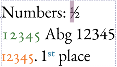
Showing numeric opentype features in the font “EB Garamond”. Selected is a fraction “1/2”, beyond that it shows old style figures for “12345” in green, tabular spacing for those old style figures in orange, and ordinals in blue.
Glyphs: Caps
Enable opentype features related to capitals, such as small caps.
- Normaal
Don’t use any particular capitals.
- Kleine hoofdletters
Sets uppercase to small caps. Typically used for abbreviations.
- Alle kleine hoofdletters
Sets all text to small caps. Typically used for formal text.
- Zeer kleine hoofdletters
Sets uppercase to petite caps. Alternative to small caps that is exactly the same as the x height.
- Alle zeer kleine hoofdletters
Sets all text to petite caps.
- Hoofdletter voor titels
Sets uppercase to use titling caps. Titling caps frequently are larger and more dramatic, and best suited for headers instead of body text.
- Letters met gelijke hoogte
Enables the unicase feature.
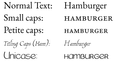
Capital related opentype features in “EB Garamond” for small and petite caps, “Estonia” for Titling caps and in a custom comic font for unicase features.
Glyphs: Oost-Aziatisch
Glyphvormen inschakelen gerelateerd aan Oost-Aziatische tekstindeling.
- Stijl
- Normaal
Use font default.
- Traditioneel
Use traditional glyphs.
- Vereenvoudigd
Use simplifies glyphs.
- JIS78
Use glyphs as specified by JIS78
- JIS83
Use glyphs as specified by JIS83
- JIS90
Use glyphs as specified by JIS90
- JIS04
Use glyphs as specified by JIS04
- Breedte
- Volledige breedte
Use full width glyphs.
- Proportioneel
Use proportional glyphs.
- Ruby
Enable glyphs meant for ruby annotations.
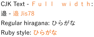
Showing the east-asian font variants in orange, using the font “Yu Gothic”. Full-width is typically used for vertical text, JIS78 refers to a Japanese industry standard that specifies certain glyph shapes.
Kerning van lettertype
Turn font kerning on or off. Font kerning enables per-glyph spacing adjustments.
Richting
Direction sets whether the text is left-to-right or right-to-left.
Unicode-Bidi
Unicode bidi gives extra control over how a shifted direction should be interpreted. Typically the default algorithm is fine, but in some specific cases, it cannot tell whether a sequence should be left-to-right or right-to-left.
- Normaal
No controls are inserted. All text inside is reordered according to its implicit direction (which is derived from the characters used).
- Inbedden
The sequence is directionally embedded. This means that the bidirectional algorithm will assume the explicit direction is that of the direction property, but the text itself is ordered by implicit direction.
- Overschrijven
Override means that the given section will use the current direction as the explicit direction as well as the direction of the text.
- Isoleren
Isolate controls are inserted. Isolate means that the bidirectional algorithm treats the sequence as if it were a completely independent paragraph. Due this, the ordering has no effect on the ordering of text on either side.
- Isolering-overschrijving
Both isolate and override are applied. This means that the text is ordered explicitely by direction, but said ordering has no effect
- Platte tekst
direction property is unused and bididirectional algorithm will instead guess at the direction.
Unicode bidi is one of the properties that does not inherit. The reason for this is that it works by inserting bi directional algorithm controls at the ends of the given range.
Basislijn
In some script traditions, the alignment point of text of different sizes are different from the alignment point with Latin text. For compatibility purposes, fonts of these scripts are usually made so the glyphs align properly with Latin text. To achieve a more traditional alignment, dominant and alignment baseline can be used.
This feature will try to use data encoded in the fonts’ baseline table. If there’s no such data, the baseline metrics will be auto-generated.
Dominant and Alignment baseline share the following options:
- Alfabetisch
Uses the baseline used by most scripts. Default.
- Ideografisch
Uses the Ideographic design square and selects the bottom end in horizontal mode, and the left side in vertical mode.
- Midden
Uses the Ideographic design square and selects the vertical center in horizontal mode, and the horizontal center in vertical mode.
- Hangend
De kopstreep uitlijnen zoals die in Noord-Brahmische schriften wordt gebruikt.
- Midden
Naar het centrum uitlijnen tussen de alfabetische basislijn en x-hoogte bij horizontaal indelen, in het verticale is dit de centrale basislijn.
- Wiskundig
Uitlijnen naar de mathematische basislijn, zodat operatorsymbolen uitlijnen.
- Bovenkant van tekst
Uitlijnen met de opklimmende.
- Onderkant van tekst
Uitlijnen met de afgaande.
Dominante basislijn
In North Brahmic scripts like Devanagari, letters of different sizes align at the headstroke. In the examples here, the top sample shows the default behaviour, while the bottom sample uses hanging over the whole text, which provides the traditional headstroke alignment.
Dominant Baseline specifies how stretches of text of different sizes are aligned, it is also the default for Uitlijning van basisregel. It has one unique value, Auto, which translates to Alphabetic in horizontal and Central in vertical Schrijfmodus.
Uitlijning van basisregel
Alignment Baseline allows control over how this range of text is aligned to the parent text. It has one unique property Baseline, which means it will take its value from the Dominante basislijn property.
Alignment baseline does not inherit. Instead, child text will try to align to the specified baseline of the parent text.
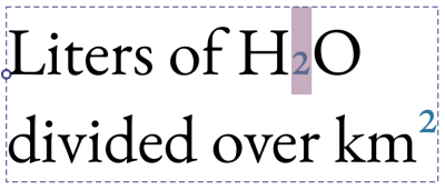
Basislijnverschuiving
Basislijnverschuiving biedt het verplaatsen van de tekst weg van de basislijn, ofwel door voordefiniëren van waarden van super en subscript of door een vaste hoeveelheid.
- Lengte
Shift text by a specified amount.
- Super
Shift text so it aligns to the inherited super script offset. Said value is retrieved from the font.
- Ondert
Shift text so it aligns to the inherited sub script offset. Said value is retrieved from the font.
Baseline shift does not inherit. Instead, shifts will be added to one another, allowing the following:
Nested baseline-shift super definitions. This is only possible by editing the text with the SVG source editor.
Witruimte
De CSS wit ruimte regelt hoe met meerdere spaties word omgegaan, en of de tekst naar de volgende regel doorloopt.
By default, this property is hidden.
Taal
De taal van deze tekstvorm. Taal heeft affect op een aantal eigenschappen, zoals glyphvorm, hoofd- en kleine letters en regelafbreking.
The text input allows typing any valid BCP 47 code. Pressing enter will cause Krita to parse the code. Typing a language name or code into the text input will show a filtered search pop-up.
Pressing on the down arrow will show all previously used locales this session, as well as stored locales. By toggling the check box in front of a locale, you can indicate that they need to be stored for future sessions.
There is also a Script dropdown. Normally, it is possible to guess the script from the language and country. However, in some places, different scripts can be used for the same language, and sometimes the main script being used has changed over the years. The script dropdown allows setting the script in these cases.
Vullen
Fill can currently not be set with the text properties docker. You will need to use the Gereedschap voor selectie van vormen to set it on the paragraph, or change the foreground color with any of the color selectors.
Streek
Stroke can currently not be configured with the text properties docker. You will need to use the Gereedschap voor selectie van vormen to set it, or use the SVG Source Editor in the text tool to manually set a stroke.
Paragraph Properties
Paragraph properties are the properties that can only be applied over a whole text shape.
Schrijfmodus
Writing Mode sets whether the text flows horizontally or vertically, and in the latter case, whether the block flows right-to-left or left-to-right.
See also Richting.
Notitie
A related feature is “Text Orientation”, which allows rotating horizontal text when it is typeset vertically. Krita does not current support this feature, but it is planned in the future.
Inspringen van tekst
Text Indent allows setting indentation at the line start. Only works when the text is wrapping. The main control is a slider defining the size of the indent. There’s two more advanced controls:
- Hangende inspringing
This does not apply indentation to the stating line, but instead the subsequent lines.
- Indent after hard breaks
This makes it so each line after a hard break qualifies as a starting lines. Frequently used for poetry.
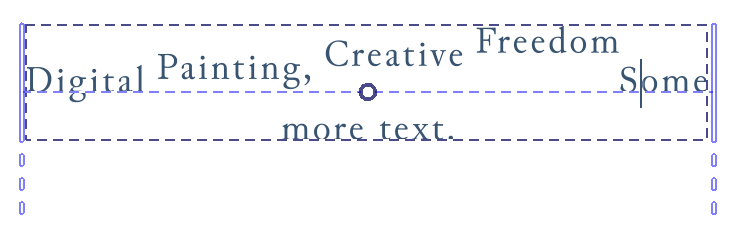
Uitlijnen van tekst
Tekst-uitlijning regelt de uitlijning van het geselecteerde blok tekst.
The main control of this shows three buttons that correspond to start, middle and end. These properties are affected by direction, meaning that for right-to-left text, start will be the same as align right. The final button is the justification toggle.
Opening the advanced settings shows the following:
- Uitlijnen van tekst
This allows you to set the text alignment when text is wrapped in a shape.
- Laatste uitlijnen
When Text Align is set to Justified, this controls what to do with the final line.
- Tekstanker
Text anchor controls how the text is anchored, instead of aligned. It somewhat resembles Text Align in that it allows text to flow from the left or right, but where Text Align is alignment within a space, Text Anchor is relative to the starting point of the text. You can use Text Anchor to set the anchor for each line, as long as the text is not being auto wrapped.
This means that there’s no justification for text that is not wrapped in shape.
By default, this property is always visible, even when not set.
Hangende punctuatie
Hangende punctuatie biedt het hangen van opening en sluitende punctuatie evenals komma’s. Deze implementatie implementeert alleen de Oost-Aziatische stijl van hangende punctuatie.
- Eerste hangend
Opening punctuation such as opening quotes or opening brackets at the start of the paragraph will be hung.
- Regeleinde
This toggle will allow or force commas and periods to hang at the end of any line.
- Laatste hangend
Closing punctuation such as closing quotes or closing brackets at the end of the paragraph will be hung.
Tab-grootte
Tab Size allows defining the size of tabulation characters. Tabulation characters (inserted with tab) are a type of white space that snaps to the nearest multiple of the reference size. Its main use case is to align columns of information without resorting to tables.
Tab size has one unique unit: Sp. This means the tab size uses the current advance of the space character as unit.
Tekstweergave
Text Rendering controls the hinting and rendering style for the text shape.
- Geoptimaliseerde snelheid
The hinting style for monochrome bitmaps is used, and anti-aliasing is turned off. Krita will also take care to snap the glyphs to the nearest pixel. This allows for pixel art fonts to look good, as well as being the fastest to render option.
- Leesbaarheid optimaliseren
In vertical writing modes, full hinting is enabled, while for horizontal, hinting only happens vertically. Krita will additionally snap relevant metrics in these directions.
- Geometrische precisie
No hinting is performed at all.
- Automatisch
Same as Geometric Precision.
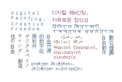
The Krita slogan in various scripts, typeset with the “Unifont” pixel font. By using Optimize Speed, Krita knows to not just disable anti-aliasing, but it will also try to snap the glyphs so that Basislijnverschuiving, Afstand tussen letters and Lijnhoogte will look good.
Tekstgebied
These properties are related to Tekst in Vorm.
- Vormopvulling
This is the padding that is calculated on the Inside shapes.
- Vormmarge
This is margin around the “Subtract” shapes that is added before they are removed from the “Inside” shapes.
Voorinstellingen van stijl.
Stijlvoorinstellingen. allow storing combinations of properties for later use. See that page for information about editing style presets.
 an entry will select it for editing, while double will apply the active properties onto the text.
The buttons at the bottom allow modifying the style presets:
- Import Style Presets
Import an SVG with a style preset definition inside.
- Delete Style Presets
Disable a given style preset.
- Create Style Preset
Creates a style preset from the current settings.
- Clone Preset
Clones the current presets and shows the edit window.
- Voorinstelling bewerken
Edits the current selected presets.