
Werken met tekst
Krita heeft een aantal onderdelen voor de creatie en bewerking van tekst. Hoewel het basisgebruik eenvoudig is, zijn er veel geavanceerde mogelijkheden die het werken met tekst heel erg snel laten gaan. Dit hoofdstuk probeert om een overzicht te geven van hoe de verschillende onderdelen samen werken.
Overzicht
Het belangrijkste onderdeel voor tekst is de Hulpmiddel Tekst, waarmee men tekstobjecten kan creëren. Hiermee kan ook tekstreeksen bewerkt worden, dat het is typing, kopiëren en plakken van tekst. Maar ook het instellen van het lettertype, kleur en lettergrootte van een reeks, en zelfs meer geavanceerde type-instellingen, zoals de selectie van glyph alternatieven en de precieze positie van glyphs.
De Tekst-functie wordt samen met het Vastzetter met teksteigenschappen gebruikt, waarin men volledige controle heeft over alle teksteigenschappen. Het heeft ook Stijlvoorinstellingen. om makkelijker bepaalde eigenschap-combinaties te hergebruiken.
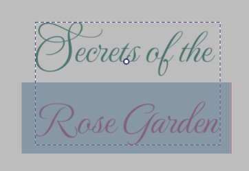
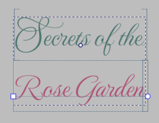
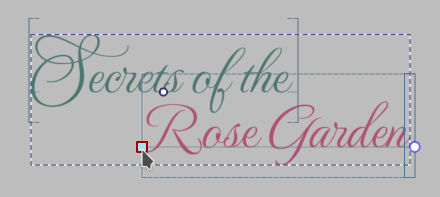
Echter, de tekst-functie kan alleen maar een enkele tekst tegelijk bewerken. Om meerdere teksten te bewerken, kan men het Gereedschap voor selectie van vormen gebruiken. Het paneel voor teksteigenschappen zal alle geselecteerde tekstobjecten tegelijk bewerken als de Vormselectie-functie wordt gebruikt. Daarnaast kan de vormselectie-functie ook worden gebruikt om tekst op een pad te plaatsen, of om tekst in meerdere vormen te gieten.
Om te zien hoe deze onderdelen samen worden gebruikt, gaan we enkele voorbeelden bekijken:
De creatie van een decoratieve titel
Laten we zeggen dat u wat tekst wilt toevoegen aan een illustratie, zoals men dat zou doen bij een poster of een postkaart.
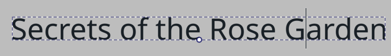
Selecteer het Hulpmiddel Tekst en klik met  op het werkvlak om een nieuwe tekst te creëren. U kunt nu uw tekst invoeren.
Om de kleur en de onderstreping aan te passen, kan men direct in een van de kleurkiezers een kleur selecteren. Voor het lettertype en de tekstgrootte echter, zal men het Vastzetter met teksteigenschappen moeten gebruiken.

In het paneel voor teksteigenschappen, zal de Paragraaf-tab de eigenschappen van de hele tekst wijzigen, terwijl de Karakter-tab alleen de eigenschappen van de huidige selectie zal wijzigen.
Nadat u een eigenschap in de karakter-tab heeft gewijzigd, komt de knop aan de linkerkant beschikbaar. Door erop te drukken wordt de wijziging ongedaan gemaakt, maar als het actief is zal het ook vertellen welke eigenschappen van de karakters ingesteld zijn. Eigenschappen die voor karakters zijn ingesteld worden niet beïnvloed door de eigenschappen ingesteld voor de paragraaf.
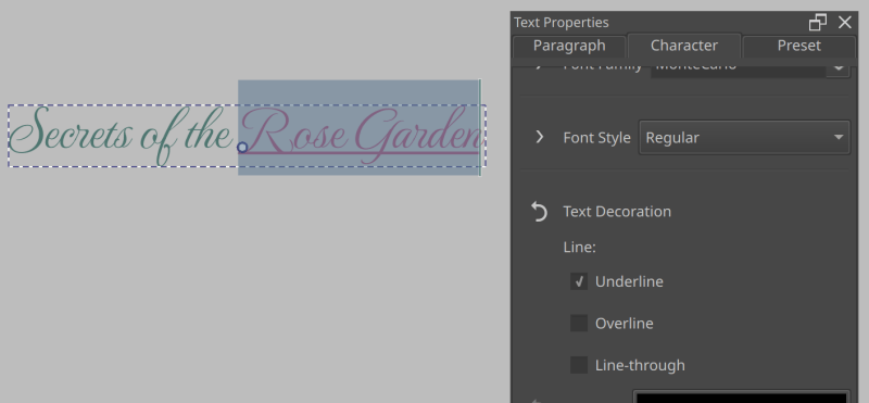
Een onderstreping is toegevoegd aan de Karakter-tab.
Laten we bijvoorbeeld dit stukje tekst gaan onderstrepen. Selecteer de tekst. Ga dan naar de Karakter-tab om daarin naar Eigenschap toevoegen onderaan te gaan, en type “Onderstrepen”. U zal dan in de lijst Tekstdecoratie zien staan. Selecteer dit. Vink nu Onderstrepen aan.
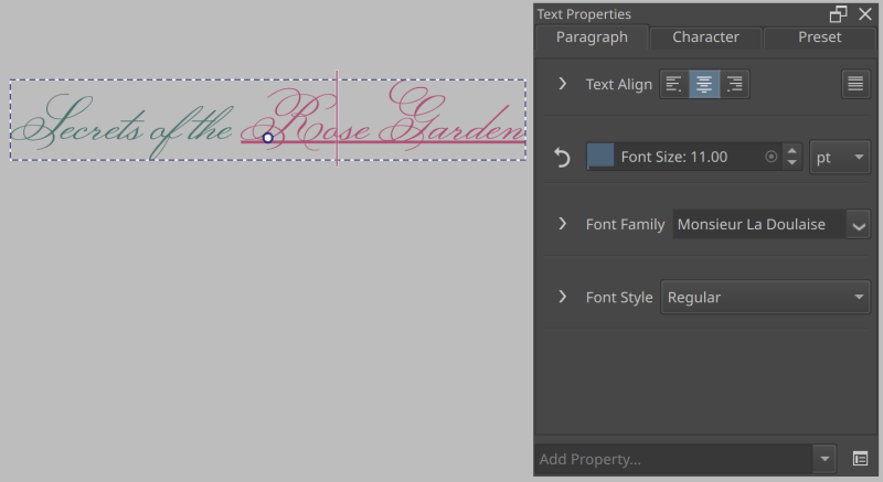
Hier zijn we terug gegaan naar de Paragraaf-tab, en hebben alleen de lettertypefamilie gewijzigd.
Als u nu terug gaat naar de Paragraaf-tab, en het lettertype aanpast, dan blijft de onderstreping van de originele selectie behouden.
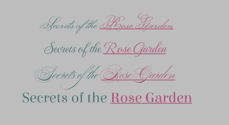
Hetzelfde als hierboven, elk van deze voorbeelden gebruikt een ander lettertype. Omdat we in de Karakter-tab alleen de onderstreping hebben aangepast, kunnen we de lettertypefamilie voor de hele tekst in de Paragraaf-tab aanpassen.
Dit kan met elk van de Character Properties worden gebruikt, en kan worden gebruikt om in een tekst de consistent te bewaren terwijl men nog steeds is om van elk karakter individueel de stijl aan te passen.
Alternatieve glyphs gebruiken
Sommige lettertypen hebben alternatieve glyphs voor specifieke karakters vanwege decoratieve effecten. Om deze te selecteren, kan men het Mogelijkheden van Opentype in het paneel voor teksteigenschappen gebruiken, maar meestal is het handiger om het Glyph Palet te gebruiken.
Om het glyph-palet te openen, gaat men naar Tekst-functie opties, en drukt op Glyph-palet.
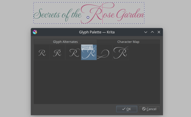
Als er een tekst actief is, en het lettertype heeft glyph-alternatieven voor het geselecteerde glyph, dan worden deze in het palet getoond.
Dubbelklik met de op een alternatieve glyph om het te selecteren.
Kromming en per karakter positionering
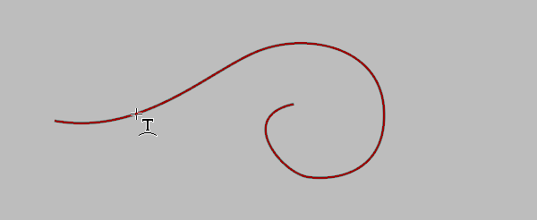
Soms wil men meer controle hebben over de positie van de glyphs. Dit kan men doen met de Letterzet modus in de Tekst-functie opties. Zorg er eerst voor dat de tekst vooraf is ingedeeld door Vooraf ingedeeld te selecteren in de Tekst-functie opties. Klik dan op knop Letterzet modus om het in te schakelen.
Het geselecteerde vlak op het werkvlak is nu vervangen door een serie lijnen. En twee stippen aan het begin en aan het eind van het geselecteerde vlak. Men kan nu de stippen met + verslepen om de hele selectie te verplaatsen.
Al hoe wel dit veel mogelijkheden geeft, wilt u soms dat de hele tekst een pad volgt zonder dat u elk karakter apart hoeft aan te passen.
Om dit te doen, moet men eerst op een vectorlaag een pad creëren.
Zweef dan boven het pad met de Hulpmiddel Tekst, en klik met .
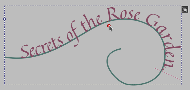
U kunt nu de tekstpositie op het pad aanpassen, en met de Gereedschap voor bewerken van een vorm kan u het pad aanpassen. U zal eerst in de contour mode (het pictogram rechtsboven) moeten gaan om daarna zoals altijd het pad te selecteren en te bewerken.
Om het pad te verbergen, gebruikt men de Gereedschap voor selectie van vormen om het te selecteren om daarna de dekking op 0% te zetten.
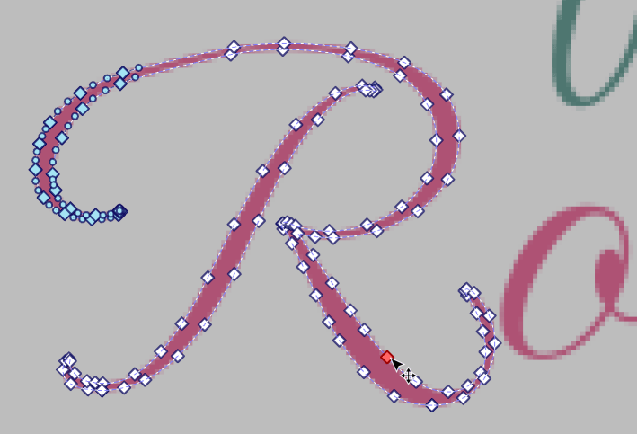
Tenslotte, als deze twee functies niet doen waarvan u wilt dat ze doen, dan is er altijd nog Converteren naar pad in de Gereedschap voor bewerken van een vorm-opties. Door dit te gebruiken zal de tekst geconverteerd worden naar een normale vectorvorm (als u meerdere kleuren gebruikt heeft, dan zal het een vormgroep produceren, zodat u de groepering moet opheffen met het Gereedschap voor selectie van vormen context menu).
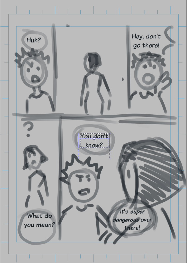
Stripverhalen
Bij het creatie van een stripverhaal, zal u op een gegeven moment tekst willen toevoegen. De voorbeelden hier focussen zich op de meest voorkomende momenten: Bij het eerste begin, wanneer een stripverhaal wordt gepland, of aan het einde, bij het letteren van de stripverhaal.
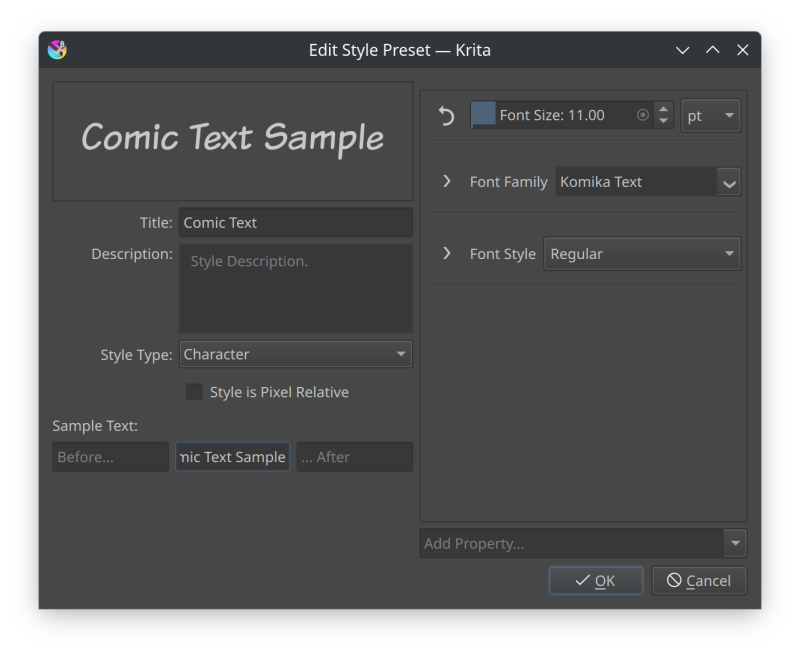
Welnu, bij de creatie van een stripverhaal, is het belangrijk dat de tekst consistent en makkelijk leesbaar is. Om daar voor te zorgen, kan men Stijlvoorinstellingen. gebruiken. Creëer eerst een tekst . Om vervolgens met de Vastzetter met teksteigenschappen, het gewenste lettertype, en lettergrootte in te stellen. Creëer tenslotte een stijl-instelling door naar de Voorinstelling-tab te gaan, en daar Nieuw Voorinstelling te selecteren. Een dialoogvenster zal openen, waar de naam en een stijlvoorbeeld ingevoerd kan worden.
Nu kunt u in de de hulpmiddelopties naar het Tekst-functie gaan, en daar Huidige teksteigenschappen deselecteren, om dan in de keuzelijst uw nieuwe voorinstelling te selecteren. Nieuwe tekst zal nu worden gecreëerd met deze voorinstelling, wat het makkelijk maakt om alles consistent te houden.
Tip
Het kan soms moeilijk zijn om een leesbaar lettergrootte te kiezen, omdat op het scherm de afbeeldingen kleiner of groter zijn dan hun uitgeprinte exemplaren (afhankelijk van het scherm). Dit is omdat programma’s zoals Krita de afbeeldingen zodanig tonen dat bij 100% een enkele pixel in de afbeelding overeenkomt met een enkele pixel op het scherm. Maar het is ook mogelijk om om te schakelen naar de fysieke afmetingen. Er is een knop onderaan naast de zoom-schuif waarmee omgeschakeld kan worden tussen pixel-afmetingen en fysieke afmetingen. Als er omgeschakeld is naar de fysieke afmetingen, dan zal Krita de afbeelding tonen ingezoomd op 100% van zijn fysieke afmeting.
Om te bepalen of een tekst leesbaar is,kan men een tekst creëren met het lettertype van uw voorkeur. Schakel dan om naar de fysieke afmeting. Als u werkt op 2x de fysieke afmeting, dan zal u moeten inzoomen naar 50%, Indien dat niet het geval is, zoom dan in op 100%. Zit dan op een armlengte van de monitor, en pas de lettergrootte van de tekst aan tot het goed leesbaar is.
Als het niet de bedoeling is dat het gedrukt wordt, dan kunt u de stap van de fysieke zoom overslaan, en in plaats daarvan de zoom zodanig instellen dat het dezelfde afmeting heeft op het scherm als het eindresultaat. Pas dan indien nodig de lettergrootte aan.
Een stripverhaal plannen
Methodes die gelijk in het begin tekst op een strippagina plaatsen, doen dat omdat de artiest er zeker van wil zijn dat de tekst genoeg ruimte heeft, en ze daarom de afbeelding rond de tekst plannen.
Welnu, u kan werken vanuit een script of van een erg grove sketch. Het eerste wat u doet is het creëren van nieuwe teksten. U kunt dat doen door een grote rechthoek met Hulpmiddel Tekst, by + verslepen om een Inline doorlopen naar volgende regel-gebied te creëren. Waarna u uw tekst typt. Deze over de regels doorlopende tekst is handig omdat het nergens wordt afgekort, zodat u zich focussen op het invoeren van de tekst en het later kan aanpassen.
U kan het Gereedschap voor selectie van vormen gebruiken om meerdere tekstvormen te selecteren om ze dan aan te passen met het Vastzetter met teksteigenschappen. Dit zal alleen de de eigenschappen op Paragraaf-niveau aanpassen.
Met alle tekst op hun plaats, is dit blad van het stripverhaal klaar om in detail uitgewerkt te worden. Door de tekst op deze manier over het blad verdeeld, wordt het duidelijk hoeveel ruimte er over is it voor de afbeeldingen.
Een stripverhaal letteren
De andere methode voor het plaatsen van tekst in een stripverhaal is helemaal aan het eind, nadat alle kleuren en afbeeldingen klaar zijn. Dit wordt meestal aangeduid als een stripverhaal “letteren”, omdat het niet alleen gaat om de tekst op zijn plaats te zetten, maar ook er voor zorgen dat het samen met de afbeeldingen er goed uit ziet.
Welnu, alle eerdere voorbeelden toonde al hoe we een soort decoratieve tekst kunnen maken voor titels en onomatopee (tekst voor geluiden als ontploffingen en dichtslaande deuren). In deze sectie gaan we ons focussen op het direct gieten van tekst in een tekstballon.
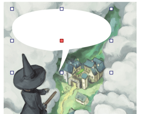
Afbeelding (met volgend voorbeeld met voorbeeld tekst) met dank aan Pepper and Carrot, CC-BY David Revoy.
Creëer eerst een gesloten vorm op een vectorlaag.
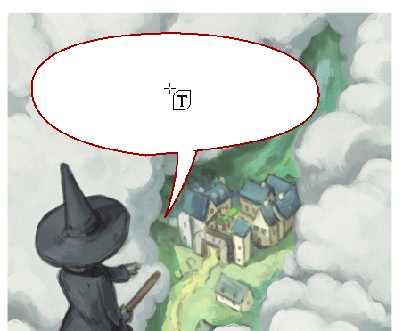
Zweef daarna met de Hulpmiddel Tekst en de boven het middelpunt.
U kunt nu de tekst typen.
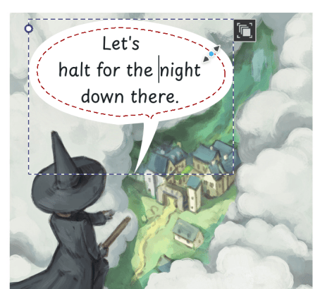
Als u wat achtergrondkleur wilt toevoegen aan de tekstballon, zweef dan boven de rand van de vorm, en + versleep naar binnen om wat achtergrondkleur toe te voegen.
Een alternatieve manier van het plaatsen tekst in een vorm is de creatie van een tekst, en een vorm waar het in moet vloeien. Waarna beide worden geselecteerd met de Gereedschap voor selectie van vormen en  voor het contextmenu. Selecteer dan . Als er meerdere voren zijn geselecteerd, dan kan de tekst ook in meerdere vormen worden gegoten.
Als u tekst in een vorm heeft, dan kunt u de grootte daarvan aanpassen met de vormselectie-functie, maar u kunt ook omschakelen naar de contour mode (door te klikken op de nieuwe knop rechtsboven) om de vormen individueel te verplaatsen.
Verticale tekst
Om een verticale tekst te maken, creëer eerst een tekst met de tekst-functie. Ga dan naar het Vastzetter met teksteigenschappen, om daar de Paragraaf-tab te selecteren. Ga dan naar Eigenschap toevoegen onderaan, en selecteer Schrijfmodus. Hier kan u het omschakelen naar Verticaal, rechts naar links om de hele tekst verticaal te maken.
Het kan verstandig zijn om hiervoor een stijl-instelling te creëren als u het regelmatig gebruikt.
Notitie
Op dit moment, Krita ondersteunt gemende tekst-modus en tekst-oriëntaties niet.
Tekst van rechts naar links
Ofschoon Krita een Bidirectionele algoritme heeft geïmplementeerd, moet u expliciet de richting van de paragraaf instellen. Voor een rechts-naar links paragraaf, creëert u een tekst. En gaat dan naar het Vastzetter met teksteigenschappen, en daar de Paragraaf-tab te selecteren. Ga dan naar Eigenschap toevoegen onderaan, en selecteer :ref:Richting. Stel deze in op :guilabel:`Rechts naar links.
Dit zal het bidirectionele algoritme correct opstarten. Het zal er ook voor zorgen dat bij Uitlijnen van tekst de betekenissen van Start en Einde worden omgewisseld. En tenslotte zal het ook Unicode Bidi-eigenschap tonen in de Karakter-tab, die kan worden gebruikt om het gedrag van het Bidirectionele algoritme te finetunen.
Woordenlijst met teksttermen
Er zijn een aantal technische termen die door de hele handleiding worden gebruikt om een bepaalde functionaliteit te beschrijven. Deze technische termen komen zo veel voor dat het handiger is om een woordenlijst met hun betekenissen te geven dan om ze iedere keer dat ze gebruikt worden uit te leggen.
- Karakters
Dit verwijst naar individuele letters in een tekst. “Individueel” betekent hier heel veel, omdat niet alle talen unieke letters hebben, maar in plaats daarvan clusters van letters gebruiken die door een enkele glyph worden voorgesteld. Overal in de documentatie gebruiken we het karakter om naar de tekst te refereren zoals het wordt getyped, en glyph om te refereren naar afbeeldingen die de tekst opmaken.
- Glyphs
Dit is de naam van de afbeelding of vectorvorm die een karakter of een cluster van karakters voorgesteld. Welke glyph is geselecteerd wordt bepaald door het lettertype, de taal en welke OpenType-functies zijn ingeschakeld.
- OpenType
Lettertypen zijn niet alleen een verzameling van glyphs voor elk karakter en cluster, maar bevatten ook een klein programmaatje die de tekstindeling instrueren hoe de glyphs gebruikt moeten worden. OpenType is een standaard voor deze programmaatjes, en in Krita is het mogelijk om de functies van het programma te regelen via verschillende OpenType functie-instellingen.
- Advance
Dit verwijst naar hoeveel ruimte een glyph inneemt op de regel waarop het is neergelegd. Soms is dit groter of kleiner dan de grootte van de glyph zelf, en dit wordt beïnvloed door zaken als Kerning en Letter spatiëring.
- Kerning
Als u een regel met tekst heeft, dan plaatst u de glyphs naast elkaar. Soms kan dit als resultaat hebben dat er kleine tussenruimtes verschijnen tussen sommige glyph-combinaties. Lettertypen hebben meestal een lijst met plekken waar dit gebeurt en geven dan opdracht aan de tekst-indeling om de glyphs een beetje terug te trekken, zodat dan de tussenruimte zich sluit. Dit heet Kerning.
- Bidirectioneel
Sommige schrijfwijzen worden van links naar rechts geschreven, terwijl andere worden van rechts naar links geschreven. Als een tekst een mix van beide heeft, dan moet het elk segment zodanig aanpassen dat de worden van elke schrijfwijze bij elkaar blijven. Hiervoor is er het Unicode bidirectionele algoritme.