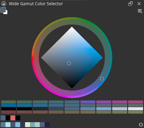
Wide Gamut Color Selector
Added in version 5.2.

The wide gamut color selector provides a customizable color selector that is also able to select colors outside of the basic sRGB color gamut.
To open the Wide Gamut Color Selector choose .
The top right of the selector has a foreground and background selector, while the middle is the main selector.
You can configure this docker by clicking the settings icons in the top level of the selector. Here you can access quick settings, like the color model and preferred selector shapes, and more configuration can be accessed with Configure....
注釈
The Wide Gamut Color Selector is intended to eventually replace the 拡張色選択, so many of its options will be familiar to you.
Configuration
Color Selection
Here you can select the color model and the main shape.
- Hue Ring Appearance
This allows you to choose how the hue ring (if applicable) will appear.
- Static
The hue right will always be at the most colorful color in that hue.
- Dynamic
The hue ring will adjust based on the lightness and saturation of the current color.
- Dynamic + Static Edge
The hue ring will be split in two parts: the inner edge will be dynamic, while the outer-edge will be static.
The color selector options are similar to the 'Type and Shape' entries in 拡張色選択.
General
This sections covers the selector layout.
- Show Quick Settings Menu
This will allow you to turn off the quick settings.
- Favourite selection
This will allow you to select preferred shapes that show up in the quick settings menu.
- Selection Color space
Select which color space will be used for the selector. You can use between current layer/mask, image, or a custom profile. This is useful for when you need to ensure your colors work inside a specific CMYK color space, while having the main image in RGB.
- Proof Colors to Painting Color Space
This ensures that the selector will display colors in the current painting color space, which happens with the options Custom and Image if the selected layer or mask does not have the same color space as the image. It has no effect when using Layer/Mask
Pop-ups
These settings configure the pop-ups that can be created with the wide gamut selector actions for Show Color History, Show MyPaint Selector, Show Wide Gamut Selector and Show Wide Gamut Shade Selector. Configuring the keyboard shortcuts for these colors is done in .
- Size
The size of the pop-up in pixels.
Color patches
- Layout
- Orientation
Whether these are oriented horizontally or vertically.
- Scrolling
This controls both the scroll direction as well as which direction the patches are laid out in, the latter perpendicular to the former.
- None
No scrolling.
- Along orientation
Scrolls vertically or horizontally depending on orientation. Patches are laid out in the perpendicular direction.
- Laterally
Shows perpendicular to the orientation, so vertically when the orientation is horizontal, and vice versa. Patches are laid out following the orientation.
- Rows
The amount of rows the patches will take up.
- Patches
- Width/Height:
The size of the patches.
- Max Patches:
The maximum number of patches allowed.
Shade Selector
This configures the shade selector.
- Update Base Color
- Color Changes Externally
When the shade selector is not responsible for the active color changes.
- Right-clicking on shade selector
The color changes by right clicking on the shade selector.
- Interaction ends
When the interaction with the selector ends. So a click+drag will not update the base color until the action is finished, but each single click will always update the color.
- Line count
How many shade selectors are available.
For each number there will be a button added to the right side.
- Line Height
How big the selectors are in pixels.
On the righthand side there will be a preview of each possible shade selector. Clicking these will allow you to edit the adjustment of the selector. The shade selectors follow the color model selected in the Color Selection options.
- Range
How strong the color change is. The further the value from zero, the bigger the change to the color. Negative values will flip the adjustment.
- Offset
How much the center of the selector is offset from the base color. Setting Hue to 0.5 for example will always show the complementary color to the current base color as the center of the slider.
- Display
Whether to show as a continuous gradient, or split up into patches, and if so, how many patches.
Color Patches
This allows you to configure the color patches for the color history and the colors from the image.
- Layout
- Orientation
Whether these are oriented horizontally or vertically.
- Scrolling
- None
No scrolling.
- Along orientation
Scrolls vertically or horizontally depending on orientation.
- Laterally
Shows perpendicular to the orientation, so vertically when the orientation is horizontal, and vice versa.
- Rows
The amount of rows the patches will take up.
- Patches
- Width/Height:
The size of the patches.
- Max Patches:
The maximum number of patches allowed.
- Options
- Clear Button
Whether the clear button is present. Only for the color history.
- Autoupdate
Whether the 'colors from image' auto updates, this will mean you will not have to press the refresh button in the docker to see them.
