Prelivi

Dostop do preliva

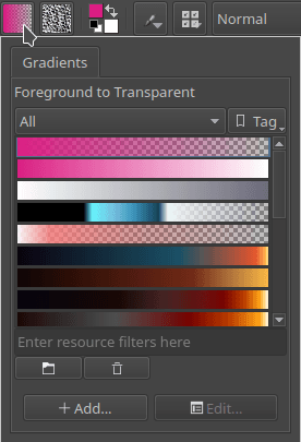
Do prilagoditvene plošče Prelivi lahko dostopate tako, da kliknete ikono Prelivi (običajno je to ikona poleg diska).

../../_images/Gradient_Toolbar_Panel.png

Prelivi so konfiguracije mešanja med barvami. Krita ponuja več kot ducat vnaprej nastavljenih dinamičnih prelivov, med katero lahko izbirate. Poleg tega lahko oblikujete in shranite svoje.

Nekatere tipične uporabe prelivov so:

  • Polnilo za vektorske like.

  • Orodje Preliv

  • Vir barve čopiča za slikovne točke.

Zloženo okno prelivov ne obstaja. Do njih je mogoče dostopati le prek prelivnega »hitrega menija« v orodni vrstici.

Urejanje preliva

Krita ima dve vrsti prelivov:

  1. Segmentni prelivi, ki so združljivi z GIMP, imajo veliko različnih funkcij, vendar so tudi nekoliko zapleteni za izdelavo.

  2. Ustavljeni prelivi so shranjeni kot datoteke SVG in so podobne temu, kakor večina programov izvaja svoje prelive, vendar imajo manj funkcij kot segmentirani prelivi.

Sprva smo lahko s Krito delali le prelive odsekov oz. segmentirane prelive, od različice 3.0.2 naprej pa lahko naredimo tudi ustavljene prelive.

../../_images/Krita_new_gradient.png

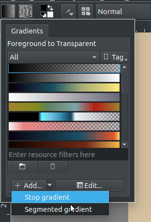
Nov preliv lahko naredite tako, da odprete spustni meni in izberete želeno vrsto preliva. Privzeto bo Krita naredila preliv z ustavitvijo.

Ustavi prelive

Stop gradients are simply a list of gradient stops. A gradient stop has two properties associated with it: a position and a color.

Novo v verziji 4.4: Gradients can have stops that use the currently selected Foreground or Background colors. This makes them dynamic: if a gradient uses the Foreground or Background colors then changing those will also change the gradient appearance.

Creating stop gradients is very straight forward. Following is a breakdown of the stop gradient editor:

../../_images/stop_gradient_editor_breakdown.png
  1. Besedilno polje Ime - v to besedilno polje lahko napišete ime preliva.

  2. Select stop - With these arrow buttons you can select the previous or next stop.

  3. Selected stop label - This label shows the currently selected stop index.

  4. Delete stop - With this button you can delete the currently selected stop.

  5. Gradient slider - This slider is the main part of the editor, where the gradient preview is shown and where you can perform some basic operations to change the gradient:

    • mouseleft on the gradient to add a stop.

    • mouseleft on the stop handles (the drop-shaped icons) to select a stop, and drag to move them.

    • Drag the stop handles outside of the bar or press Delete key to remove the selected stop.

    • Double-mouseleft on a stop handle or press Enter key to open a color dialog where you can choose the color of the stop.

    • Use the mousescroll or the Left and Right keys to move the selected stop. If you also press Shift key the increment will be smaller.

    • Use Ctrl + mousescroll or Ctrl + Left and Ctrl + Right shortcuts to select the previous or next stop.

  6. Color type - With these three buttons you can select the type of color used by the selected stop (Foreground, Background or custom).

  7. Color button - If the selected stop uses a custom color then you can use this button to open a color dialog and change the color.

  8. Flip gradient - With this button you can reverse the order of the stops in the gradient.

  9. Sort stops by value - Clicking this button will sort the stops by its value.

  10. Distribute stops evenly - Clicking this button will space the stops leaving the same amount of space between them.

  11. Sort stops by hue - Clicking this button will sort the stops by its hue.

  12. Opacity slider - If the selected stop uses a custom color then you can use this slider to change its opacity.

  13. Position slider - This slider allows to fine-tune the position of the selected stop.

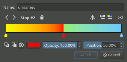
As per SVG spec, you can make a sudden change between stops by moving them close together. The stops will overlap, but you can still drag them around:
../../_images/Krita_stop_sudden_change.png

Right now, stop gradients are the only ones that are capable of handling colors outside of sRGB.

Segmentirani prelivi

Segmented gradients are a list of gradient segments. A gradient segment has the following properties:

  • A start and end positions that denote where the segment is placed inside the gradient.

  • A start and end colors associated with the start and end positions.

    Novo v verziji 4.4: Gradients can have segment endpoints that use the currently selected Foreground or Background colors, and those endpoints can be transparent. This makes them dynamic: if a gradient uses the Foreground or Background colors then changing those will also change the gradient appearance. These features allow full compatibility with GIMP gradients.

  • A blending strategy used to fill the segment inbetween the extreme colors. This strategy is formed by two different properties:

    • Barvni model:

      ../../_images/Krita_gradient_segment_color_model.png
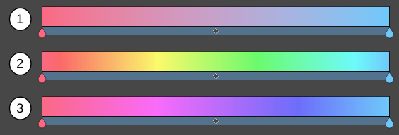
      1. RGB - izvede mešanje v modelu RGB.

      2. HSV clockwise - Blends the two colors using the HSV model, and follows the hue clockwise (red-yellow-green-cyan-blue-purple). The above screenshot is an example of this.

      3. HSV counter-clock wise - Blends the color as the previous options, but then counter-clockwise.

    • An interpolation function used to determine how the colors should vary along the segment:
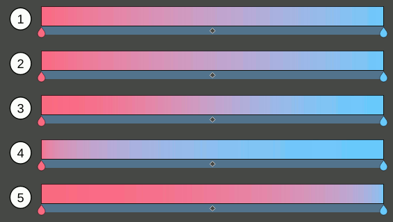
      ../../_images/Krita_gradient_segment_blending.png
      1. Linear - Does a linear blending between both extreme colors.

      2. Curved - This causes the mix to ease-in and out faster.

      3. Sine - Uses a sine function. This causes the mix to ease in and out slower.

      4. Sphere, increasing - This puts emphasis on the later color during the mix.

      5. Sphere, decreasing - This puts emphasis on the first color during the mix.

  • A segment middle position used to set where the center color obtained with the blending strategy should go. The visual effect is as if you stretched one half of the segment and squashed the other.
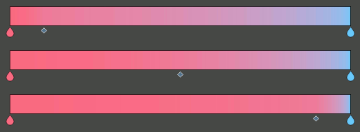
    ../../_images/Krita_gradient_segment_mid_position.png

The segmented gradient editor is very similar to the stop gradient editor. The main difference is that you can select three different types of handles to edit the gradient: segment, stop, and middle point handles. When selecting one of these handles the widgets around the gradient slider will change to reflect the actions that you can perform on that handle. For example, for a segment handle you can change the start and end colors (amongst other actions), but for a middle point handle you can only change its position.

Following are a general breakdown and three specific breakdowns of the editor corresponding to the different user interfaces that are presented when the different handles are selected.

Splošna razčlenitev uporabniškega vmesnika
../../_images/segment_gradient_editor_general_breakdown.png
  1. Besedilno polje Ime - v to besedilno polje lahko napišete ime preliva.

  2. Select handle buttons - With these arrow buttons you can select the previous or next handle.

  3. Selected handle label - This label shows the currently selected handle index.

  4. Handle actions area - In this area will appear some actions you can perform on the selected handle. They vary depending on the type of handle selected.

  5. Flip gradient - With this button you can reverse the order of the segments (and their start and end colors) in the gradient.

  6. Distribute segments evenly - Clicking this button will make all the segments have the same amount of space.

  7. Gradient slider - This slider is the main part of the editor, where the gradient preview is shown and where you can perform some basic operations to change the gradient. These operations basically make changes to the different handles and are explained in the following sections. You can change the selected handle by pressing Ctrl key and using mousescroll or by pressing Ctrl + Left and Ctrl + Right shortcuts.

  8. Handle properties area - In this area will appear some widgets you can use to change the different properties of the selected handle.

Razčlenitev uporabniškega vmesnika za ročico odseka

../../_images/segment_gradient_editor_segment_handle_breakdown.png
  1. Delete segment - Pressing this button will delete the selected segment (unless it is the only one).

  2. Flip segment - Pressing this button you can reverse the start and end colors of the selected segment as well as its middle point.

  3. Split segment - Pressing this button will divide the selected segment in two, using the segment middle point as the cutting position.

  4. Duplicate segment - Pressing this button will create a copy of the selected segment to its right.

  5. Gradient slider - Here is a list of the segment related actions you can perform on the gradient slider:

    • You can select a segment by mouseleft on an area of the slider where there is no stop handle (the drop-shaped icon) or middle point handle (the rhombus-shaped icon).

    • You can move the whole segment by mouseleft and dragging on an area of the slider where there is no stop handle or middle point handle. You can also move the segment by using mousescroll or Left and Right keys and while doing that, if you also press Shift key, then the increment will be smaller. The first and last segments can not be moved.

    • You can delete the selected segment by pressing Delete key or by dragging it outside the slider area.

    • Odsek lahko razdelite tako, da na njem pritisnete kombinacijo krmilka + mouseleft. Točka rezanja bo tam, kjer ste kliknili.

    • Odsek lahko podvojite tako, da na njem pritisnete kombinacijo dvigalka + mouseleft.

  6. Left color - In this row of widgets you can change the properties related to the start of the segment:

    • With the first three buttons you can set the type of color used (Foreground, Background or custom).

    • Next to the color type buttons will appear a check box when the color type is Foreground or Background that you can use to establish that the color should also be transparent. If the color type is custom, then instead a color button and an opacity slider will appear to let you choose a specific color.

    • Lastly there is a position slider you can use to fine-tune the start position of the segment. This also changes the end position of the previous segment.

  7. Right color - In this row of widgets you can change the properties related to the end of the segment. They are pretty much the same as the ones explained in the previous point.

  8. Interpolation - In this row you can set the interpolation method and color model used to blend the colors inbetween the segment.

Stop Handle UI Breakdown

Keep in mind that a segmented gradient is just a list of gradient segments. There isn’t really a concept of stop associated with it. The stop handles are just a convention used in the editor to ease the editing of the gradient. When manipulating or changing the properties of a stop handle you are really modifying the end of the segment on the left and the start of the segment on the right synchronously.

../../_images/segment_gradient_editor_stop_handle_breakdown.png
  1. Delete stop - Pressing this button will delete the selected stop. Under the hood this action will merge the left and right segments, keeping the start of the left segment and the end of the right segment.

  2. Center stop - Pressing this button will center the stop between the start position of the left segment and the end position of the right segment.

  3. Gradient slider - Here is a list of the stop related actions you can perform on the gradient slider:

    • You can select a stop handle by mouseleft on one of the drop-shaped icons.

    • You can move the stop handle by mouseleft and dragging the drop-shaped icon. You can also move the stop handle by using mousescroll or Left and Right keys and while doing that, if you also press Shift key, then the increment will be smaller. The first and last stop handles can not be moved.

    • You can delete the selected stop by pressing Delete key or by dragging it outside the slider area.

    • You can create a new stop by pressing Ctrl + mouseleft shortcut on an area of the slider where there is no stop handle or middle point handle. This is exactly the same action as splitting a segment.

  4. Left Color - In this row of widgets you can change the properties related to the end of the segment on the left of the stop:

    • With the first three buttons you can set the type of color used (Foreground, Background or custom).

    • Next to the color type buttons will appear a check box when the color type is Foreground or Background that you can use to establish that the color should also be transparent. If the color type is custom, then instead a color button and an opacity slider will appear to let you choose a specific color.

  5. Right color - In this row of widgets you can change the properties related to the start of the segment on the right of the stop. They are pretty much the same as the ones explained in the previous point.

  6. Link colors - If this button is checked then changing the properties on the left color area will also change the properties on the right color area and vice versa. Check it if you want the two colors to be synchronized.

  7. Position - you can use this slider to fine-tune the position of the stop. This changes the end position of the segment on the left and the start position of the segment on the right.

Middle Point Handle UI Breakdown

../../_images/segment_gradient_editor_midpoint_handle_breakdown.png
  1. Center middle point - Pressing this button will center the middle point of the selected segment.

  2. Gradient slider - Here is a list of the middle point related actions you can perform on the gradient slider:

    • You can select a segment middle point by mouseleft on one of the rhombus-shaped icons.

    • You can move the middle point by mouseleft and dragging the rhombus-shaped icon. You can also move it by using mousescroll or Left and Right keys and while doing that, if you also press Shift key, then the increment will be smaller.

  3. Position - With this slider you can fine-tune the position of the middle point of the segment.

Compact Gradient Editors

In some places in the GUI a compact version of the gradient editors may be used because of the lack of space or other reasons. They just show the gradient slider and all the other functionality that is exposed in the non-compact mode is compacted and moved to the side.

../../_images/compact_stop_gradient_editor.png

Generic Gradient Editor

In some places you will find that the previously mentioned gradient preset chooser and editors are shown together and that they are interconnected. When this happens, you are probably using the generic gradient editor, that was introduced to ease the creation and manipulation of gradients.

Njegove glavne značilnosti so:

  • Allows you to load/save gradients from/to the gradient resources to/from the editor.

  • Omogoča prepis obstoječega vira preliva.

  • A specific editor is shown automatically depending on the type of the gradient (stop gradient or segmented gradient).

  • Omogoča pretvorbo med vrstami prelivov.

Sledi razčlenitev vmesnika urejevalnika:

../../_images/generic_gradient_editor_breakdown.png
  1. Add gradient button - Pressing this button you can add the current gradient to the resources.

  2. Update gradient button - Pressing this button you can overwrite the gradient resource that is currently selected in the gradient chooser. Keep in mind that the type of the gradient resource and the type of the gradient that is currently being edited must match.

  3. Convert gradient button - Pressing this button you can convert the current gradient to a stop gradient if it is a segmented gradient or to a segmented gradient if it is a stop gradient.

  4. Convert gradient warning - This icon will appear when pressing the convert button means that some data or info will be lost in the conversion. This can happen when converting from a segmented gradient to a stop gradient.

  5. Gradient presets button - Pressing this button will pop-up a gradient preset chooser to let you choose a gradient and edit it. This button is only available if the „use a pop-up gradient preset chooser“ is checked.

  6. Options button - Pressing this button will show an options menu.

  7. Specific editor area - Here the stop or segmented gradient editor will be shown when a gradient is selected. The specific gradient editors are documented in the previous sections.

  8. Gradient preset chooser - This widget shows a collection of gradient resources and allows you to load one of those gradients into the editor.

  9. Use a pop-up gradient preset chooser - If this option is checked, the gradient preset chooser will be accessed through a pop-up window that is shown by clicking the „choose gradient preset“ button. If this option is not checked then the gradient preset chooser is shown inline above all the other widgets.

  10. Show compact gradient preset chooser - If this option is checked, then only the collection of gradient resources is shown, without any surrounding buttons or options. If it is not checked then the gradient preset chooser will also show some extra buttons, like tag filtering or viewing options.