Ton ekranu
Added in version 4.4.
Wypełnia warstwę prostymi regularnymi wzorami takimi jak kropki i linie, takimi jak są używane w tradycyjnych technikach tonów ekranowych czy półtonów.
General Concepts
The screentone generator is based on traditional and digital halftoning principles. Following are some explanations of basic concepts used through this page.
- Pixel Grid
The pixel grid is the grid formed by the regular positioning of each pixel in the image. Each cell in this grid is formed by a single pixel.
- Screen
The term screen comes from the days when analog halftoning was invented. It is also used for example when talking about screen printing. Traditionally it was some kind of sheet with very small holes (a fabric for example) through which the light passed. Here we use the term to refer to the unbounded regular pattern formed by repeating some shape.
- Screen Cell
A screen cell is the minimum rectangular area in the screen that contains a repeatable shape or image (commonly a dot, but can be a part of a line or other shape). In principle every cell contains the same shape, and the arrangement of the cells, in a regular and orthogonal grid, forms the screen.
- Screen Grid
The screen grid is the grid formed by the regular positioning of screen cells.
- Macrocell
Because this filter needs to align the screen image to the pixel grid (the rasterization process) it may happen that not all the cells contain exactly the same shape (in terms of pixel values). This can produce artifacts such as moire patterns. To solve this, the screen grid can be aligned to the pixel grid in such a way that some screen cell corners fall at integer pixel coordinates. You can select every how many screen cells horizontally and vertically this should happen. The effect is that the shapes of the set of cells between such aligned corners will repeat. For example, if you align the screen grid every 2 cells horizontally and every 1 cell vertically, every 2 by 1 block of cells will be identical (although the cells inside the block can be slightly different with respect to each other). This set of contiguous cells that repeat along the screen is sometimes called a macrocell or supercell. Similarly the single cell is sometimes called microcell.
- Spot Function
A spot function is a kind of function that generates the shapes analytically inside every screen cell (a circle, a line, etc.).

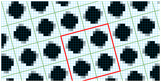
In this figure we can see a magnified screentone with an overlay marking the pixel grid in blue and the screen grid in green. As shown they may not align. The red outline is a macrocell border. The four cells that compose it are repeated in contiguous macrocells but may differ slightly in shape between them. Note how the corners of the macrocell align with the pixel grid.
Description of the Parameters
Rodzaj tonów ekranu
- Wzór
Wybierz globalny wygląd (kropki, linie).
- Kształt
Wybiera dany wygląd wzoru (na przykład: okrągłe kropki, diamentowe kropki, proste linie, linie fali sinusoidalnej).
- Interpolacja
Określa przejścia wzorów z pierwszego do drugiego planu.
W większości przypadków, poza odmianami wzoru kropek o okrągłych kształtach, wynik trybu interpolacji nie jest za bardzo zauważalny.
- Equalization
Added in version 5.1.
The spot functions are simple periodic 2D functions that output a value between black and white. Every one cycle in the width and height forms a screentone cell and all the cells combined form the screentone grid. The spot functions are designed to be simple and fast to compute, but for some functions this means that they don’t have a uniform distribution of values. Suppose we threshold the function (contrast value equal to 100%, the usual in traditional halftoning). This lack of uniform distribution has the downside of not producing shapes that have a direct relationship between the brightness of the input and the coverage of the black areas. The effect is a mismatch between the input brightness and the perceived brightness. If the function has a uniform distribution of values, for example choosing a brightness of 40% will produce a shape that has 40% of the pixels white and 60% black. To solve this the user can select between three equalization modes:
None: by selecting this mode the generator will use the functions as is, it will not enforce a uniform distribution of values if the function is not already equalized. This is the same behavior as in versions prior to 5.1.
Function based equalization: this mode will perform something similar to histogram equalization to the function.
Template based equalization: this mode is a bit more involved. It tries to replicate the traditional screen generation methods on digital halftoning. This achieves equalization in a very different way. First the original spot function is used along with the transformation parameters to create a template (a small image) that contains a set of one or more contiguous cells (macrocell) and is used as a reference later to paint the screentone grid. To equalize the template, all the pixels in the macrocell are then sorted from darker to lighter over all the macrocells and from top-left to bottom-right over each cell. This step will produce an equalized macrocell that grows 1 pixel at a time (or a bit more if the number of pixels in it is greater than 256), avoiding the sudden jumps in brightness.

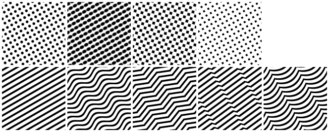
Od lewej do prawej, od góry do dołu: wzór z kropkami o okrągłych kształtach, wzór z kropkami o eliptycznych kształtach, wzór z kropkami o diamentowych kształtach, wzór z kropkami o kwadratowych kształtach, wzór linii z prostym kształtem, wzór linii z kształtem fali, wzór linii z kształtem fali trójkątnej, wzór linii z kształtem fali piły zębatej i wzór linii z kształtem kurtyny.
Przekształcanie
Wybierz jak wzór ma być ułożony geometrycznie na obrazie (położenie, rozmiar, obrót, pochylenie). Niektóre wzory korzystają z możliwości określania rozmiarów w poziomie i pionie osobno. Na przykład, wzór fali sinusoidalnej ma małą kropkę domyślnie, a po wybraniu dużego rozmiaru w poziomie, ta kropka także będzie wyglądać na większą.
- Size Mode
Added in version 5.1.
You can choose between a resolution based mode and a pixel based mode to adjust the geometric transformations of the screen. In the resolution mode you set a resolution and change the frequency of the patterns in lines per inch/cm. The pixel mode is the old one in which you set the size of the cells manually. Those two modes are synched so changing the frequency will change the cell size and vice versa.
- Align to Pixel Grid
Added in version 5.1.
If the alignment is set on, all the cells (or macrocells if the alignment is every more than 1 cell) will have the same shapes in terms of pixels, producing a more pleasant and regular tiled structure. The downside is that the range of possible transformations is reduced.

Od lewej do prawej: wzór z kropkami o okrągłych kształtach bez obrotu, wzór z kropkami o okrągłych kształtach z obrotem o 45 stopni, wzór linii z kształtem fali i rozmiarem 20 pikseli w poziomie i pionie, wzór linii z kształtem fali i rozmiarem 50 pikseli w poziomie i 20 pikseli w pionie.
Przetwarzanie końcowe
- Drugi i pierwszy plan
Umożliwia ci wybranie barwy i nieprzezroczystości pierwszego planu (kropki, linie) i drugiego planu.
- Odwróć
Odbija to co jest traktowane jako pierwszy i drugi plan.
- Jasność i kontrast
Jasność określa jak blisko do barwy pierwszoplanowej, czy drugoplanowej jest zbliżony wzór (jak ciemny lub jasny w przypadku czarnego pierwszego planu i białego drugiego planu). Tak więc jeśli chcesz np. naśladować małe kropki, to ustaw jasność na wysoką wartość, a zęby uzyskać duże kropki ustaw ją na niską wartość.
Kontrast określa jak gładkie lub ostre będą przejścia pomiędzy barwami pierwszo- i drugoplanowymi. Domyślnie, kontrast jest ustawiony na 50 % (gładko). Aby uzyskać zwyczajowe ostre granice, kontrast musi być ustawiony na wyższe wartości.

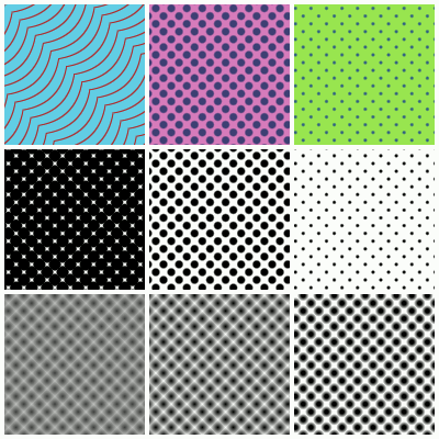
Pierwszy wiersz: różne połączenia barw pierwszo- i drugoplanowych. Drugi wiersz, od lewej do prawej: 25 %, 50 % oraz 75 % jasności przy 90 % kontrastu. Trzeci wiersz, od lewej do prawej: 25 %, 50 % oraz 75 % kontrastu przy 50 % jasności.
Usage Tips
What Interpolation to Use?
The interpolation sets how the shape of the pattern should vary from dark to light.
You will only have to worry about the interpolation in the case of the round and elliptical dots and the line patterns, although if you use some equalization mode the interpolation will look the same in the case of the line patterns.
So, in summary, change the interpolation if you use round or elliptical dots to vary how they change shape when changing the brightness. If you use linear interpolation the dots will look as black circles/ellipses that grow radially until they cover the cells. If you use the sinusoidal interpolation, the round/elliptical dot pattern will change symmetrically. This means that at low brightness values the pattern will look as small white circles/ellipses and at high brightness values it will look as small black circles/ellipses. At mid-brightness values the pattern will look as a checkerboard.
What Equalization Mode to Use?
Most of the time you will be fine using the default template based equalization. It is the mode that gives better tone representation when using small cell sizes. Here is a comparison of the modes:
No Equalization:
Pros:
It is the fastest mode.
Nice smoothing of the edges.
Cons:
There is a mismatch between the brightness parameter and the perceived brightness.
Since it is an analytical approach it may not produce a wide range of brightness variations when the cells are small. For example, the round dot shape grows radially. This means that if the radius grows 1 pixel, then a bunch of pixels are added all around the dot. This produces a big jump on the perceived brightness.
When to use: use this mode when you need the most speed and don’t care about the perceived brightness or the shapes at small cell sizes.
Function based equalization:
Pros:
It produces better-perceived tones.
Nice smoothing of the edges.
Cons: Since it is still an analytical approach it may not produce a wide range of brightness variations when the cells are small.
When to use: use this mode if you need accurate tone representation and you use big cell sizes, or if you need nice smoothing. For example, if you use the screentone on graphic design works.
Template based equalization:
Pros:
It produces better perceived tones.
No sudden jumps in perceived brightness.
Cons:
The shape may not be as correct as in the other cases, although it is difficult to perceive.
The smoothing of the edges is worst.
When to use:
Use this mode whenever possible, especially if you want small cell sizes or if you want smooth transitions between perceived brightness values.
Use this mode if you use 100% contrast.
Use this mode if you use the screentone generator with the halftone filter.
What Size Mode to Use?
At the end of the day choosing what size mode to use is a matter of how many size-related calculations you want to avoid, and this usually has to be with the final medium you intend the image to be displayed on.
If you intend to print the image you are making, then you will find it easier to set the cells size in terms of resolution and cell frequency. If you choose the same resolution as the resolution of the image then you can easily map the frequency values to real-life measures.
On the other hand, if you just want to produce digital images, then you may find it easier to work with pixel sizes directly, as they are easier to compare to the image size. In the case you don’t really care about the exact size of the pattern, this mode allows you to easily try different sizes while looking at the image to see the changes.
Using the Align to Pixel Grid Options
This option is key to achieve the maximum cell regularity and to avoid moire patterns. Usually you won’t have to change the default values.
The downside of aligning to the pixel grid is that the available range of transformations is reduced. So, if you want to use a specific rotation, cell size or shear, but you can’t achieve it with the selected alignment options, you can try to upper every how many cells to align using the sliders. Always prefer first changing those values than to disabling the alignment. In fact, disabling the alignment has the same effect as aligning the grid at infinity.
Keep in mind that the greater the distance between alignment points (with respect to the screen grid), the more likely the appearance of moire patterns will be.
Using the Brightness and Contrast Options
Most of the time, to achieve the classical screentone/halftone look, you will have to set the contrast slider to a high value and then change how dark/light the pattern looks with the brightness slider.
At 100% contrast the shapes will look aliased, binary. This is the classic approach to digital halftoning, since printers can only output black or white (ink or absence of ink).
If you want sharp edges but also want antialiased edges, you can try choosing a contrast value around 80% to 95%.
Sometimes you will need to have extra soft shapes. For example, if you use the screentone generator with the halftone filter, you better use a 50% contrast and 50% brightness. The reason is that the halftone filter performs its own contrast adjustment. You can take advantage of these soft shapes to then apply your own contrast adjustment filter and achieve even more unique looks as shown in the following image.

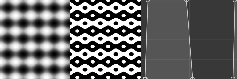
On the left: a simple screentone layer with 50 pixels wide elliptical dots, sinusoidal interpolation and 50% brightness and contrast. In the middle: The layer with a curves filter mask applied to it. On the right: the curve used on the filter.
