
ソフトプルーフ
注釈
Soft Proofing works only with Canvas Graphics Acceleration enabled.
Krita で画像を作って、プリンタで印刷すると、画像の見た目は少し異なります。色は暗く、または期待どおりに暗くなかったり、赤がより強く出るかもしれませんし、コントラストが失われます。単純な文書ではそんなに問題にはなりませんが、プロの印刷においては、これはとても悲しむべきことで、画像の見た目と印象が劇的に変わります。
これが起こる理由は単純でプリンタが色の範囲(色域と言います)に乏しい異なるカラーモデル(CMYK)を使用することによるものです。
鈍感な人はこう言うでしょう: CMYK カラーモデルで作業をしよう!でもそれには3つの問題があります:
CMYK 空間で塗ることはプリンタで同じ色になることを保証するものではありません。それぞれのインクの組み合わせ、紙と印刷機械、結果の色域は異なります。つまりそれぞれの物に関連付けた異なるプロファイルが必要になります。
さらに、プロファイルがあってプリンタが出せる色空間そのもので作業をしていたとしても、CMYK 色空間はまるで一般的ではなく、色の計算は他の空間に比べると良いものではありません。合成モードも CMYK では異なります。
最後に、CMYK 空間で作業をするということは画像がその空間に捕らわれてしまうことです。もし紙やプリンタ、インクが違って異なる CMYK プロファイルで作業をすることになった場合、より明るい色のある広い色域の方がメリットが大きいでしょう。
理想的には、RGB で作業して、お気に入りの RGB ツールを使い、CMYK 空間への変換はコンピュータにプレビューだけをワンタッチで任せる事です。これは可能で、私たちが「ソフトプルーフ」と呼んでいるものです。
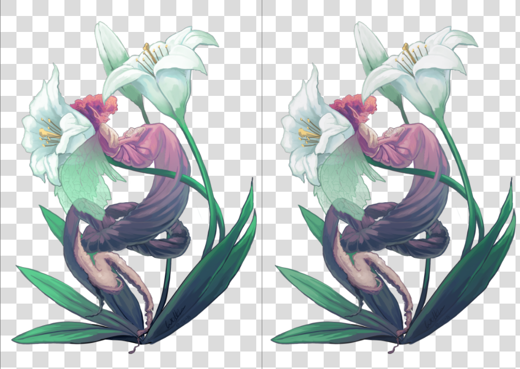
左はオリジナル、右はソフトプルーフをオンにしたビューです。明るい色が欠けているため違いは僅かですが、ソフトプルーフの方が花の白さから青がわずかに欠け、葉の緑からわずかに彩度が欠けています。
You can toggle soft proofing on any image using the Ctrl + Y shortcut. Unlike other programs, this is per-view, so that you can look at your image non-proofed and proofed, side by side. The proofing configuration can also be set per image, and saved into the .kra file. Just enable Store Softproofing configuration in the image in the proofing options in . If the checkbox is unchecked, then Krita will use global settings from (for more details see here).
注釈
When Store Softproofing configuration in the image is enabled, Krita embeds the entire proofing ICC profile into .kra file. This ICC profile can be big for some output devices, especially CMYK ones.
以下のオプションを設定できます:
- Model, Profile
これらの中で、プロファイルだけが本当に重要です。ソフトプルーフするものはプロファイルとして提供されます。プロのプリント工程では、このプロファイルは印刷業者によって決められます。
- Rendering Intent
Set the intent used to convert the image to the proofed output device profile. It uses the same options as the intents mentioned in the color managed workflow. This intent should coincide with the conversion intent used by your print house before printing. If your print house does not do any conversion internally, then you should perform the conversion yourself before sending the file to them.
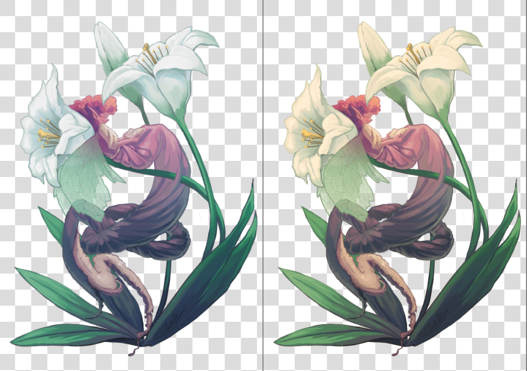
Left: Soft proofed image with Absolute Intent Chromatic Adaptation enabled. Right: Soft proofed image with Absolute Intent Chromatic Adaptation disabled.
- Black Point Compensation
Enables the black point compensation when converting image to the proofed output device profile. Turning this off will clip the shadow values to the minimum that either the screen and the proofing profile can handle, while turning this on will scale the black to the screen-range, showing you the full range of grays in the image. Like Conversion Rendering Intent, this value should coincide with the value used by the printing house when performing conversion to the device.
- Display Mode
Defines the way how the proofed (and possibly clipped) space will be shown on the screen, i.e. what rendering intent and flags will be used to convert colors from the proofed output device profile into the screen profile.
Use global display settings instructs Krita to render the proofed space using the global settings, set in .
Simulate paper white and black is used to preview the white point (or "color tint") of the paper on the current display. In other words, if the paper is matte, or metallic, or has some sort of sepia effect, this will be visible on your screen. Please take it into account that the viewing conditions' white point will still be adjusted to the one of the screen. It means that you cannot visually compare the physical print and the image on the screen, unless all three white points coincide: the one in the paper profile, the one the display is configured to and the white point of the light bulb that illuminates your physical print.
Custom allows you to configure the final conversion step manually. You may want to configure the pipeline depending on your goal:
- Preview color gamut (or "color variety") of the image
Rendering Intent --> Relative Colorimetric
Black Point Compensation --> Enabled
注釈
If you want to use Out of Gamut Warnings, it is best to use them in this mode
- Preview contrast degradations caused by the color of the paper
Rendering Intent --> Absolute Colorimetric
Absolute Intent Chromatic Adaptation --> Enabled
警告
If you are using Wayland compositor, Absolute Colorimetric intent may be broken (even in XWayland mode). More than that, it may be broken differently in different versions.
In KWin 6.4.x and earlier, Absolute Colorimetric will behave as if Absolute Intent Chromatic Adaptation is always disabled. It will cause severe color tint if white points (sigChromaticAdaptationTag) of the printer and display profiles do not coincide.
In KWin 6.5.x and later, Absolute Colorimetric will behave as if Absolute Intent Chromatic Adaptation is always enabled. Given that you keep the checkbox set, the feature will work correctly and will let you preview contrast degradations, but you will not be able to get advanced effects of disabling color adaptation to the display space.
This is a problem of the Wayland protocol specification, the fix is discussed here.
- 色域外警告
Set the color of Out of Gamut Warnings.
You can set the defaults that Krita uses in .
正しく設定するために、印刷するテスト画像を作って(正しく設定されたプリンタで印刷し)比べ、現実のコピーと画像がどう違うかを見てからプルーフオプションを近づけることが推奨されます。
色域外警告
色域外警告、またが色域警告はソフトプルーフの一番上に来るオプションです: どの色が欠けるかを見え、その色を設定した警告色で置き換えます。
どの部分のコントラストが失われるのかを知るのに有用で、よりコントラストの少ない画像にゆっくり変更する事ができます。
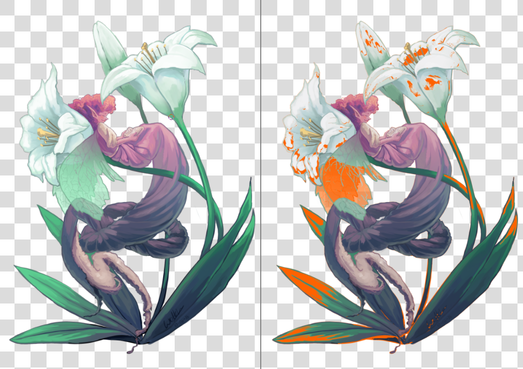
左: 元の画像、右: ソフトプルーフし色域外警告をオンにした状態。Krita は警告色を KRA ファイルのソフトプルーフオプションと一緒に保存し、選んだ警告色は現在の画像でのみ表示されることになります。
色域外警告は Ctrl + Shift + Y ショートカットで有効にできますが、完全に機能させるにはソフトプルーフが有効になっている必要があります。
注釈
ソフトプルーフは浮動小数点色空間では正しく動きませんし、無理にやろうとしても間違った色域外警告が発生します。それゆえに無効になっています。
警告
色域警告は時々リニアプロファイルで妙な警告を発生させることがあります。これは LittleCMS のバグで、詳しい情報は ここ にあります。