
Бічна панель властивостей тексту
За допомогою бічної панелі властивостей тексту можна редагувати властивості текстових об’єктів, які позначено за допомогою Інструмент «Позначення форми» або Інструмент тексту. Див. Робота з текстом, щоб ознайомитися із усіма можливостями з роботи з текстом.
На бічній панелі передбачено три вкладки: Абзац, Символ і Набір.
Вкладку Абзац призначено для редагування типових властивостей для всього абзацу та містить як Властивості абзацу, так і Властивості символу. Властивості можна редагувати за допомогою обох інструментів.
Вкладку Символ призначено для редагування властивостей позначеного слова або діапазону символів, можна редагувати лише Властивості символу. Властивості доступні, лише при редагуванні за допомогою Інструмент тексту.
На решті, за допомогою вкладки Набір ви можете створювати набори стилів та застосовувати їх до тексту. Докладніший опис наведено у розділі Набори стилів.
Типово, на перших двох вкладках буде показано лише кілька основних властивостей, тоді як усі інші властивості буде показано, лише якщо їх встановлено або успадковано.
Кнопка скасування ліворуч від поля певної властивості покаже, чи змінено властивість, а натискання на неї скасує цю зміну. Якщо вибрано кілька властивостей стилю, ви побачите багатонаправлену стрілку, а сам елемент керування показуватиме типове значення або успадковане значення. Зміна елемента керування встановить однакове значення для всіх властивостей, а натискання кнопки скасування скасує властивість для всього тексту.
Нові властивості можна додавати за допомогою спадного списку Додати властивість нижче. Введення тексту надає змогу шукати поточні властивості тексту, причому кожна властивість має кілька альтернативних ключових слів. Наприклад, введення «підкреслення» призведе до показу Оформлення тексту, частиною якої є опція Підкреслення. Вибір Оформлення тексту додасть властивість до списку, щоб її можна було встановити.
Стан видимості кожної властивості можна налаштувати, натиснувши кнопку Налаштувати поруч зі спадним списком Додати властивість. Якщо типовий режим видимості встановлено на «завжди показувати» і жодна з окремих властивостей не налаштована на умовний показ, спадний список Додати властивість буде замінено фільтром. Можливі поточні стани видимості:
- За типовим
Значення властивості буде визначено за типовим станом видимості у верхній частині вікна налаштовування.
- Показувати завжди
Властивість завжди буде видимою.
- Якщо встановлено
Властивість буде показано, лише якщо її встановлено.
- Якщо потрібно
Властивість буде показано, лише якщо її встановлено або якщо її буде успадковано.
- Ніколи не показувати
Властивість не буде показано ніколи.
Успадкування
Текстова форма Krita використовує CSS, що надає змогу успадковувати властивості. Це означає, що такі властивості, як розмір шрифту, можна встановити для всієї текстової фігури, а фрагменти тексту всередині форми типово матимуть успадковане значення, якщо воно явно не встановлено для фрагмента.
Успадкування корисне, оскільки надає нам змогу встановлювати лише ті властивості, які важливі для певного розділу. Таким чином, ми можемо виокремити фрагмент тексту курсивом на вкладці Символ, а потім скористатися вкладкою Абзац, щоб змінити розмір шрифту або гарнітуру шрифтів для всього тексту, не втрачаючи позначення фрагмента тексту.
І навпаки, деякі властивості взагалі не успадковуються, наприклад, Зсув базової лінії. Ці властивості зазвичай додаються одна поверх одної, але точна поведінка описана у відповідному записі.
Одиниці, пов’язані із шрифтом
Деякі властивості дозволяють використовувати одиниці вимірювання, що залежать від шрифту. Значення цих одиниць також залежить від механізму успадкування. Усі одиниці вимірювання, що залежать від шрифту, намагатимуться використовувати поточні метрики шрифту. Однак, коли зазначена метрика шрифту дорівнює Em, а властивість, яку редагують, дорівнює Розмір шрифту, вона буде відносною до успадкованого розміру шрифту. Подібно до Lh та Висота рядка.
Одиниці вимірювання шрифту особливо корисні для Інтервал між літерами, який часто вимірюється відносно розміру Em. Аналогічно, дуже часто для тексту верхніх індексів встановлюється значення 0,5 Em (тобто це половина звичайного розміру шрифту) або для Фаски форми встановлюють значення 1 Ex.
- Ем
Поточний розмір шрифту (або успадкований розмір шрифту у випадку «Розмір шрифту»).
- Ex
Поточна висота «x». Цей показник буде отримано зі шрифту, він залежить від розміру шрифту.
- Cap
Поточна висота прописних літер. Цей показник буде отримано зі шрифту, він залежить від розміру шрифту.
- Lh
Висота рядка. Це значення або відносно поточної висоти рядка, або, у випадку Висота рядка, успадкованої висоти рядка.
- Ic
Відносно до ідеографічного символу Поступ. Просування одного символу китайсько-японської ієрогліфії.
- Ch
Поступ цифри «0».
Властивості символу
Властивості символів – це властивості, які можна застосовувати до фрагмента тексту або до всього абзацу.
Розмір шрифту
Розмір шрифту надає змогу встановити розмір символів. Зокрема, він масштабує весь шрифт так, щоб його запрограмований розмір («em size») збігався з розміром шрифту.
При використанні Одиниці, пов’язані із шрифтом, розмір шрифту завжди використовуватиме успадкований розмір та гарнітуру шрифтів як еталонний шрифт. Цим можна скористатися, щоб зробити фрагмент тексту завжди трохи більшим або трохи меншим за навколишній текст, що може бути корисним для верхніх індексів або заголовків.
Типово, ця властивість буде видимою завжди.
Коригування розміру шрифту
За допомогою коригування розміру шрифту можна встановити коефіцієнт, на який має бути помножено висоту x. Висота «x» — висота малої латинської літери x у шрифтах латиниці, значення визначається на основі метрики шрифту.
Це особливо корисно з використанням резервних шрифтів, але також може бути корисним загалом для забезпечення певної узгодженості висоти x. Передбачено кнопку Обчислити, за допомогою якої можна обчислити співвідношення розмірів шрифту поточної гарнітури шрифтів.
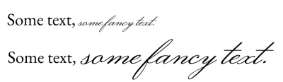
Рукописні шрифти часто мають набагато меншу висоту x, ніж типові шрифти основного тексту. За допомогою пункту Коригування розміру шрифту та натискаючи Обчислити, ми можемо встановити текст з подібним розміром висоти x.
Гарнітура шрифту
Гарнітура шрифту надає змогу вибрати список шрифтів, які слід використовувати для поточного тексту. Першим пунктом у списку буде використаний основний шрифт, а шрифти з усіх наступних пунктів може бути використано як резервні.

Багато шрифтів мають гліфи лише для підмножини Unicode, тому контроль резервного використання може надати нам змогу вибирати шрифти, які, здається, мають подібну традицію, наприклад, використати шрифт Serif Latin для шрифту Naskh Arabic.
Див. Сімейства шрифтів, щоб дізнатися більше про вибір шрифту та гарнітури шрифтів.
Типово, ця властивість буде видимою завжди.
Стиль шрифту
За допомогою стилю шрифту можна встановити підстиль заданої гарнітури шрифту, зокрема курсив та напівжирний
Основний елемент керування — це спадний список, у якому зібрано попередньо визначені стилі. Вони визначаються або шрифтами у гарнітурі, або екземплярами всередині Змінного шрифту. Клацання на будь-якому з них встановить відповідні властивості CSS для всього стилю.
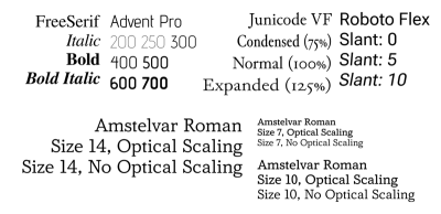
На зображенні вище показано кілька стилів. У верхньому рядку показано вплив ширини, товщини та нахилу, а в нижньому рядку — ефект зміни оптичного розміру для різних розмірів шрифту.
Після розгортання цієї властивості доступні такі параметри:
- Вага
Керує товщиною контурів гліфів.
- Синтезувати напівжирний
Надає змогу синтезувати товсті гліфи, коли в сімействі шрифтів не передбачено підтримки напівжирного шрифту.
- Ширина
Це визначає, скільки місця за горизонталлю займає гліф. Підтримку цієї можливості передбачено не в усіх шрифтах, і для неї не передбачено синтезу.
- Нахилений
Це може бути Звичайний, Курсив або Нахилений. Різниця між курсивом та нахиленим шрифтом полягає у тому, що перший відповідає стилю гліфів, що нагадує стиль каліграфії курсивом, тоді як другий є нахиленою версією звичайних гліфів.
Якщо вибрано Нахилений, кут також можна налаштувати. Цей пункт у першу чергу призначено для використання зі змінними шрифтами, у яких передбачено підтримку всі нахилу.
- Синтезувати нахилений
Надає змогу синтезувати нахилені гліфи там, де немає курсивних або нахилених версій гліфів.
- Оптичний розмір
Визначає, чи буде синхронізовано оптичну вісь розміру у змінних шрифтах із розміром шрифту. Зауважте, що Krita інтерпретує значення осі як значення в пунктах.
Зрештою, є місце для додаткових осей. Вони призначені для використання зі змінними шрифтами, що може забезпечити більше можливостей для налаштовування стилю шрифту.
Типово, ця властивість буде видимою завжди.
Інтервал між літерами
Міжлітерний інтервал контролює відстань між видимими кластерами символів. Існують незначні відмінності у тому, як реалізовано показ інтервалів між літерами у різних програмах, де передбачено підтримку CSS. Реалізація Krita відповідає CSS-Text-3 і тому не застосовується до окремих символів. Міжлітерний інтервал здебільшого призначений для застосування до цілих проміжків символів.
Інтервал між словами
Інтервал між словами контролює розмір символів роздільників слів, зокрема пробілів. Він також забезпечує інтервал для інших символів роздільників слів, зокрема ефіопського пробілу, егейський роздільника слів, угаритський роздільник слів, а також фінікійський роздільник слів.
Висота рядка
Висота рядка контролює висоту рядка, яка використовується для фрагмента тексту. Вона не працює для попередньо розміщеного тексту SVG 1.1, але застосовується до попередньо відформатованого тексту, який використовує жорсткі розриви рядків або текст із перенесенням рядків.
- Звичайний
Якщо увімкнено, Krita намагатиметься визначити висоту рядка, враховуючи кожен символ у рядку та визначаючи його підйом, спуск, а також метрику проміжку між рядками. Максимальне з цих значень використовується як висота рядка.
- Ln
Висота рядка має одну унікальну одиницю вимірювання: Ln, це схоже на «звичайний», за винятком використання розміру шрифту.
Усі інші одиниці вимірювання визначатимуть фіксований зсув. Навіть Одиниці, пов’язані із шрифтом є фіксованими до поточного шрифту та розміру елемента, для якого визначено висоту рядка.
При використанні відносних одиниць вимірювання, для висоти рядка буде використано як орієнтир поточний розмір та гарнітуру шрифтів. Однак, при використанні одиниці вимірювання висоти рядка, для висоти рядка буде використано як орієнтир успадковану висоту рядка.
Розрив рядка
За допомогою параметра розриву рядка можна вибрати строгість для алгоритму розриву рядків. Здебільшого використовують для східноазійських писемностей, потребує працездатних налаштувань Мова. У поточній версії Krita не передбачено підтримки Вільний.
Розривати між словами
Параметр розриву рядка надає змогу точно налаштувати розрив рядка, перемикаючи між режимами: розривати рядок лише на словах чи також на символах. Корисно для корейської та ефіопської мов.

Слоган Krita корейською мовою. Ліворуч використано типову поведінку, яка призводить до перенесення слів після кожного кластера хангиля. Це виглядає досить старомодно. Якщо встановити розрив слів на Зберігати усі, розриви відбуватимуться лише на межах слів.
Перетворення тексту
Перетворення тексту надає змогу перетворювати заданий діапазон символів, наприклад, встановлюючи для них верхній регістр або замінюючи форми половинної ширини на форми повної ширини. Це корисно тим, що застосовується як стилістичний ефект, тобто будь-який написаний текст буде автоматично перетворено.
Перетворення тексту залежить від встановленого значення Мова. Наприклад, турецька i без крапки буде перетворена на i, тоді як звичайна i буде перетворена на i без крапки.
- Регістр
Визначає, чи слід перетворювати весь текст у верхній чи нижній регістр. У випадку позначення З великої літери першу літеру після кожного роздільника слів буде записано верхнім регістром, а решта — нижнім.
- Повна ширина
Термін «повна ширина» стосується кодових позицій «Повна ширина» у блоці Unicode Halfwidth та Fullwidth. Перемикання цього пункту означатиме, що пропорційні або половинні гліфи будуть замінені цими гліфами повної ширини, якщо це можливо. Зазвичай у вертикальному тексті пропорційні гліфи обертаються, але коли це неможливо або не потрібно, використання гліфів повної ширини може виглядати набагато акуратніше. Можливість OpenType повної ширини робить щось подібне, але її підтримку передбачено не в усіх шрифтах.
- Повнорозмірна кана
У японській писемності кана є кілька випадків використання малої та великої кани, які мають дещо різну вимову. Однак, коли текст дуже маленький, може бути корисним замінити малу кану на велику кану, щоб текст було зручніше читати.
Оформлення тексту
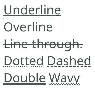
Зразок з демонстрацією усіх можливих варіантів декорування, а також стилів ліній.
За допомогою оформлення тексту можна підкреслювати рядки, надкреслювати рядки та перекреслювати текст.
- Лінія:
Увімкнути або вимкнути надкреслення, підкреслення або перекреслення. Можна одночасно вмикати декілька ліній.
- Колір:
Встановити колір підкреслення. Якщо не встановлено, колір декорування буде збігатися з кольором тексту.
- Стиль:
Стиль ліній. Спільний для всіх увімкнених ліній, їх можна зробити штриховими, пунктирними, хвилястими, і навіть подвійними лініями.
Декорування тексту не успадковується. Натомість воно застосовується до кожного фрагмента тексту, для якого його визначено, причому пізніше визначене декорування тексту буде накладено на раніше визначене декорування тексту.
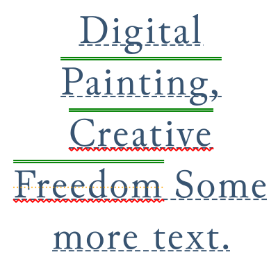
Визначення вкладених декорувань тексту. Хоча щось таке складне можливе лише за допомогою редактора початкового коду SVG, ви можете побачити подібний результат, якщо визначите декорування тексту для абзацу та для діапазону символів.
Розташування підкреслювання
Вказати розташування підкреслювання для оформлення тексту.
- Горизонтально:
Поведінка у режимах горизонтального запису
- Авто
Лінії підкреслення буде розташовано відповідно до метрики шрифту.
- Внизу
Підкреслення буде вирівняно за нижнім елементом літери.
- Вертикально:
Поведінка у режимах вертикального запису.
- Вертикально ліворуч
Підкреслення буде намальовано ліворуч від літер. Надкреслення буде намальовано праворуч.
- Вертикально праворуч
Підкреслення буде намальовано праворуч від літер. Надкреслення буде намальовано ліворуч.
Можливості OpenType
У файлах деяких шрифтів зберігаються даних таких можливостей OpenType, як кернінґ, лігатури або прописні літери, а також може бути використано різноманітні альтернативні гліфи (або навіть контекстні гліфи), щоб складні об’єднані писемності було показано правильно. Останній тип зазвичай завжди увімкнено, а Krita надає можливості керування для першого.
Параметри можливостей OpenType

Деякі можливості, які увімкнено у шрифті «Junicode» у середньовічному стилі. Перші чотири літери — це «мітка можливості OpenType», тобто спосіб, у який ці можливості зберігаються у шрифті. Назву можна отримати зі шрифту, якщо вона визначена; якщо назву не визначено, Krita надасть власну назву.
Це забезпечує точніше керування над можливостями Open Type. Можливості OpenType зазвичай визначаються теґами, і тим, увімкнено їх чи вимкнено. У спадному списку буде показано список можливостей основного шрифту у списку Гарнітура шрифту.
Там, де це можливо, буде показано невеличке зображення попереднього перегляду, але для деяких можливостей створення таких зображень може бути непростою справою.
Введення назви функції або теґу у поле пошуку призведе до показу відфільтрованого список усіх офіційних можливостей, які відповідають критерію пошуку. Таким чином, можливості, яких немає в основному шрифті, можна вибрати та увімкнути (що корисно при успадкуванні).
Див. також Палітра гліфів щодо альтернативного способу вибору альтернативних гліфів у поточному тексті.
Можливості OpenType, хоча й успадковуються, успадковуються одним списком. Якщо ви хочете надати загальні підказки щодо активації певної можливості для всього тексту, скористайтеся властивістю «Гліф»:
Гліфи: лігатури
Увімкнути або вимкнути лігатури і контекстуальні альтернативи у тексті.
- Загальні
Вмикає liga і clig, тобто лігатури загального використання.
- Дискреційні
Вмикає dlig, тобто лігатури декоративнішої природи.
- Історичні
Вмикає hlig, тобто старовинні лігатури.
- Контекстуальні альтернативи
Вмикає можливість calt, яка часто використовується рукописними та декоративними шрифтами для вибору відповідних гліфів залежно від їхнього контексту.
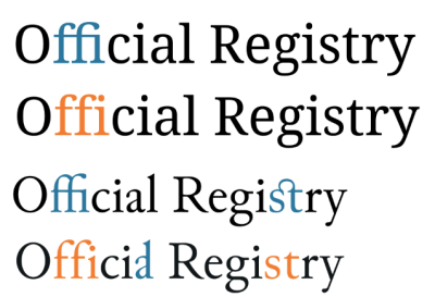
Лігатури у шрифтах «Noto Serif» та «Junicode», де самі лігатури позначені синім кольором, а відсутність лігатур — помаранчевим. «ffi» — поширена лігатура у Noto Serif і контекстуальна у Junicode, «st» — довільна лігатура у Junicode, а «al» — історична лігатура у Junicode.
Гліфи: розташування
Увімкнути верхні і нижні індекси у тексті.
- Верхній
Вмикає гліфи верхніх індексів.
- Нижній
Вмикає гліфи нижніх індексів.

Показ нижніх і верхніх індексів у шрифті «EB Garamond».
Гліфи: числові
Увімкнути пов’язані з числами форми гліфів у тексті.
- Стиль
- Звичайний
Не вмикати явним чином жоден стиль, показ типового шрифту.
- Вирівняні
Надсилає запит щодо форм, які вкладаються у розміри тексту верхнім регістром символів, використовуючи lnum.
- Старий стиль
Надсилає запит щодо форм, які вкладаються у розміри тексту верхнім регістром символів, використовуючи onum.
- Пропорції
- Звичайний
Не вмикати явним чином жоден стиль, показ типового шрифту.
- Пропорційний
Надсилає запит щодо пропорційних форм, використовуючи pnum.
- Табличні
Надсилає запит щодо табличних форм, використовуючи tnum; в усіх цих формах використано однаковий зсув.
- Частка
- Звичайний
Не вмикати явним чином жоден стиль, показ типового шрифту.
- Діагональні
Замінює цифри, розділені скісною рискою, правильною формою діагонального дробу. Якщо шрифт має можливості показу чисельника та знаменника, а числа розділені «дробовою скісною рискою» (U+2044), буде виконано заміну на чисельники перед скісною рискою та знаменники після скісної риски.
- Двоповерхові
Замінює числа, відокремлені похилою рискою, формою спрощеного дробу.
- Порядкові
Замінює літери, які слідують за числами їхніми порядковими формами.
- Перекреслений нуль
Замінює символ нуля на перекреслений посередині символ, що може запобігти плутанині з подібними гліфами, наприклад літерою «O».
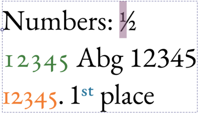
Показ числових можливостей opentype шрифтом «EB Garamond». Вибрано дріб «1/2», далі зеленим кольором показано цифри старого стилю для «12345», помаранчевим — табличні інтервали для цих цифр старого стилю, а порядкові числа — синім.
Гліфи: Прописні
Увімкнути можливості opentype, пов’язані із прописними літерами, зокрема малі прописні.
- Звичайний
Не використовувати особливих прописних літер.
- Малі прописні
Встановлює верхній регістр на прописні літери. Зазвичай використовується для скорочень.
- Уся мала капітель
Переводить усі літери у малі прописні. Типово використовують для звичайного тексту.
- Мініатюрні прописні
Встановлює використання для великих літер мініатюрних прописних. Альтернатива для малих прописних, яка має точно ту саму висоту, що і літера «x».
- Усі мініатюрні прописні
Встановлює для усіх літер тексту режим мініатюрних прописних.
- Заголовочні прописні
Встановлює використання заголовних літер для літер вищого регістру. Заголовні літери часто більші та ефектніші, і найкраще підходять для заголовків, а не для основного тексту.
- Єдиний регістр
Вмикає можливість єдиного регістру.

Пов’язані із прописними літерами можливості opentype у «EB Garamond» для малих і мініатюрних прописних, «Estonia» для заголовкових прописних та у нетиповому шрифті Comic для можливостей єдиного регістру.
Гліфи: східноазійські
Увімкнути форми гліфів, які пов’язано із компонуваннями текстів східноазійськими мовами.
- Стиль
- Звичайний
Використовувати типові для шрифту.
- Традиційний
Використовувати традиційні гліфи.
- Спрощений
Використовувати спрощені гліфи.
- JIS78
Використовувати гліфи, визначені JIS78
- JIS83
Використовувати гліфи, визначені JIS83
- JIS90
Використовувати гліфи, визначені JIS90
- JIS04
Використовувати гліфи, визначені JIS04
- Ширина
- Повна ширина
Використовувати гліфи повної ширини.
- Пропорційний
Використовувати пропорційні гліфи.
- Рубінова
Увімкнути гліфи для рубінових прив’язок.
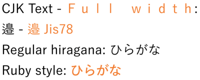
Помаранчевим кольором показано східноазійські варіанти шрифту «Yu Gothic». Повноширинний шрифт зазвичай використовується для вертикального тексту, JIS78 – це японський галузевий стандарт, який визначає певні форми гліфів.
Кернінґ шрифту
Вмикає або вимикає кернінґ шрифту. Кернінґ шрифту надає змогу коригувати інтервал між символами для кожної окремої пари гліфів.
Напрямок
Напрямок визначає спосіб записування тексту — зліва праворуч чи справа ліворуч.
Unicode-Bidi
Unicode bidi надає додаткові можливості керування тим, як слід інтерпретувати зсув напрямку. Зазвичай типовий алгоритм працює добре, але в деяких випадках він не може визначити, чи послідовність має бути зліва праворуч чи справа ліворуч.
- Звичайний
Елементи керування не буде вставлено. Весь текст всередині перевпорядковується відповідно до його неявного напрямку (який визначається з використаних символів).
- Вбудувати
Послідовність є вбудованою за напрямком. Це означає, що двонаправлений алгоритм вважатиме, що явний напрямок відповідає напрямку у властивості direction, але сам текст упорядковується за неявним напрямком.
- Перевизначити
Перевизначення означає, що в заданому розділі буде використано поточний напрямок як явний напрямок, а також напрямок тексту.
- Ізолювати
Буде вставлено елементи керування ізолюванням. «Ізолювання» означає, що двонаправлений алгоритм обробляє послідовність так, ніби це повністю незалежний абзац. Завдяки цьому порядок не впливає на порядок тексту з обох боків.
- Ізолювати-перевизначити
Буде застосовано як ізолювання, так і перевизначення. Це означає, що текст упорядковується явно за напрямком, але це впорядкування ні на що не впливатиме.
- Звичайний текст
Властивість direction не буде використано, а двонаправлений алгоритм натомість вгадуватиме напрямок.
Unicode bidi — це одна з властивостей, яка не успадковується. Причина цього полягає в тому, що вона працює шляхом вставлення двонаправлених алгоритмічних елементів керування в кінці заданого фрагмента.
Базова лінія
У деяких традиційних писемностях точки вирівнювання тексту різних розмірів відрізняються від точки вирівнювання тексту латиницею. З метою забезпечення сумісності шрифти цих писемностей зазвичай створюються таким чином, щоб гліфи правильно вирівнювалися з текстом латиницею. Для досягнення більш традиційного вирівнювання можна використовувати домінантне та базове вирівнювання.
Завдяки цій можливості програма спробує використати дані, закодовані в таблиці базових ліній шрифтів. Якщо таких даних немає, базові показники будуть згенеровані автоматично.
У домінантної базової лінії і у базової лінії вирівнювання є спільними такі параметри:
- Абеткове
Використовує базову лінію, використану у більшості писемностей. Типовий варіант.
- Ідеографічне
Використовує ідеографічний квадрат дизайну і вибирає нижній кінець у горизонтальному режимі, а лівий — у вертикальному.
- Центральне
Використовує ідеографічний квадратний дизайн і вибирає вертикальний центр у горизонтальному режимі, а горизонтальний центр у вертикальному режимі.
- Підвішене
Вирівнювання до верхнього штриха, яке використовується у північно-брахмічних писемностях.
- Середня
Вирівнювання до центра між абетковою базовою лінією і висотою x при горизонтальному компонуванні, у вертикальному — це центральна базова лінія.
- Математичне
Вирівнювання до математичної базової лінії, яке використовують для вирівнювання символів операторів.
- Верх тексту
Вирівнювання за акцентом.
- Низ тексту
Вирівняти вниз.
Основна базова лінія
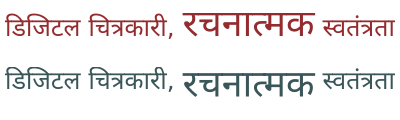
У північнобрахмічних писемностях, зокрема деванагарі, літери різного розміру вирівнюються по лінії літери. У наведених нижче прикладах верхній зразок показує типову поведінку, тоді як нижній зразок використовує повисання поверх усього тексту, що забезпечує традиційне вирівнювання лінії літери.
Домінантна базова лінія визначає, як вирівнюються фрагменти тексту різних розмірів, вона також є типовим значенням для Базова лінія вирівнювання. Вона має одне унікальне значення, Авто, яке перетворюється на Абеткове по горизонталі та Центральне по вертикалі Режим письма.
Базова лінія вирівнювання
Базова лінія вирівнювання надає змогу контролювати вирівнювання цього фрагмента тексту відносно батьківського тексту. Вона має одну унікальну властивість Базова лінія, що означає, що її значення береться з властивості Основна базова лінія.
Базова лінія вирівнювання не успадковується. Натомість, дочірній текст намагатиметься вирівнятися за заданою базовою лінією батьківського тексту.
Зсув базової лінії
Зсув базової лінії надає змогу пересувати текст від базової лінії на попередньо визначені значення верхнього і нижнього індексу або на фіксовану величину.
- Довжина
Зсунути текст на вказану відстань.
- Верхній
Зсуває текст, щоб він вирівнювався за успадкованим зміщенням верхнього індексу шрифту. Зазначене значення буде отримано зі шрифту.
- Нижній
Зсуває текст, щоб він вирівнювався за успадкованим зміщенням нижнього індексу. Це значення буде отримано зі шрифту.
Зсув базової лінії не успадковується. Натомість, зсуви будуть додаватися один до одного, що надасть змогу:
Вкладені надвизначення зсуву базової лінії. Реалізувати їх можна лише шляхом редагування тексту за допомогою редактора початкового коду SVG.
Пробіл
Правило пробілів CSS керує тим, як буде оброблено кратні пробіли, і тим, чи можна переносити рядки тексту.
Типово, цю властивість приховано.
Мова
Мова цієї текстової фігури. Мова впливає на низку властивостей, таких як форма гліфа, великі і малі літери та розрив рядка.
У текстове поле можна ввести будь-який дійсний код BCP 47. Натискання Enter призведе до того, що Krita обробить код. Введення назви мови або коду в текстове поле призведе до показу контекстного вікна з фільтрованими результатами пошуку.
Натискання стрілки вниз призведе до показу усіх раніше використаних локалей цього сеансу, а також збережених локалей. Встановивши прапорець перед пунктом локалі, ви можете вказати, що локальн потрібно зберегти для майбутніх сеансів.
Також передбачено спадний список Писемність. Зазвичай можна вгадати шрифт за мовою та країною. Однак у деяких місцях для однієї й тієї ж мови можуть використовуватися різні шрифти, а іноді основний шрифт, що використовується, змінювався протягом багатьох років. У таких випадках за допомогою спадного списку шрифтів можна налаштувати шрифт.
Заповнити
У поточній версії залиття неможливо встановити за допомогою бічної панелі властивостей тексту. Вам доведеться скористатися інструментом Інструмент «Позначення форми», щоб встановити його на абзаці, або змінити колір переднього плану за допомогою будь-якого із засобів вибору кольорів.
Штрих
У поточній версії штрих не можна налаштувати за допомогою бічної панелі властивостей тексту. Щоб налаштувати його, слід скористатися інструментом Інструмент «Позначення форми» або інструментом Редактор коду SVG у тексті, щоб встановити параметри штриха вручну.
Властивості абзацу
Властивості абзацу — це властивості, які можна застосовувати лише до всієї текстової форми.
Режим письма
Режим запису визначає, як розташовано текст — горизонтально чи вертикально, а в останньому випадку – буде вписано блок справа ліворуч чи зліва праворуч.
Див. також Напрямок.
Примітка
Пов’язана функція — «Орієнтація тексту», яка надає змогу обертати горизонтальний текст, якщо його набрано вертикально. У поточній версії Krita не передбачено підтримки цієї можливості, але її планують додати у майбутньому.
Відступ
Абзацний відступ надає змогу визначити відступ на початку абзацу. Працює, лише якщо увімкнено перенесення рядків. Основним засобом керування є повзунок, що визначає розмір відступу. Передбачено також два додаткових засоби керування:
- Висячий відступ
Відступ не буде застосовано до початкового рядка, лише до наступних рядків.
- Відступ після жорсткого розриву рядка
Кожен рядок після жорсткого розриву буде вважатися початковим рядком. Часто використовується для поезії.
Вирівнювання тексту
Вирівнювання тексту встановлює вирівнювання для заданого блоку символів.
Основний елемент керування містить три кнопки, що відповідають початку, середині і кінцю. Ці властивості залежать від напрямку, тобто для тексту справа ліворуч початок буде таким самим, як і для вирівнювання за правим краєм. Остання кнопка — це перемикач вирівнювання.
Відкриття додаткових параметрів призведе до показу такого:
- Вирівнювання тексту
Надає змогу встановити вирівнювання тексту, якщо текст вписано у форму.
- Вирівнювання останнього:
Якщо для параметра Вирівнювання тексту встановлено значення За шириною, цей параметр визначає спосіб обробки останнього рядка.
- Прив’язка тексту
Прив’язка тексту контролює спосіб прив’язки тексту, а не вирівнювання. Це дещо нагадує Вирівнювання тексту тим, що дозволяє тексту переміщатися ліворуч або праворуч, але де Вирівнювання тексту — це вирівнювання в межах порожнього простору, Прив’язка тексту обчислюється відносно початкової точки тексту. Ви можете використовувати Прив’язку тексту для встановлення прив’язки для кожного рядка, якщо текст не переноситься автоматично.
Це означає, що немає вирівнювання для тексту, який не вписано у форму.
Типово, ця властивість буде видимою завжди, навіть якщо її не встановлено.
Висяча пунктуація
Висяча пунктуація дозволяє використовувати висячі початкові та завершальні розділові знаки, а також коми. Ця реалізація використовує лише висячу пунктуацію у східноазійському стилі.
- Провисання першого
Початкові розділові знаки, зокрема початкові лапки або початкові дужки на початку абзацу, будуть повисати.
- Кінець рядка
Цей перемикач надає змогу або примусово встановлює коми та крапки в кінці будь-якого рядка.
- Провисання останнього
Кінцеві розділові знаки, зокрема кінцеві лапки або кінцеві дужки у кінці абзацу, будуть повисати.
Розмір табуляції
Розмір табуляції надає змогу визначити ширину символів табуляції. Символи табуляції (вставляються за допомогою Tab) – це тип пробілу, який прив’язується до найближчого кратного еталонного розміру. Його основним використанням є вирівнювання стовпців інформації без використання таблиць.
Розмір табуляції має одну унікальну одиницю вимірювання: Sp. Це означає, що розмір табуляції використовує як одиницю вимірювання поточне переміщення символу пробілу.
Обробка тексту
Обробка тексту керує гінтінґом та стилем обробки для текстової форми.
- Оптимізувати швидкість
Використано стиль гінтінґу для монохромних растрових зображень, а згладжування вимкнено. Krita також подбає про прив’язку гліфів до найближчого пікселя. Це надає змогу шрифтам піксельної графіки виглядати добре, а також є найшвидшим варіантом для обробки.
- Оптимізувати чіткість
У вертикальних режимах запису увімкнено повний гінтінґ, тоді як у горизонтальних — лише вертикальний. Krita додатково прив’язуватиме у цих напрямках відповідні метрики.
- Геометрична точність
Без жодного гінтінґу.
- Авто
Те саме, що і Геометрична точність.
Слоган Krita різними шрифтами, набраний піксельним шрифтом «Unifont». Коли позначено пункт Оптимізувати швидкість, Krita знатиме, що потрібно не лише вимкнути згладжування, але й спробувати прив’язати гліфи так, щоб Зсув базової лінії, Інтервал між літерами та Висота рядка виглядали добре.
Область тексту
Ці властивості пов’язані із Текст у формі.
- Фаска форми
Це відступ, який розраховується для вписування всередину форм.
- Поле форми
Це поле навколо форм «Відняти», яке додається перед тим, як їх буде вилучено з форм «Всередині».
Набори стилів
Набори стилів дозволяють зберігати комбінації властивостей для подальшого використання. Див. відповідну сторінку, щоб дізнатися більше про редагування наборів стилів.
Клацання  на записі вибере його для редагування, тоді як подвійне клацання застосує активні властивості до тексту.
За допомогою кнопок внизу можна вносити зміни до наборів стилів:
- Імпортування наборів стилів
Імпортувати SVG з визначенням набору стилів.
- Вилучення наборів стилів
Вимкнути заданий набір стилів.
- Створити набір стилів
Створює набір стилів з поточними параметрами.
- Клонувати набір
Клонує поточні набори і показує вікно редагування.
- Редагувати набір параметрів
Редагування поточних позначених наборів.