
Prova Suave
Nota
Soft Proofing works only with Canvas Graphics Acceleration enabled.
Quando criamos uma imagem no Krita e a imprimimos com uma dada impressora, a imagem tende a ficar diferente. As cores ficam mais escuras, ou menos escuras que o esperado, talvez com vermelhos mais agressivos ou com um contraste perdido. Para os documentos simples, não é um problema muito grave, mas nas impressões profissionais, isto pode ser muito desagradável, porque poderá modificar de forma drástica a aparência e comportamento de uma dada imagem.
A razão pela qual isto acontece é porque a impressora usa um modelo de cores diferente (CMYK) e tem normalmente acesso a uma gama de cores mais reduzida (chamada de gamute).
Uma pessoa mais inocente iria sugerir a seguinte solução: faça o seu trabalho com o modelo de cores CMYK! Mas existem três problemas com isso:
A pintura num espaço CMYK não lhe garante que as cores sejam iguais na sua impressora. Para cada combinação de Tinta, Papel e Impressora, o gamute resultante que poderá usar será diferente. O que significa que cada um destes poderá ter um perfil diferente associado.
Para além disso, mesmo que tenha o perfil e esteja a trabalhar no espaço de cores exacto que a sua impressora consegue gerar, o espaço de cores CMYK é muito irregular, o que significa que as contas de cores não são tão exactas como nos outros espaços. Os modos de mistura também são diferentes no CMYK.
Finalmente, se trabalhar nesse espaço de cores CMYK específico, significa que a imagem fica fixa a esse espaço. Se estiver a preparar o seu trabalho para um perfil CMYK diferente, devido às diferenças no papel, impressora ou tinta, poderá obter um gamute mais amplo e com cores mais claras e que poderia tirar partido.
Como tal, idealmente, iria criar a imagem em RGB e use todas as suas ferramentas de RGB favoritas, deixando que o computador faça uma conversão para um dado espaço CMYK na hora, apenas para fins de antevisão. Isto é possível e é o que chamamos de “”Prova Suave””.
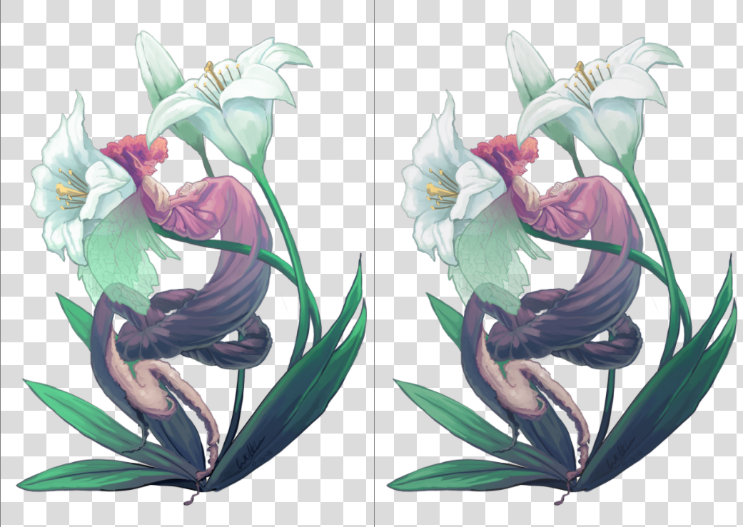
Do lado esquerdo, encontra-se o original, enquanto à direita aparece uma janela onde está activada a prova suave. A diferença é subtil devido à falta de cores realmente claras, mas a versão com prova suave é ligeiramente menos azul na zona dos brancos das flores e ligeiramente menos saturada nos verdes das folhas.
You can toggle soft proofing on any image using the Ctrl + Y shortcut. Unlike other programs, this is per-view, so that you can look at your image non-proofed and proofed, side by side. The proofing configuration can also be set per image, and saved into the .kra file. Just enable Store Softproofing configuration in the image in the proofing options in . If the checkbox is unchecked, then Krita will use global settings from (for more details see here).
Nota
When Store Softproofing configuration in the image is enabled, Krita embeds the entire proofing ICC profile into .kra file. This ICC profile can be big for some output devices, especially CMYK ones.
Aí poderá definir as seguintes opções:
- Model, Profile
Destes, só o perfil é realmente importante. Este servirá como o perfil para o qual está a fazer a prova. Num dia-a-dia de impressão profissional, este perfil deverá ser definido pela casa de impressão.
- Rendering Intent
Set the intent used to convert the image to the proofed output device profile. It uses the same options as the intents mentioned in the color managed workflow. This intent should coincide with the conversion intent used by your print house before printing. If your print house does not do any conversion internally, then you should perform the conversion yourself before sending the file to them.
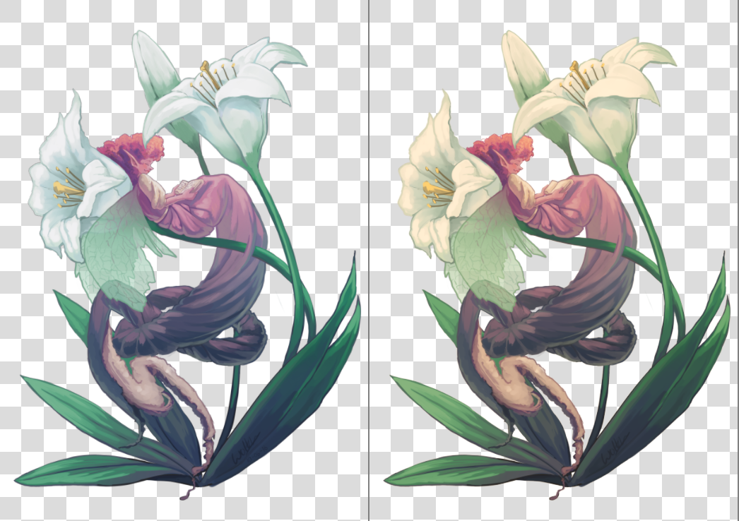
Left: Soft proofed image with Absolute Intent Chromatic Adaptation enabled. Right: Soft proofed image with Absolute Intent Chromatic Adaptation disabled.
- Black Point Compensation
Enables the black point compensation when converting image to the proofed output device profile. Turning this off will clip the shadow values to the minimum that either the screen and the proofing profile can handle, while turning this on will scale the black to the screen-range, showing you the full range of grays in the image. Like Conversion Rendering Intent, this value should coincide with the value used by the printing house when performing conversion to the device.
- Display Mode
Defines the way how the proofed (and possibly clipped) space will be shown on the screen, i.e. what rendering intent and flags will be used to convert colors from the proofed output device profile into the screen profile.
Use global display settings instructs Krita to render the proofed space using the global settings, set in .
Simulate paper white and black is used to preview the white point (or «color tint») of the paper on the current display. In other words, if the paper is matte, or metallic, or has some sort of sepia effect, this will be visible on your screen. Please take it into account that the viewing conditions” white point will still be adjusted to the one of the screen. It means that you cannot visually compare the physical print and the image on the screen, unless all three white points coincide: the one in the paper profile, the one the display is configured to and the white point of the light bulb that illuminates your physical print.
Custom allows you to configure the final conversion step manually. You may want to configure the pipeline depending on your goal:
- Preview color gamut (or «color variety») of the image
Rendering Intent –> Relative Colorimetric
Black Point Compensation –> Enabled
Nota
If you want to use Out of Gamut Warnings, it is best to use them in this mode
- Preview contrast degradations caused by the color of the paper
Rendering Intent –> Absolute Colorimetric
Absolute Intent Chromatic Adaptation –> Enabled
Aviso
If you are using Wayland compositor, Absolute Colorimetric intent may be broken (even in XWayland mode). More than that, it may be broken differently in different versions.
In KWin 6.4.x and earlier, Absolute Colorimetric will behave as if Absolute Intent Chromatic Adaptation is always disabled. It will cause severe color tint if white points (sigChromaticAdaptationTag) of the printer and display profiles do not coincide.
In KWin 6.5.x and later, Absolute Colorimetric will behave as if Absolute Intent Chromatic Adaptation is always enabled. Given that you keep the checkbox set, the feature will work correctly and will let you preview contrast degradations, but you will not be able to get advanced effects of disabling color adaptation to the display space.
This is a problem of the Wayland protocol specification, the fix is discussed here.
- Aviso do Gamute
Set the color of Out of Gamut Warnings.
You can set the defaults that Krita uses in .
Para configurar isto de forma adequada, recomenda-se que crie uma imagem de testes para imprimir (e que seja impressa numa impressora devidamente configurada) e faça a comparação, fazendo depois a aproximação nas opções de prova, para que a imagem fique igual em comparação com a cópia na vida real que criou.
Aviso de Fora-do-Gamute
O aviso de fora-do-gamute, ou alarme de gamute, é uma opção extra sobre a Prova Suave: Permite-lhe ver quais as cores que estão a ser recortadas, substituindo a cor resultante pela cor do alarme definida.
Isto pode ser útil para definir onde se estão a perder certos contrastes e para lhe permitir mudar esse valor lentamente para uma imagem com menos contraste.
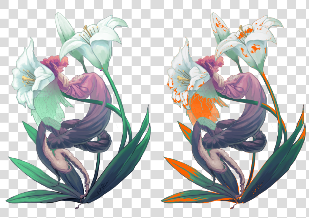
Esquerda: Janela com a imagem original, Direita: Janela com a prova suave e os avisos de gamute ligados. O Krita irá gravar a cor de aviso do gamute em conjunto com as opções de prova no ficheiro KRA; por isso, escolha uma cor que ache que se destaca na sua imagem actual.
Poderá activar os Avisos de Gamute com o Ctrl + Shift + Y, mas precisa de ter a prova suave activada para funcionarem em pleno.
Nota
A Prova Suave não funciona correctamente nos espaços com valores em vírgula flutuante, e qualquer tentativa de a forçar irá provocar alarmes de gamute incorrectos. Como tal, está desactivada.
Aviso
Os Avisos de Gamutes algumas vezes dão avisos estranhos para os perfis lineares nas zonas sombreadas. Isto é um erro no LittleCMS, para o qual poderá consultar mais alguma informação aqui.