
Prova colore
Nota
La prova colore funziona solo con la Accelerazione grafica della tela abilitata.
Quando creiamo un’immagine in Krita e la stampiamo con una stampante, l’immagine tende a risultare diversa. I colori sono più scuri o meno scuri di come ce li aspettiamo, magari i rossi sono più aggressivi o si è perso il contrasto. Per semplici documenti non è un grosso problema, ma per la stampa professionale lo è, dato che questo può cambiare radicalmente l’aspetto dell’immagine.
La ragione di questo fenomeno risiede semplicemente nel fatto che la stampante utilizza un modello dei colori diverso (CMYK) e, spesso, ha accesso a una gamma inferiore di colori (chiamata gamut).
Una persona ingenua suggerirebbe la soluzione seguente: create il vostro lavoro all’interno del modello dei colori CMYK! Ma ci sono tre problemi a esso collegati:
Disegnare in uno spazio CMYK non garantisce che i colori siano gli stessi ottenuti con la tua stampante. Per ciascuna combinazione di inchiostro, carta e stampa, la gamma di colori risultante utilizzabile è differente, e questo significa che ognuna di queste combinazioni potrebbe avere un profilo diverso a esse associato.
Inoltre, anche se possiedi il profilo e lavori nell’esatto spazio dei colori che la tua stampante può stampare, lo spazio dei colori CMYK è molto irregolare, e questo significa che la metrica dei colori va meno bene rispetto agli altri spazi. In CMYK sono diversi anche i metodi di fusione.
Infine, lavorare in uno spazio CMYK specifico significa che l’immagine è bloccata in quello spazio. Se stai preparando il tuo lavoro per un profilo CMYK diverso, a causa di differenze nella carta, nella stampante o nell’inchiostro, vorrai avere una gamma maggiore con colori più brillanti, con cui ottenere una resa migliore.
Dunque, idealmente, dovresti creare l’immagine in RGB, utilizzando i tuoi strumenti RGB preferiti, e lasciar fare al computer la conversione al volo a uno spazio CMYK determinato, giusto come anteprima. Ciò è possibile e si chiama «Prova colore».
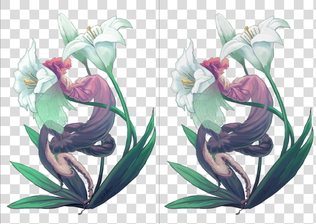
A sinistra l’originale, a destra una vista in cui è attivata la prova colore. La differenza è sottile, a causa della mancanza di colori realmente brillanti, ma la versione di prova è leggermente meno blu nei bianchi dei fiori e leggermente meno saturata nei verdi delle foglie.
Puoi attivare la prova colore su qualsiasi immagine utilizzando la scorciatoia Ctrl + Y. A differenza di altri programmi, essa è «per vista», ossia puoi osservare la tua immagine con prova e senza prova, fianco a fianco. La configurazione della prova colore può essere impostata anche per immagine e salvata nel file .kra. Basta attivare Memorizza la configurazione di prova colore nell’immagine nelle opzioni di prova in . Se la casella di controllo è disattivata, Krita userà invece le impostazioni globali da (per ulteriori dettagli vedi qui).
Nota
Quando l’opzione Memorizza la configurazione di prova colore nell’immagine è attivata, Krita incorpora l’intero profilo ICC della prova colore nel file .kra. Questo profilo ICC può risultare grande per certi dispositivi di output, specialmente per quelli CMYK.
Lì puoi impostare le opzioni seguenti:
- Modello, Profilo
Di questi tre, solo il profilo è davvero importante. Esso funziona da profilo con cui eseguire la prova. In un ambito per la stampa professionale, questo profilo deve essere determinato dall’azienda tipografica.
- Obbiettivo di resa
Imposta l’obbiettivo utilizzato per convertire l’immagine al profilo del dispositivo di output con prova. Usa le stesse opzioni degli obbiettivi citati nel flusso di lavoro di gestione dei colori. Quest’obbiettivo deve coincidere con l’obbiettivo di conversione utilizzato dalla tua tipografia prima della stampa. Se la tua tipografia non esegue alcuna conversione interna, allora devi fare tu la conversione prima di inviare loro i file.
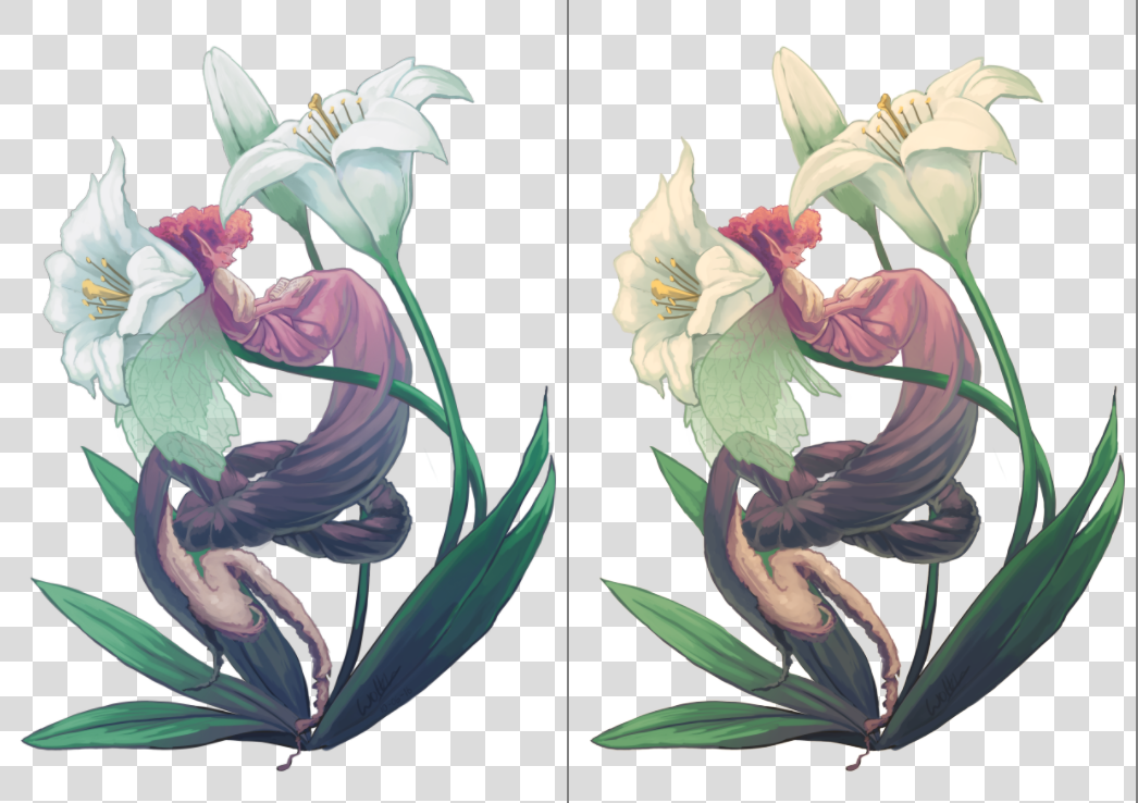
Sinistra: immagine con prova colore con Adattamento cromatico per l’obbiettivo assoluto attivato. Destra: immagine con prova colore con Adattamento cromatico per l’obbiettivo assoluto disattivato.
- Compensazione del punto nero
Abilita la compensazione del punto nero quando si converte l’immagine al profilo del dispositivo di output con prova colore. Con la sua disattivazione ritaglierai i valori di ombra al minimo valore che lo schermo e il profilo della prova possono gestire, mentre con la sua attivazione il nero verrà scalato ai valori possibili dello schermo, mostrandoti l’intero intervallo di grigi nell’immagine. Come l`:guilabel:obbiettivo di resa della conversione, questo valore deve coincidere col valore utilizzato dalla tipografia quando esegue la conversione verso il dispositivo.
- Modalità di visualizzazione
Definisce il modo in cui lo spazio con prova (e possibilmente ritagliato) verrà mostrato sullo schermo, ossia quale l’obbiettivo di resa e quali flag verranno utlilizzati per convertire i colori dal profilo del dispositivo di output con prova all’interno del profilo dello schermo.
Usa le impostazioni globali di visualizzazione istruisce Krita a rendere lo spazio con prova tramite le impostazioni globali impostate in .
Simula bianco e nero cartaceo viene utilizzato per eseguire l’anteprima del punto di bianco (o «tinta colore») della carta sullo schermo attivo. In altre parole, se la carta è opaca, o metallica, o possiede qualche effetto seppia, esso sarà visibile sullo schermo. Tieni presente che il punto di bianco delle condizioni di visualizzazione saranno ancora regolate a quello dello schermo. Questo significa che non puoi confrontare visivamente la stampa fisica con l’immagine sullo schermo, a meno che i tre punti di bianco non coincidano: quello del profilo della carta, quello con cui è configurato lo schermo e il punto di bianco della lampadina che illumina la tua stampa fisica.
Personalizzato ti permette di configurare manualmente il passaggio della conversione finale. Potresti voler configurare la pipeline in base ai tuoi scopi:
- Anteprima gamut dei colori (o «varietà dei colori«) dell’immagine
Obbiettivi di resa –> Colorimetrico relativo
Compensazione del punto nero –> Abilitata
Nota
Se vuoi utilizzare gli Avvisi fuori dal gamut è meglio utilizzarli in questa modalità
- Anteprima del degrado del contrasto causata dal colore della carta
Obbiettivi di resa –> Colorimetrico assoluto
Adattamento cromatico per l’obbiettivo assoluto –> Abilitato
Avvertimento
Se stai utilizzando il compositore Wayland, l’obbiettivo Colorimetrico assoluto potrebbe essere danneggiato (anche in modalità XWayland). Oltre quello, potrebbe essere danneggiato diversamente nelle varie versioni.
In KWin 6.4.x e versioni precedenti, Colorimetrico assoluto si comporterà come se l’opzione Adattamento cromatico per l’obbiettivo assoluto sia sempre disabilitata. Causerà una forte colorazione se i punti di bianco (sigChromaticAdaptationTag) della stampante e dei profili dello schermo non coincidono.
In KWin 6.5.x e versioni successive, Colorimetrico assoluto si comporterà come se l’opzione Adattamento cromatico per l’obbiettivo assoluto sia sempre abilitata. Dato che mantieni la casella di controllo impostata, la funzionalità funzionerà correttamente e ti permetterà di eseguire l’anteprima delle degradazioni dei contrasti, ma non potrai ottenere effetti avanzati disattivando l’adattamento dei colori nello spazio dello schermo.
Questo è un problema delle specifiche del protocollo Wayland, la correzione viene discussa qui.
- Avviso gamut
Imposta il colore degli Avvisi fuori dal gamut.
Puoi impostare i valori predefiniti che Krita utilizza in .
Per configurare correttamente questa opzione, si raccomanda di creare un’immagine di prova da stampare (e che sia stampata da una stampante correttamente configurata) e da confrontare, e quindi approssimare nelle opzioni di prova come l’immagine appare confrontata con la copia reale che hai creato.
Avviso «Fuori dal gamut»
L’avviso «fuori dal gamut», o allarme gamut, è un’opzione aggiuntiva sopra la prova colore: ti consente di osservare quali colori vengono tagliati, sostituendo il colore risultante con quello impostato nell’allarme.
Questo può essere utile per determinare dove vengono persi certi contrasti e per permetterti di cambiare gradualmente l’immagine con una con meno contrasto.
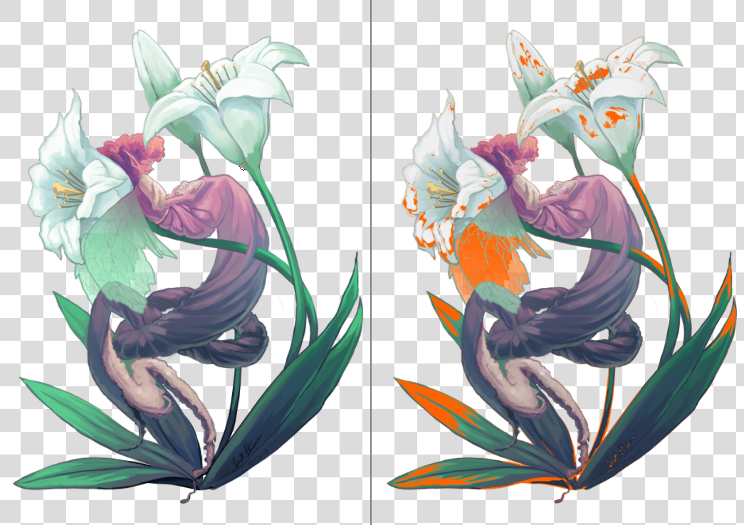
Sinistra: vista con immagine originale. Destra: vista con prova colore e avvisi gamut attivati. Krita salverà il colore di avviso gamut assieme alle opzioni di prova colore nel file KRA, dunque scegli un colore che pensi risalti nell’immagine.
Puoi attivare gli avvisi gamut mediante la scorciatoia Ctrl + Maiusc + Y, ma affinché funzionino in modo completo la prova colore deve essere attivata.
Nota
La Prova colore non funziona correttamente negli spazi in virgola mobile, e il tentativo di forzarla causerebbe allarmi gamut sbagliati, pertanto essa è disabilitata.
Avvertimento
Gli avvisi gamut a volte restituiscono strani avvisi per i profili lineari nelle ombre. È un errore in LittleCMS, per maggiori informazioni vedi qui.