
Korekta na ekranie
Informacja
Soft Proofing works only with Canvas Graphics Acceleration enabled.
Gdy tworzymy obraz w Kricie i drukujemy go na drukarce, to wygląda on inaczej. Barwy są ciemniejsze lub mniej ciemne niż oczekiwano, może czerwony jest bardziej agresywny, może kontrast został utracony. Dla prostych dokumentów, to nie jest duży problem, lecz w profesjonalnych wydrukach, może to być bardzo smutne, gdyż może znacznie zmienić wygląd obrazu.
Powodem, dla którego się to dzieje jest to, ze drukarki używają innego modelu barw (CMYK) i często ma dostęp do niższego zakresu barw (zwanym gamut).
Naiwna osoba doradziłaby następujące postępowanie: pracuj w modelu barw CMYK! Jednakże powoduje to pojawienie się tych trzech kłopotów:
Malowanie w CMYK nie zapewnia, że barwy będą takie same na twojej drukarce. Do każdej kombinacji tuszu, papieru i drukarki, wynikowy gamut barw, którego używasz jest różny. Oznacza to, że każdy z tych parametrów może potrzebować przypisania innego profilu.
Dodatkowo, nawet gdy masz profil i pracujesz w przestrzeni barw dokładnie takiej, jak na twojej drukarce, to przestrzeń barw CMYK jest bardzo nierównomierna, co oznacza, że matematyka barw nie jest taka ładna jak w innych przestrzeniach. Tryby mieszania także są inne niż w CMYK.
Na koniec, to praca w danej przestrzeni CMYK oznacza, że obraz ten jest związany z tą przestrzenią. Jeśli przygotowujesz swoją pracę do innego profilu CMYK, ze względu na papier, drukarkę lub inny tusz, możesz mieć większy gamut z większą liczbą jasnych barw, które chciałbyś wykorzystać.
Tak więc idealnie, wykonałbyś obraz w RGB i użył wszystkich swoich ulubionych narzędzi RGB i pozwolił komputerowi dokonać przekształceń do danej przestrzeni CMYK w locie, tylko do podglądu. Jest to możliwe i nazywa się „Korekta na ekranie”.
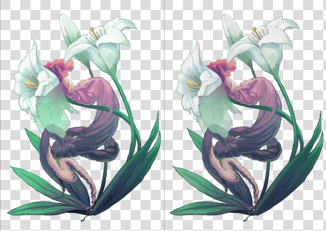
Po lewej, pierwotny obraz, po prawej, widok na którym włączona jest korekta na ekranie. Różnica jest nieznaczna ze względu na brak naprawdę jasnych barw, lecz wersja z włączoną korektą jest mniej niebieska w bieli kwiatów i lekko mniej nasycona w zieleni liści.
You can toggle soft proofing on any image using the Ctrl + Y shortcut. Unlike other programs, this is per-view, so that you can look at your image non-proofed and proofed, side by side. The proofing configuration can also be set per image, and saved into the .kra file. Just enable Store Softproofing configuration in the image in the proofing options in . If the checkbox is unchecked, then Krita will use global settings from (for more details see here).
Informacja
When Store Softproofing configuration in the image is enabled, Krita embeds the entire proofing ICC profile into .kra file. This ICC profile can be big for some output devices, especially CMYK ones.
Tutaj może ustawić co następuje:
- Model, Profile
Z tych, tylko profil jest naprawdę ważny. Będzie on służył jako profil, względem którego przeprowadzasz korektę. W zawodowym druku, profil ten powinien zostać nadany przez drukarnie.
- Rendering Intent
Set the intent used to convert the image to the proofed output device profile. It uses the same options as the intents mentioned in the color managed workflow. This intent should coincide with the conversion intent used by your print house before printing. If your print house does not do any conversion internally, then you should perform the conversion yourself before sending the file to them.
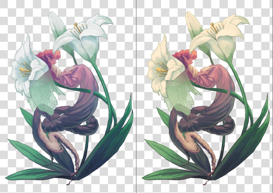
Left: Soft proofed image with Absolute Intent Chromatic Adaptation enabled. Right: Soft proofed image with Absolute Intent Chromatic Adaptation disabled.
- Black Point Compensation
Enables the black point compensation when converting image to the proofed output device profile. Turning this off will clip the shadow values to the minimum that either the screen and the proofing profile can handle, while turning this on will scale the black to the screen-range, showing you the full range of grays in the image. Like Conversion Rendering Intent, this value should coincide with the value used by the printing house when performing conversion to the device.
- Display Mode
Defines the way how the proofed (and possibly clipped) space will be shown on the screen, i.e. what rendering intent and flags will be used to convert colors from the proofed output device profile into the screen profile.
Use global display settings instructs Krita to render the proofed space using the global settings, set in .
Simulate paper white and black is used to preview the white point (or „color tint”) of the paper on the current display. In other words, if the paper is matte, or metallic, or has some sort of sepia effect, this will be visible on your screen. Please take it into account that the viewing conditions» white point will still be adjusted to the one of the screen. It means that you cannot visually compare the physical print and the image on the screen, unless all three white points coincide: the one in the paper profile, the one the display is configured to and the white point of the light bulb that illuminates your physical print.
Custom allows you to configure the final conversion step manually. You may want to configure the pipeline depending on your goal:
- Preview color gamut (or „color variety”) of the image
Rendering Intent –> Relative Colorimetric
Black Point Compensation –> Enabled
Informacja
If you want to use Out of Gamut Warnings, it is best to use them in this mode
- Preview contrast degradations caused by the color of the paper
Rendering Intent –> Absolute Colorimetric
Absolute Intent Chromatic Adaptation –> Enabled
Ostrzeżenie
If you are using Wayland compositor, Absolute Colorimetric intent may be broken (even in XWayland mode). More than that, it may be broken differently in different versions.
In KWin 6.4.x and earlier, Absolute Colorimetric will behave as if Absolute Intent Chromatic Adaptation is always disabled. It will cause severe color tint if white points (sigChromaticAdaptationTag) of the printer and display profiles do not coincide.
In KWin 6.5.x and later, Absolute Colorimetric will behave as if Absolute Intent Chromatic Adaptation is always enabled. Given that you keep the checkbox set, the feature will work correctly and will let you preview contrast degradations, but you will not be able to get advanced effects of disabling color adaptation to the display space.
This is a problem of the Wayland protocol specification, the fix is discussed here.
- Ostrzeżenie gamut
Set the color of Out of Gamut Warnings.
You can set the defaults that Krita uses in .
Aby ustawić to właściwie, zaleca się wydruk obrazu próbnego (na właściwie ustawionej drukarce) i porównanie tego wydruku, a następnie spróbowanie przybliżyć w ustawieniach korekty, to jak obraz wygląda na ekranie z tym jak wygląda na wydruku.
Ostrzeżenie spoza gamut
Ostrzeżenie spoza gamut, lub alarm gamu, jest dodatkowym ustawieniem nad korektą na ekranie: umożliwia, które barwy są przycinane, poprzez zastąpienie barwy wynikowej z barwą ustawionego alarmu.
Jest to użyteczne przy określaniu, w którym miejscu pewne kontrasty są tracone i umożliwia ci ich powolną zmianę do mniej kontrastowego obrazu.
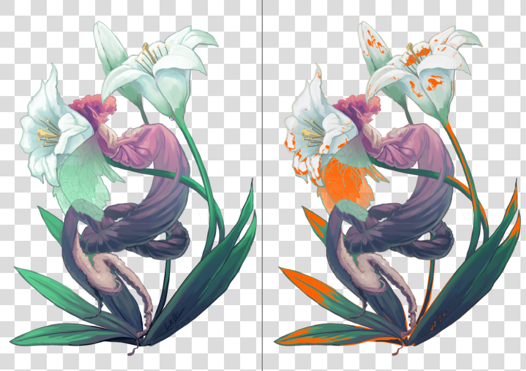
Po lewej: widok pierwotnego obrazu, Po prawej: widok z włączoną korektą na ekranie i ostrzeżeniami gamut. Krita zapisze barwę ostrzeżenia gamut warz z ustawieniami korekty do pliku KRA, więc wybierz barwę, która myślisz, że będzie odstawać na twoim bieżącym obrazie.
Ostrzeżenia gamut możesz włączyć przy użyciu skrótu Ctrl + Shift + Y, lecz wymaga to włączenia korekty na ekranie, aby mogło zadziałać w pełni.
Informacja
Korekta na ekranie nie działa właściwie w przestrzeniach o l. zmiennoprzecinkowych, a wymuszenie tego spowoduje nieprawidłowe alarmy gamu. Tak więc jest to wyłączone.
Ostrzeżenie
Ostrzeżenia gamut czasami dziwnie pojawiają się dla profili liniowych w cieniach. Jest to błąd w LittleCMS, zajrzyj tutaj po szczegóły.