
Special interface controls
Maths Input
Also known as Numerical Input boxes. You can make Krita do simple maths for you in the places where we have number input. Just select the number in a spinbox, or right-click a slider to activate number input. It doesn’t do unit conversion yet, but this is planned.
Possible Functions
- Addition (Operator: + )
Just adds the numbers. Usage:
50+100Output:150- Subtraction (Operator: - )
Just subtracts the last number from the first. Usage:
50-100Output:50- Multiplication (Operator: * )
Just multiplies the numbers. Usage:
50*100Output:5000- Division (Operator: / )
Just divides the numbers. Usage:
50/100Output:0.5- Exponent (Operator: ^ )
Makes the last number the exponent of the first and calculates the result. Usage:
2^8Output:256- Sine (Operator: sin() )
Gives you the sine of the given angle. Usage:
sin(50)Output:0.76- Cosine (Operator: cos() )
Gives you the cosine of the given angle. Usage:
cos(50)Output:0.64- Tangent (Operator: tan() )
Gives you the tangent of the given angle. Usage:
tan(50)Output:1.19- Arc Sine (Operator: asin() )
Inverse function of the sine, gives you the angle which the sine equals the argument. Usage:
asin(0.76)Output:50- Arc Cosine (Operator: acos() )
Inverse function of the cosine, gives you the angle which the cosine equals the argument. Usage:
acos(0.64)Output:50- Arc Tangent (Operator: atan() )
Inverse function of the tangent, gives you the angle which the tangent equals the argument. Usage:
atan(1.19)Output:50- Absolute (Operator: abs() )
Gives you the value without negatives. Usage:
abs(75-100)Output:25- Exponent (Operator: exp() )
Gives you given values using e as the exponent. Usage:
exp(1)Output:2.7183- Natural Logarithm (Operator: ln() )
Gives you the natural logarithm, which means it has the inverse functionality to exp(). Usage:
ln(2)Output:0.6931
The following are technically supported but bugged:
- Common Logarithm (Operator: log10() )
Gives you logarithms of the given value. Usage:
log10(50)Output:0.64
Order of Operations.
The order of operations is a globally agreed upon reading order for interpreting mathematical expressions. It solves how to read an expression like:
2+3*4
You could read it as 2+3 = 5, and then 5*4 =20. Or you could say 3*4 = 12 and then 2+12 = 14.
The order of operations itself is Exponents, Multiplication, Addition, Subtraction. So we first multiply, and then add, making the answer to the above 14, and this is how Krita will interpret the above.
We can use brackets to specify certain operations go first, so to get 20 from the above expression, we do the following:
( 2+3 )*4
Krita can interpret the brackets accordingly and will give 20 from this.
Errors
Sometimes, you see the result becoming red. This means you made a mistake and Krita cannot parse your maths expression. Simply click the input box and try again.
Slider
Krita uses these to control values like brush size, opacity, flow, Hue, Saturation, etc… Below is an example of a Krita slider.
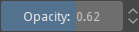
The total range is represented from left to right and the colored bar gives an indication of where in the possible range the current value is. Clicking anywhere, left or right, of that slider will change the current number to something lower (to the left) or higher (to the right). You can also use Down or Left, to decrease the value, and Up or Right to increase it.
Some sliders may have a soft range to choose from, in addition to the full range. The soft range is a sub-range formed by the most common values in the full range. When a slider has the ability to toggle between the full range and the sub-range then a small button with a circle icon is shown to the side of the increase/decrease buttons. Clicking that button will toggle between full range and sub-range.
To input a specific number with the keyboard, you can either double-click  , right click
  on the slider, or press any number key. Press Enter to accept. A number can now be entered directly for even greater precision. This control is also a maths input, so you can enter complex mathematical expressions. To commit the new value, press Enter. To cancel the editing without committing and returning to the value that was set before entering the editing mode, press Escape.
Pressing the Shift key while dragging the slider changes the values at a smaller increment, and pressing the Ctrl key while dragging the slider will snap the value to the nearest value step (the exact value step may vary from slider to slider).
Changed in version 5.1: Shift while dragging will now also enable “relative mode”, which means that the cursor can be dragged outside the slider area.
Angle Selector
Krita uses these to control values thar represent some angle or rotation. Below is an example of a Krita angle selector.

The angle selector uses degrees as units and is composed of three parts: a circular gauge, an maths input and some shortcut actions to easily flip and reset the angle.
You can and drag on the circular gauge to set a new angle on an intuitive way. The new angle is computed from the relative position of the cursor with respect to the center of the gauge and, by default, if the mouse cursor if far from the gauge, it can be any value, even with decimals (if supported), but if the mouse cursor remains close enough to the gauge when dragging around, the angle will snap to multiples of fifteen degrees. This makes it easier to set the angle in different ways with just the mouse or pen. This default behavior can be altered by using keyboard modifiers: if the Ctrl key is pressed while dragging, then the angle will always be snapped to multiples of fifteen degrees, no matter the distance from the cursor to the gauge; if the Shift key is pressed while dragging, then the angle will never be snapped, no matter the distance from the cursor to the gauge; if both the Ctrl and Shift keys are pressed while dragging, the angle will be snapped to integer values (useful only when the angle selector allows decimal values).
The maths input allows you to set the angle in a more precise fashion.
There are some actions that allow to flip the angle horizontally, vertically, or both, and another that resets the angle to some default value (usually zero degrees). These actions can be accessed in different ways. Most of the times, there will be three buttons to the side to quickly flip the angle. But, when there is no enough space in the user interface, those may be put together in the form of a menu under a single dropdown button, or even be hidden completely, leaving only the circular gauge and the maths input visible. Nevertheless, the actions will be always accessible by right clicking the circular gauge. Also, one can reset the angle by double on the gauge.
Curve editor
Krita uses these to edit curves that control different properties of the brushes and some filters, among others. Below is an example of a Krita curve editor used in the color adjustment curves filter.
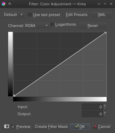
Curves can be edited by defining a small number of points in the editing window. These points create a curve where the curve has to pass smoothly (without creating any sharp corners) through all the points, unless the given point is marked as a corner. If the curve has control points that are marked as corner then the smoothness constrain won’t apply at that specific point, allowing for sharp turns in the curve.
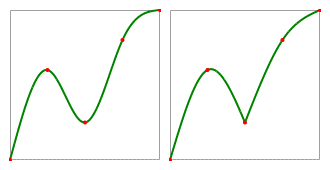
An illustration of the difference between smooth and corner/sharp control points. The curve is painted in green with control points painted in red. Left: the curve with all the control points set to smooth. Right: The same curve but with the third point set as corner/sharp.
To select a control point you have to on top of one, and then, to change its position, you drag the mouse. When you click, if there is no control point below the cursor, then a new one is created there and immediately selected and grabbed. If you are moving a control point but you don’t like the changes you can press the Escape key to cancel the editing. The point will return to the position where it was before being dragged.
If the Ctrl key was pressed when clicking on a control point, then its smooth/sharp property is toggled. If the Ctrl key was pressed but there was no control point under the cursor when clicking, then the newly added control point is automatically set as corner/sharp. Another way of toggling the smooth/sharp property is by first selecting the control point and then pressing the S key.
If you drag a control point outside the curve control, then it is removed. If you don’t release the mouse button after the removal, you can still drag the mouse inside the control so that the point is recovered. But, if you did release the mouse button, then the control point is not recoverable. You can also remove a control point by first selecting it and then pressing the Delete or Backspace keys.
By pressing the A key a new point will be inserted exactly in the middle of the curve.
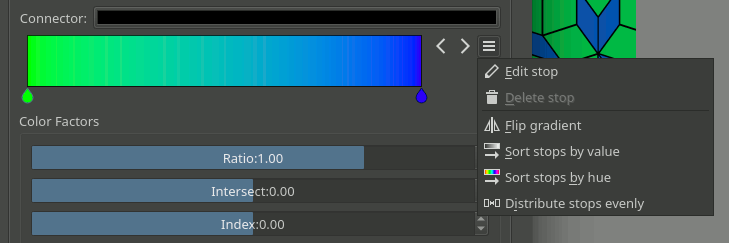
Gradients
As discussed in Gradients, Krita has two gradient types: Segmented Gradients and Stop Gradients. Although each type requires a different kind of editor, due to the distinct properties of each one, the main usage is similar.
Stop Gradient Editor
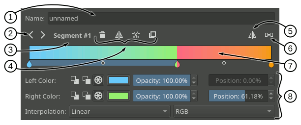
Following is a breakdown of the stop gradient editor:
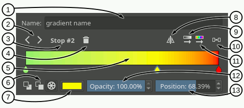
Name text field - In this text field you can write a name for the gradient.
Select stop - With these arrow buttons you can select the previous or next stop.
Selected stop label - This label shows the currently selected stop index.
Delete stop - With this button you can delete the currently selected stop.
Gradient slider - This slider is the main part of the editor, where the gradient preview is shown and where you can perform some basic operations to change the gradient:
- on the gradient to add a stop.
- on the stop handles (the drop-shaped icons) to select a stop, and drag to move them.
Drag the stop handles outside of the bar or press Delete key to remove the selected stop.
Double-
on a stop handle or press Enter key to open a color dialog where you can choose the color of the stop.Use the
 or the Left and Right keys to move the selected stop. If you also press Shift key the increment will be smaller.
Use Ctrl +
or Ctrl + Left and Ctrl + Right shortcuts to select the previous or next stop.
Color type - With these three buttons you can select the type of color used by the selected stop (Foreground, Background or custom).
Color button - If the selected stop uses a custom color then you can use this button to open a color dialog and change the color.
Flip gradient - With this button you can reverse the order of the stops in the gradient.
Sort stops by value - Clicking this button will sort the stops by its value.
Distribute stops evenly - Clicking this button will space the stops leaving the same amount of space between them.
Sort stops by hue - Clicking this button will sort the stops by its hue.
Opacity slider - If the selected stop uses a custom color then you can use this slider to change its opacity.
Position slider - This slider allows to fine-tune the position of the selected stop.
Segmented Gradient Editor
The segmented gradient editor is very similar to the stop gradient editor. The main difference is that you can select three different types of handles to edit the gradient: segment, stop, and middle point handles. When selecting one of these handles the widgets around the gradient slider will change to reflect the actions that you can perform on that handle. For example, for a segment handle you can change the start and end colors (amongst other actions), but for a middle point handle you can only change its position.
Following are a general breakdown and three specific breakdowns of the editor corresponding to the different user interfaces that are presented when the different handles are selected.
- General UI Breakdown
Name text field - In this text field you can write a name for the gradient.
Select handle buttons - With these arrow buttons you can select the previous or next handle.
Selected handle label - This label shows the currently selected handle index.
Handle actions area - In this area will appear some actions you can perform on the selected handle. They vary depending on the type of handle selected.
Flip gradient - With this button you can reverse the order of the segments (and their start and end colors) in the gradient.
Distribute segments evenly - Clicking this button will make all the segments have the same amount of space.
Gradient slider - This slider is the main part of the editor, where the gradient preview is shown and where you can perform some basic operations to change the gradient. These operations basically make changes to the different handles and are explained in the following sections. You can change the selected handle by pressing Ctrl key and using
or by pressing Ctrl + Left and Ctrl + Right shortcuts.Handle properties area - In this area will appear some widgets you can use to change the different properties of the selected handle.
- Segment Handle UI Breakdown
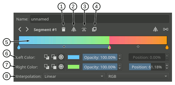
Delete segment - Pressing this button will delete the selected segment (unless it is the only one).
Flip segment - Pressing this button you can reverse the start and end colors of the selected segment as well as its middle point.
Split segment - Pressing this button will divide the selected segment in two, using the segment middle point as the cutting position.
Duplicate segment - Pressing this button will create a copy of the selected segment to its right.
Gradient slider - Here is a list of the segment related actions you can perform on the gradient slider:
You can select a segment by
on an area of the slider where there is no stop handle (the drop-shaped icon) or middle point handle (the rhombus-shaped icon).You can move the whole segment by
and dragging on an area of the slider where there is no stop handle or middle point handle. You can also move the segment by using or Left and Right keys and while doing that, if you also press Shift key, then the increment will be smaller. The first and last segments can not be moved.You can delete the selected segment by pressing Delete key or by dragging it outside the slider area.
You can split a segment by pressing Ctrl +
shortcut on it. The cutting point will be where you clicked.You can duplicate a segment by pressing Shift +
shortcut on it.
Left color - In this row of widgets you can change the properties related to the start of the segment:
With the first three buttons you can set the type of color used (Foreground, Background or custom).
Next to the color type buttons will appear a check box when the color type is Foreground or Background that you can use to establish that the color should also be transparent. If the color type is custom, then instead a color button and an opacity slider will appear to let you choose a specific color.
Lastly there is a position slider you can use to fine-tune the start position of the segment. This also changes the end position of the previous segment.
Right color - In this row of widgets you can change the properties related to the end of the segment. They are pretty much the same as the ones explained in the previous point.
Interpolation - In this row you can set the interpolation method and color model used to blend the colors inbetween the segment.
- Stop Handle UI Breakdown
Keep in mind that a segmented gradient is just a list of gradient segments. There isn’t really a concept of stop associated with it. The stop handles are just a convention used in the editor to ease the editing of the gradient. When manipulating or changing the properties of a stop handle you are really modifying the end of the segment on the left and the start of the segment on the right synchronously.
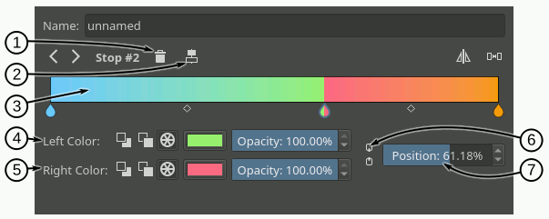
Delete stop - Pressing this button will delete the selected stop. Under the hood this action will merge the left and right segments, keeping the start of the left segment and the end of the right segment.
Center stop - Pressing this button will center the stop between the start position of the left segment and the end position of the right segment.
Gradient slider - Here is a list of the stop related actions you can perform on the gradient slider:
You can select a stop handle by
on one of the drop-shaped icons.You can move the stop handle by
and dragging the drop-shaped icon. You can also move the stop handle by using or Left and Right keys and while doing that, if you also press Shift key, then the increment will be smaller. The first and last stop handles can not be moved.You can delete the selected stop by pressing Delete key or by dragging it outside the slider area.
You can create a new stop by pressing Ctrl +
shortcut on an area of the slider where there is no stop handle or middle point handle. This is exactly the same action as splitting a segment.
Left Color - In this row of widgets you can change the properties related to the end of the segment on the left of the stop:
With the first three buttons you can set the type of color used (Foreground, Background or custom).
Next to the color type buttons will appear a check box when the color type is Foreground or Background that you can use to establish that the color should also be transparent. If the color type is custom, then instead a color button and an opacity slider will appear to let you choose a specific color.
Right color - In this row of widgets you can change the properties related to the start of the segment on the right of the stop. They are pretty much the same as the ones explained in the previous point.
Link colors - If this button is checked then changing the properties on the left color area will also change the properties on the right color area and vice versa. Check it if you want the two colors to be synchronized.
Position - you can use this slider to fine-tune the position of the stop. This changes the end position of the segment on the left and the start position of the segment on the right.
- Middle Point Handle UI Breakdown
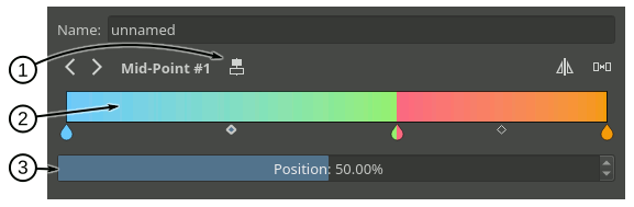
Center middle point - Pressing this button will center the middle point of the selected segment.
Gradient slider - Here is a list of the middle point related actions you can perform on the gradient slider:
You can select a segment middle point by
on one of the rhombus-shaped icons.You can move the middle point by
and dragging the rhombus-shaped icon. You can also move it by using or Left and Right keys and while doing that, if you also press Shift key, then the increment will be smaller.
Position - With this slider you can fine-tune the position of the middle point of the segment.
Compact Gradient Editors
In some places in the GUI a compact version of the gradient editors may be used because of the lack of space or other reasons. They just show the gradient slider and all the other functionality that is exposed in the non-compact mode is compacted and moved to the side.
Generic Gradient Editor
In some places you will find that the previously mentioned gradient preset chooser and editors are shown together and that they are interconnected. When this happens, you are probably using the generic gradient editor, that was introduced to ease the creation and manipulation of gradients.
Its main features are:
Allows you to load/save gradients from/to the gradient resources to/from the editor.
Allows to overwrite an existing gradient resource.
A specific editor is shown automatically depending on the type of the gradient (stop gradient or segmented gradient).
Allows to convert between gradient types
Following is a breakdown of the interface of the editor:
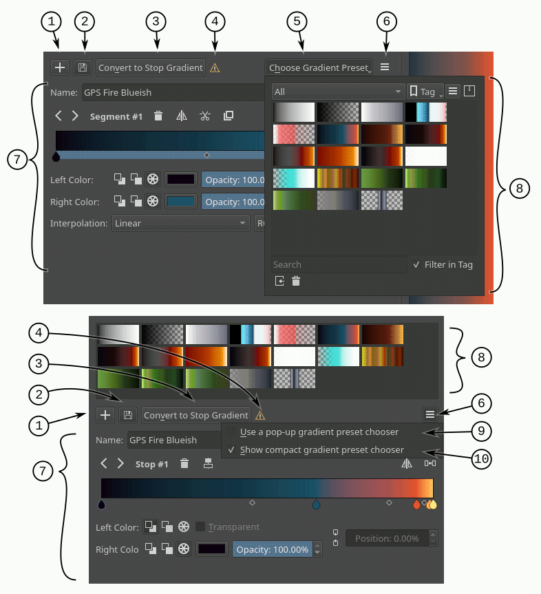
Add gradient button - Pressing this button you can add the current gradient to the resources.
Update gradient button - Pressing this button you can overwrite the gradient resource that is currently selected in the gradient chooser. Keep in mind that the type of the gradient resource and the type of the gradient that is currently being edited must match.
Convert gradient button - Pressing this button you can convert the current gradient to a stop gradient if it is a segmented gradient or to a segmented gradient if it is a stop gradient.
Convert gradient warning - This icon will appear when pressing the convert button means that some data or info will be lost in the conversion. This can happen when converting from a segmented gradient to a stop gradient.
Gradient presets button - Pressing this button will pop-up a gradient preset chooser to let you choose a gradient and edit it. This button is only available if the “use a pop-up gradient preset chooser” is checked.
Options button - Pressing this button will show an options menu.
Specific editor area - Here the stop or segmented gradient editor will be shown when a gradient is selected. The specific gradient editors are documented in the previous sections.
Gradient preset chooser - This widget shows a collection of gradient resources and allows you to load one of those gradients into the editor.
Use a pop-up gradient preset chooser - If this option is checked, the gradient preset chooser will be accessed through a pop-up window that is shown by clicking the “choose gradient preset” button. If this option is not checked then the gradient preset chooser is shown inline above all the other widgets.
Show compact gradient preset chooser - If this option is checked, then only the collection of gradient resources is shown, without any surrounding buttons or options. If it is not checked then the gradient preset chooser will also show some extra buttons, like tag filtering or viewing options.