
Soft Proofing
Note
Soft Proofing works only with Canvas Graphics Acceleration enabled.
When we make an image in Krita, and print that out with a printer, the image tends to look different. The colors are darker, or less dark than expected, maybe the reds are more aggressive, maybe contrast is lost. For simple documents, this isn’t much of a problem, but for professional prints, this can be very sad, as it can change the look and feel of an image drastically.
The reason this happens is simply because the printer uses a different color model (CMYK) and it has often access to a lower range of colors (called a gamut).
A naive person would suggest the following solution: do your work within the CMYK color model! But there are three problems with that:
Painting in a CMYK space doesn’t guarantee that the colors will be the same on your printer. For each combination of Ink, Paper and Printing device, the resulting gamut of colors you can use is different, which means that each of these could have a different profile associated with them.
Furthermore, even if you have the profile and are working in the exact color space that your printer can output, the CMYK color space is very irregular, meaning that the color maths isn’t as nice as in other spaces. Blending modes are different in CMYK as well.
Finally, working in that specific CMYK space means that the image is stuck to that space. If you are preparing your work for different a CMYK profile, due to the paper, printer or ink being different, you might have a bigger gamut with more bright colors that you would like to take advantage of.
So ideally, you would do the image in RGB, and use all your favorite RGB tools, and let the computer do a conversion to a given CMYK space on the fly, just for preview. This is possible, and is what we call ‘’Soft Proofing’’.
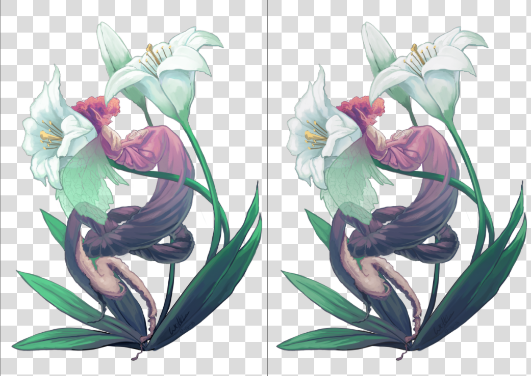
On the left, the original, on the right, a view where soft proofing is turned on. The difference is subtle due to the lack of really bright colors, but the soft proofed version is slightly less blueish in the whites of the flowers and slightly less saturated in the greens of the leaves.
You can toggle soft proofing on any image using the Ctrl + Y shortcut. Unlike other programs, this is per-view, so that you can look at your image non-proofed and proofed, side by side. The proofing configuration can also be set per image, and saved into the .kra file. Just enable Store Softproofing configuration in the image in the proofing options in . If the checkbox is unchecked, then Krita will use global settings from (for more details see here).
Note
When Store Softproofing configuration in the image is enabled, Krita embeds the entire proofing ICC profile into .kra file. This ICC profile can be big for some output devices, especially CMYK ones.
There you can set the following options:
- Model, Profile
Of these, only the profile is really important. This will serve as the profile you are proofing to. In a professional print workflow, this profile should be determined by the printing house.
- Rendering Intent
Set the intent used to convert the image to the proofed output device profile. It uses the same options as the intents mentioned in the color managed workflow. This intent should coincide with the conversion intent used by your print house before printing. If your print house does not do any conversion internally, then you should perform the conversion yourself before sending the file to them.
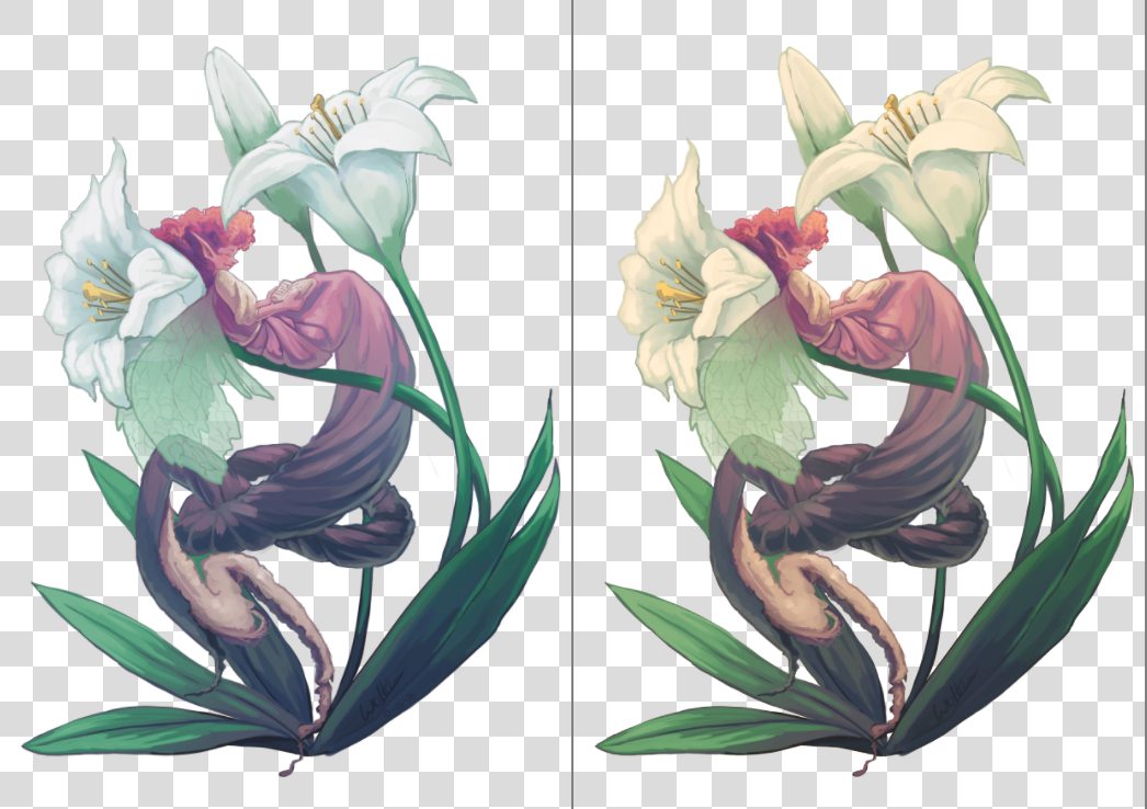
Left: Soft proofed image with Absolute Intent Chromatic Adaptation enabled. Right: Soft proofed image with Absolute Intent Chromatic Adaptation disabled.
- Black Point Compensation
Enables the black point compensation when converting image to the proofed output device profile. Turning this off will clip the shadow values to the minimum that either the screen and the proofing profile can handle, while turning this on will scale the black to the screen-range, showing you the full range of grays in the image. Like Conversion Rendering Intent, this value should coincide with the value used by the printing house when performing conversion to the device.
- Display Mode
Defines the way how the proofed (and possibly clipped) space will be shown on the screen, i.e. what rendering intent and flags will be used to convert colors from the proofed output device profile into the screen profile.
Use global display settings instructs Krita to render the proofed space using the global settings, set in .
Simulate paper white and black is used to preview the white point (or “color tint”) of the paper on the current display. In other words, if the paper is matte, or metallic, or has some sort of sepia effect, this will be visible on your screen. Please take it into account that the viewing conditions’ white point will still be adjusted to the one of the screen. It means that you cannot visually compare the physical print and the image on the screen, unless all three white points coincide: the one in the paper profile, the one the display is configured to and the white point of the light bulb that illuminates your physical print.
Custom allows you to configure the final conversion step manually. You may want to configure the pipeline depending on your goal:
- Preview color gamut (or “color variety”) of the image
Rendering Intent –> Relative Colorimetric
Black Point Compensation –> Enabled
Note
If you want to use Out of Gamut Warnings, it is best to use them in this mode
- Preview contrast degradations caused by the color of the paper
Rendering Intent –> Absolute Colorimetric
Absolute Intent Chromatic Adaptation –> Enabled
Warning
If you are using Wayland compositor, Absolute Colorimetric intent may be broken (even in XWayland mode). More than that, it may be broken differently in different versions.
In KWin 6.4.x and earlier, Absolute Colorimetric will behave as if Absolute Intent Chromatic Adaptation is always disabled. It will cause severe color tint if white points (sigChromaticAdaptationTag) of the printer and display profiles do not coincide.
In KWin 6.5.x and later, Absolute Colorimetric will behave as if Absolute Intent Chromatic Adaptation is always enabled. Given that you keep the checkbox set, the feature will work correctly and will let you preview contrast degradations, but you will not be able to get advanced effects of disabling color adaptation to the display space.
This is a problem of the Wayland protocol specification, the fix is discussed here.
- Gamut Warning
Set the color of Out of Gamut Warnings.
You can set the defaults that Krita uses in .
To configure this properly, it’s recommended to make a test image to print (and that is printed by a properly set-up printer) and compare against, and then approximate in the proofing options how the image looks compared to the real-life copy you have made.
Out of Gamut Warning
The out of gamut warning, or gamut alarm, is an extra option on top of Soft-Proofing: It allows you to see which colors are being clipped, by replacing the resulting color with the set alarm color.
This can be useful to determine where certain contrasts are being lost, and to allow you to change it slowly to a less contrasted image.
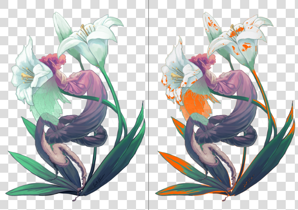
Left: View with original image, Right: View with soft proofing and gamut warnings turned on. Krita will save the gamut warning color alongside the proofing options into the KRA file, so pick a color that you think will stand out for your current image.
You can activate Gamut Warnings with the Ctrl + Shift + Y shortcut, but it needs soft proofing activated to work fully.
Note
Soft Proofing doesn’t work properly in floating-point spaces, and attempting to force it will cause incorrect gamut alarms. It is therefore disabled.
Warning
Gamut Warnings sometimes give odd warnings for linear profiles in the shadows. This is a bug in LittleCMS, see here for more info.