
Color Managed Workflow
You may have heard that Krita has something called color-management. Or maybe you just wondered what all these ‘color model’ and ‘color profile’ things you can find in the menus mean. Color management is pretty useful for people who work in digital imaging professionally, and hopefully this page will explain why.
Basic Info
If you’ve never worked with color management before, and have no clue what it is, then know that you’ve probably been working in the 8bit RGB color space with the sRGB profile. This means you can choose for sRGB built-in or sRGB-elle-v2-srgbtrc.icc. With the new color space browser this profile is marked with (default) when using 8bit.
We’ll go into what these terms mean in the theory, but if you’re here only for trying to figure out which is the default, you now know it. Maybe, after reading this, you may feel like changing the default, to get new and interesting results from filters, blending modes, or just the color smudge brush.
What is the problem?
To explain the point of color management, you’d first need to learn which problem color management tries to solve.
Let us imagine a kinder garden:
The class of 28 children is subdivided in groups of 7. Each group has its own table.
The teacher gives them a painting assignment: They need to paint a red triangle, a blue square, a green circle and put a yellow border around the three. The kids are very experienced with painting already, so the teacher can confidently leave the smarter ones to their own devices, and spent more time on those who need help.
The following results come from painting:
Even though all groups had the same assignment, each group’s result looks different.
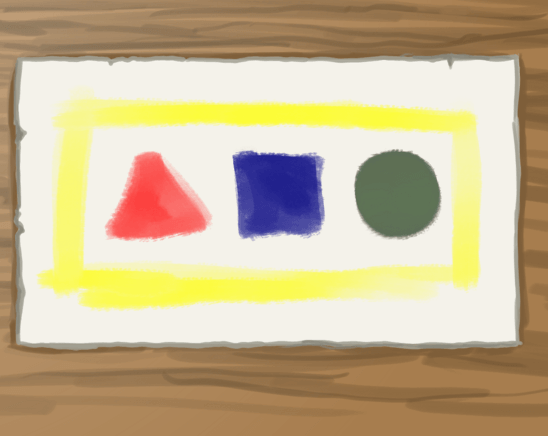
Group 1 had vermilion red, citron yellow and ultramarine blue to their disposal. This means their triangle looks nice and red, but their circle’s green is muddy. This is because ultramarine is too dark of a blue to create nice greens with.
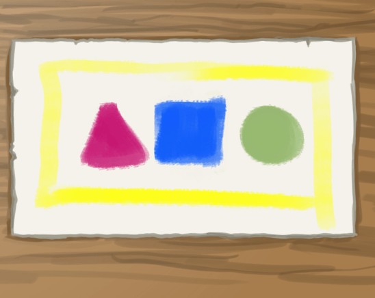
Group 2 had magenta red, citron yellow and cerulean blue. Magenta is a type of red that is closer to pink, opposed to vermilion, which is closer to orange. However, their green looks nice because cerulean is a much lighter blue.
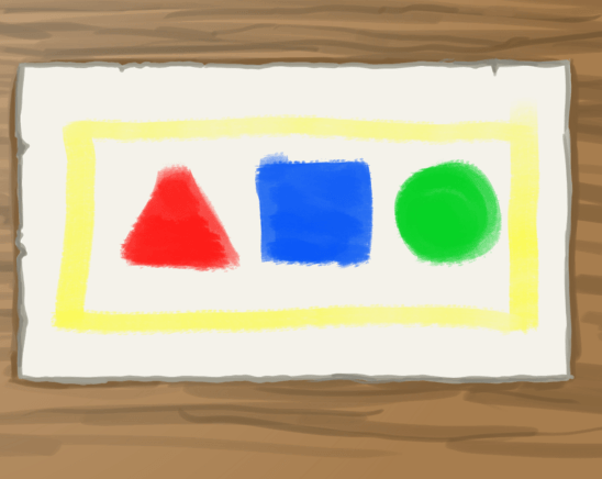
Group 3 had vermilion red, citron yellow, emerald green and cerulean blue. They didn’t mix their green, and thus ended up with a purer color.
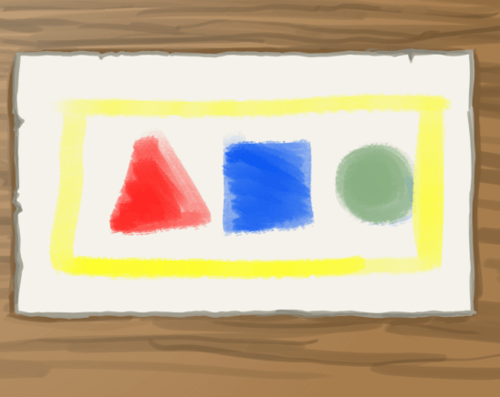
Finally, group 4 has vermilion red, citron yellow and cerulean blue. Their colors probably look like what you imagined.
Now, these are kindergarteners, so this isn’t the largest problem in the world. However, imagine that something like this happened at a printing company? Imagine four printers printing the same magazine with wildly different results? That would be disastrous!
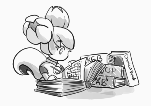
For this purpose, we invented color management.
What is color management?
Color management is, dryly put, a set of systems that tries to have the same color translate properly between color devices.
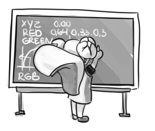
It usually works by attempting to convert a color to the reference color space XYZ. XYZ is a coordinate system that has a spot for all colors that the average human eye can see.
From XYZ it can then be translated back into another device space, such as RGB (for screens), or CMYK (for printers).
Krita has two systems dedicated to color management. On the one hand, we have lcms2, which deal with ICC profiles, and on the other, we have OCIO, which deal with LUT color management.
To give a crude estimate, ICC profiles deal with keeping colors consistent over many interpretations of devices (screens, printers) by using a reference space, and OCIO deals with manipulating the interpretation of said colors.
Within both we can identify the following color spaces:
- Device spaces
Device spaces are those describing your monitor, and have to be made using a little device that is called “colorimeter”. This device, in combination with the right software, measures the strongest red, green and blue your screen can produce, as well as the white, black and gray it produces. Using these and several other measurements it creates an ICC profile unique to your screen. You set these in Krita’s color management tab. By default we assume sRGB for screens, but it’s very likely that your screen isn’t exactly fitting sRGB, especially if you have a high quality screen, where it may be a bigger space instead. Device spaces are also why you should first consult with your printer what profile they expect. Many printing houses have their own device profiles for their printers, or may prefer doing color conversion themselves. You can read more about colorimeter usage here.
- Working spaces
These are delivered alongside Krita for ICC, and downloadable from the OCIO website for OCIO. Working spaces are particularly nice to do color calculations in, which programs like Krita do often. It’s therefore recommended to have a working space profile for your image.
- Aesthetic or Look spaces
These are special spaces that have been deformed to give a certain look to an image. Krita doesn’t deliver Look profiles for ICC, nor does it yet support Look spaces for OCIO.
Color managed workflow
Knowing this about these spaces of course doesn’t give you an idea of how to use them, but it does make it easier to explain how to use them. So let us look at a typical color management workflow:

A typical example of a color managed workflow. We have input from scanners and cameras, which we convert to a working space that can be used between different editing software, and is converted to an output space for viewing on screen or printing.
In a traditional color managed workflow, we usually think in terms of real world colors being converted to computer colors and the other way around. So, for example photos from a camera or scanned in images. If you have a device space of such a device, we first assign said device space to the image, and then convert it to a working space.
We then do all our editing in the working space, and use the working space to communicate between editing programs. In Krita’s case, due to it having two color management systems, we use ICC profiles between programs like Gimp 2.9+, Inkscape, digiKam and Scribus, and OCIO configuration between Blender and Natron.
You also store your working files in the working space, just like how you have the layers unmerged in the working file, or have it at a very high resolution.
Sometimes, we apply aesthetic or ‘look’ spaces to an image as part of the editing process. This is rather advanced, and probably not something to worry about in Krita’s case.
Then, when we’re done editing, we try to convert to an output space, which is another device space. This can be CMYK for printers or a special screen RGB profile. When you are dealing with professional printing houses, it is best to ask them about this step. They have a lot of experience with doing the best conversion, and may prefer to do the conversion from your working space to the device space of their printers.
Another form of output is the way your screen displays the color. Unlike regular output, this one is done all the time during editing: After all, you need to be able to see what you are doing, but your screen is still a device with a device space, so it does distort how the image looks. In this manner, you can see your screen as a set of binoculars you have to look through to see your image at all.
Therefore, without a profiled monitor, you actually don’t know what the actual colors you are working with are like, because the computer doesn’t know the relevant properties of your screen. So if you profiled your monitor, give Krita the profile in the settings, and select the sRGB space to draw in, you are for the first time seeing the actual colors of the sRGB space.
So what does this mean?

When we paint from scratch, we can see our screen profile as the input space, because we use it to determine what colors to pick. This somewhat simplifies the workflow, but makes the screen profile and viewing conditions more important.
Now, photographers and people who do a tricky discipline of VFX called ‘color grading’ will go completely mad over trying to get the colors they put in to come out 100% correctly, and will even count in factors like the time of day and the color they painted their walls. For example, if the wall behind your computer is pure red, your eyes will adjust to be less sensitive to red, which means that the colors they pick in the program could come out redder. We call these the viewing conditions.
Thankfully, artists have to worry a slight bit less about this. As illustrations are fully handmade, we are able to identify the important bits and make appropriate contrasts between colors. This means that even if our images turn out to be slightly redder than intended, it is less likely the whole image is ruined. If we look back at the kindergarten example above, we still understand what the image was supposed to look like, despite there being different colors on each image. Furthermore, because the colors in illustrations are deliberately picked, we can correct them more easily on a later date. Yet, at the same time, it is of course a big drag to do this, and we might have had much more flexibility had we taken viewing conditions under consideration.
That said, for artists it is also very useful to understand the working spaces. Different working spaces give different results with filters and mixing, and only some working spaces can be used for advanced technology like HDR.
Similarly, Krita, as a program intended to make images from scratch, doesn’t really worry about assigning workspaces after having made the image. But because you are using the screen as a binocular to look at your image, and to pick colors, you can see your screen’s device space as an input space to the image. Hence why profiling your monitor and giving the profile to Krita in the settings can help with preparing your work for print and future ventures in the long run.
Overall, it is kinda useful to keep things like viewing conditions in the back of your mind. Many professional artists use a mid-gray color as their default canvas background because they find they create much more dynamic images due to having improved their viewing conditions. It is also why a lot of graphics programs, including Krita, come with a dark theme nowadays. (Though, of course this might also be because dark themes can be considered cool, who knows.)
ICC profiles
An ICC profile is a set of coordinates describing the extremities of the device space within XYZ, and it is the color management data you use to communicate your working space to printers and applications that are designed for the print industry, such as Gimp, Scribus, Photoshop, Illustrator, Inkscape, digiKam, RawTheraphee, etc. You have two types of ICC profiles:
- Matrix Shaper profiles
These are delivered alongside Krita. Matrix shaper profiles are made by setting parameters and interpolating between these to get the exact size of the color space. Due to this, Krita’s color space browser can give you a lot of information on these profiles. Such profiles are also preferable as working space.
Matrix shaper profiles have a few parameters that describe the color space which are then interpolated between, this requires a lot of maths.
- cLUT profiles
These are fairly rare, and primarily used to describe printer profiles, such as CMYK. cLUT, or Color Look-up Table profiles store far more data than Matrix shaper profiles, so they can hold data of little particularities caused by, for example, unexpected results from mixing pigments. This is a far more organic approach to describing a color space, hence why a lot of programs that don’t care for color management much don’t support these.
cLUT profiles work by holding tables of each color in a color space and their respective coordinates in a reference space. For CMYK this is typically L*A*B* and for the rest XYZ. These tables are tricky to make, which means these profiles are a lot rarer.
The interesting thing about ICC profiles is that your working space can be larger than your device space. This is generally not bad. However, when converting, you do end up with the question of how to translate the working space values.
- Perceptual
This just squishes the values of the working space into the space it’s converted to. It’s a nice method to see all possible values in this, but not so good if you want accurate color reproduction. Use this if you want to see all colors in an image, or want to express all possible contrasts. Doesn’t work with Matrix Shaper profiles, defaults to relative colorimetric.
- Absolute Colorimetric
The opposite to Perceptual, Absolute colorimetric will attempt to retain all the correct colors at whatever cost, which may result in awful looking colors. Recommended only for reproduction work. Doesn’t work with Matrix Shaper profiles in Krita due to ICC v4 workflow standards.
- Relative Colorimetric
An in between solution between perceptual and absolute, relative will try to fit whatever colors it can match between color spaces. It does this by aligning the white and black points. It cuts off the rest to their respective borders. This is what all matrix shaper profiles default to during conversion, because the ICC v4 workflow specifies to only use Relative Colorimetric for matrix shaper profiles.
- Saturation
Does anything to retain colorfulness, even hue will be sacrificed. Used in infographics. Doesn’t work with Matrix Shaper profiles, defaults to relative colorimetric.
ICC profile version is the last thing to keep in mind when dealing with ICC profiles. Krita delivers both Version 2 and Version 4 profiles, with the later giving better results in doing color maths, but the former being more widely supported (as seen below in ‘Interaction with other applications’). This is also why Krita defaults to V2, and we recommend using V2 when you aren’t certain if the other programs you are using support V4.
LUT docker and HDR imaging
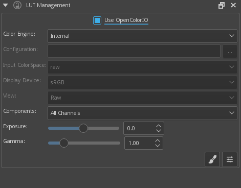
The LUT Management is the second important bit of color management in Krita that is shared between Krita and programs like Blender, Natron and Nuke, and only uses Look Up Tables that are configured via a config file.
You can set the workingspace of the image under input color space, and the display to sRGB or your own LUT if you have added it to the configuration. View in this case is for proofing transforms to a certain display device.
Component, exposure, gamma, whitepoint and blackpoint are knobs which allows you to modify the display filter.

As explained before, we can see our monitor as a telescope or binocular into the world of our picture. Which means it distorts our view of the image a little. But we can modify this binocular, or display filter to see our image in a different way. For example, to allow us to see the white in an image that are whiter than the white of our screen. To explain what that means, we need to think about what white is.
For example, white, on our monitor is full red, full green and full blue. But it’s certainly different from white on our paper, or the color of milk, white from the sun, or even the white of our cell-phone displays.
Black similarly, is brighter on a LCD display than a LED one, and incomparable with the black of a carefully sealed room.
This means that there’s potentially blacker blacks than screen black, and white whites than screen white. However, for simplicity’s sake we still assign the black-point and the white-point to certain values. From there, we can determine whether a white is whiter than the white point, or a black blacker than the black-point.
The LUT docker allows us to control this display-filter and modify the distortion. This is useful when we start modifying images that are made with scene referred values, such as HDR photos, or images coming out of a render engine.

So, for example, we can choose to scale whiter-than-screen-white to our screen-white so we can see the contrasts there.
The point of this is that you can take advantage of more lightness detail in an image. While you can’t see the difference between screen white and whiter-than-screen-white (because your screen can’t show the difference), graphics programs can certainly use it.
A common example is matching the lighting between a 3d model and a real world scene. Others are advanced photo retouching, with much more contrast information available to the user. In painting itself, this allows you to create an image where you can be flippant with the contrast, and allow yourself to go as bright as you’d like.
LUT docker manipulations are per view, so you can create a new view and set it to luminosity. This way you can see the image in both color as well as grayscale and keep a good eye on your values.
Another example is to carefully watch the gradients in a certain section.
Like ICC, the LUT Docker allows you to create a profile of sorts for your device. In this case it’s the ‘LUT’, which stands for ‘Look Up Table’, and which can be added to OCIO by modifying the configuration file. When OCIO is turned on, the configuration in is turned off, unless you are using the Internal color engine.
In summary
Krita has two modes of color management:
ICC works in terms of spaces relative to the CIEXYZ space, and requires an ICC profile.
OCIO works in terms of interpretation, and makes use of LUTs.
both can be made with a colorimeter.
If you want to have a properly color managed workflow, you have one made customary for the input device (your screen) and the output devices (your printer, or target screen). For web the output is always sRGB.
Set up your screen profiles under .
Do NOT use screen profiles or other device profiles to draw in. Use a working space profile such as any of the ‘elle’ profiles for this, as the color maths will be much more predictable and pleasant. Krita will convert between your screen and working space on the fly, allowing you to pick the correct colors. This turns your screen into binoculars to view the image.
Use the appropriate color management for the appropriate workflow. If you are working with Blender, you will be better off using OCIO, than ICC. If you are working with Scribus or Photoshop, use ICC.
Krita does a lot of color maths, often concerning the blending of colors. This color maths works best in linear color space, and linear color space requires a bit depth of at the least 16bit to work correctly. The disadvantage is that linear space can be confusing to work in.
If you like painting, have a decent amount of RAM, and are looking to start your baby-steps in taking advantage of Krita’s color management, try upgrading from having all your images in sRGB built-in to sRGB-v2-elle-g10.icc or rec2020-v2-elle-g10.icc at 16bit float. This’ll give you better color blending while opening up the possibility for you to start working in HDR!
Note
Some graphics cards, such as those of the NVidia-brand actually have the best performance under 16bit float, because NVidia cards convert to floating point internally. When it does not need to do that, it speeds up!
Note
No amount of color management in the world can make the image on your screen and the image out of the printer have 100% the same color.
Exporting
When you have finished your image and are ready to export it, you can modify the color space to optimize it:
If you are preparing an image for the web:
If you use 16bit color depth or higher, convert the image to 8bit color depth. This will make the image much smaller.
Krita doesn’t have built-in dithering currently, which means that 16 to 8bit conversions can come out a bit banded. But you can simulate it by adding a fill layer with a pattern, set this fill layer to overlay, and to 5% opacity. Then flatten the whole image and convert it to 8bit. The pattern will function as dithering giving a smoother look to gradients.
If it’s a gray-scale image, convert it to gray-scale.
If it’s a color image, keep it in the working space profile: Many web browsers these days support color profiles embedded into images. Firefox, for example, will try to convert your image to fit the color profile of the other monitor (if they have one). That way, the image will look almost exactly the same on your screen and on other profiled monitors.
Note
In some versions of Firefox, the colors actually look strange: This is a bug in Firefox, which is because its color management system is incomplete, save your PNG, JPG or TIFF without an embedded profile to work around this.
If you are preparing for print:
You hopefully made the picture in a working space profile instead of the actual custom profile of your screen, if not, convert it to something like Adobe RGB, sRGB or Rec. 2020.
Check with the printer what kind of image they expect. Maybe they expect sRGB color space, or perhaps they have their own profile.
Interaction with other applications
Blender
If you wish to use Krita’s OCIO functionality, and in particular in combination with Blender’s color management, you can try to have it use Blender’s OCIO config.
Blender’s OCIO config is under <Blender-folder>/version number/datafiles/colormanagement.
Set the LUT docker to use the OCIO engine, and select the config from the above path. This will give you Blender’s input and screen spaces, but not the looks, as those aren’t supported in Krita yet.
Windows Photo Viewer
You might encounter some issues when using different applications together. One important thing to note is that the standard Windows Photo Viewer application does not handle modern ICC profiles. Krita uses version 4 profiles; Photo Viewer can only handle version 2 profiles. If you export to JPEG with an embedded profile, Photo Viewer will display your image much too dark.
Example workflows
Here are some example workflows to get a feeling of how your color management workflow may look like.
As mentioned before, input for your screen is set via , or via the LUT docker’s ‘screen space’. Working space is set via new file per document, or in the LUT docker via ‘input space’.
Webcomic

- Input
Your screen profile. (You pick colors via your screen)
- Workingspace
sRGB (the default screen profile) or any larger profile if you can spare the bit depth and like working in them.
- Output
sRGB, ICC version 2, sRGB TRC for the internet, and a specialized CMYK profile from the printing house for the printed images.
Use the sRGB-elle-V2-srgbtrc.icc for going between Inkscape, Photoshop, Paint Tool SAI, Illustrator, Gimp, Manga Studio, Paintstorm Studio, MyPaint, Artrage, Scribus, etc. and Krita.
If you are using a larger space via ICC, you will only be able to interchange it between Krita, Photoshop, Illustrator, Gimp 2.9, Manga Studio and Scribus. All others assume sRGB for your space, no matter what, because they don’t have color management.
If you are going between Krita and Blender, Nuke or Natron, use OCIO and set the input space to ‘sRGB’, but make sure to select the sRGB profile for ICC when creating a new file.
For the final for the web, convert the image to sRGB 8bit, ‘srgbtrc’, do not embed the ICC profile. Then, if using PNG, put it through something like ‘pngcrush’ or other PNG optimizers. sRGB in this case is chosen because you can assume the vast majority of your audience hasn’t profiled their screen, nor do they have screens that are advanced enough for the wide gamut stuff. So hence why we convert to the screen default for the internet, sRGB.
Print

- Input
Your screen profile. (You pick colors via your screen)
- Workingspace
sRGB or Rec. 2020 if you can afford the bit-depth being 16bit.
- Output
Specialized CMYK profile from the printing house for the printed images.
The CMYK profiles are different per printer, and even per paper or ink-type so don’t be presumptuous and ask ahead for them, instead of doing something like trying to paint in any random CMYK profile. As mentioned in the viewing conditions section, you want to keep your options open.
You can set the advanced color selector to transform to a given profile via . There, tick Color Selector Uses Different Color Space than Image and select the CMYK profile you are aiming for. This will limit your colors a little bit, but keep all the nice filter and blending options from RGB.
Games

- Input
Your screen profile. (You pick colors via your screen)
- Workingspace
sRGB or grayscale linear for roughness and specular maps.
- Output
This one is tricky, but in the end it’ll be sRGB for the regular player.
So this one is tricky. You can use OCIO and ICC between programs, but recommended is to have your images to the engine in sRGB or grayscale. Many physically based renderers these days allow you to set whether an image should be read as a linear or ‘srgbtrc’ image, and this is even vital to have the images being considered properly in the physically based calculations of the game renderer.
While game engines need to have optimized content, and it’s recommended to stay within 8bit, future screens may have higher bit depths, and when renderers will start supporting those, it may be beneficial to develop a workflow where the working-space files are rather unnecessarily big and you run some scripts to optimize them for your current render needs, making updating the game in the future for fancier screens less of a drag.
Normal maps and heightmaps are officially supposed to be defined with a ‘non-color data’ working space, but you’ll find that most engines will not care much for this. Instead, tell the game engine not to do any conversion on the file when importing.
Specular, glossiness, metalness and roughness maps are all based on linear calculations, and when you find that certain material has a metalness of 0.3, this is 30% gray in a linear space. Therefore, make sure to tell the game engine renderer that this is a linear space image (or at the very least, should NOT be converted).
See also