
Viewing Conditions
We mentioned viewing conditions before, but what does this have to do with ‘white points’?
A lot actually, rather, white points describe a type of viewing condition.
So, usually what we mean by viewing conditions is the lighting and decoration of the room that you are viewing the image in. Our eyes try to make sense of both the colors that you are looking at actively (the colors of the image) and the colors you aren’t looking at actively (the colors of the room), which means that both sets of colors affect how the image looks.
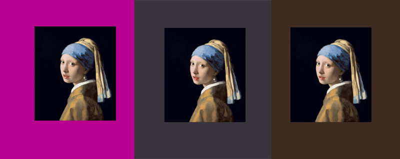
Left: Let’s ruin Vermeer by putting a bright purple background that asks for more attention than the famous painting itself. Center: a much more neutral backdrop that an interior decorator would hate but brings out the colors. Right: The approximate color that this painting is displayed against in real life in the Maurits House, at the least, last time I was there. Original image from wikipedia commons.
This is for example, the reason why museum exhibitioners can get really angry at the interior decorators when the walls of the museum are painted bright red or blue, because this will drastically change the way how the painting’s colors look. (Which, if we are talking about a painter known for their colors like Vermeer, could result in a really bad experience).
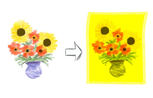
Lighting is the other component of the viewing condition which can have dramatic effects. Lighting in particular affects the way how all colors look. For example, if you were to paint an image of sunflowers and poppies, print that out, and shine a bright yellow light on it, the sunflowers would become indistinguishable from the white background, and the poppies would look orange. This is called metamerism, and it’s generally something you want to avoid in your color management pipeline.
An example where metamerism could become a problem is when you start matching colors from different sources together.

For example, if you are designing a print for a red t-shirt that’s not bright red, but not super grayish red either. And you want to make sure the colors of the print match the color of the t-shirt, so you make a dummy background layer that is approximately that red, as correctly as you can observe it, and paint on layers above that dummy layer. When you are done, you hide this dummy layer and sent the image with a transparent background to the press.

But when you get the t-shirt from the printer, you notice that all your colors look off, mismatched, and maybe too yellowish (and when did that T-Shirt become purple?).
This is where white points come in.
You probably observed the t-shirt in a white room where there were incandescent lamps shining, because as a true artist, you started your work in the middle of the night, as that is when the best art is made. However, incandescent lamps have a black body temperature of roughly 2300-2800K, which makes them give a yellowish light, officially called White Point A.
Your computer screen on the other hand, has a black body temperature of 6500K, also known as D65. Which is a far more blueish color of light than the lamps you are hanging.
What’s worse, Printers print on the basis of using a white point of D50, the color of white paper under direct sunlight.

So, by eye-balling your t-shirt’s color during the evening, you took its red color as transformed by the yellowish light. Had you made your observation in diffuse sunlight of an overcast (which is also roughly D65), or made it in direct sunlight light and painted your picture with a profile set to D50, the color would have been much closer, and thus your design would not be as yellowish.

Applying a white balance filter will sort of match the colors to the tone as in the middle, but you would have had a much better design had you designed against the actual color to begin with.
Now, you could technically quickly fix this by using a white balancing filter, like the ones in G’MIC, but because this error is caught at the end of the production process, you basically limited your use of possible colors when you were designing, which is a pity.
Another example where metamerism messes things up is with screen projections.
We have a presentation where we mark one type of item with red, another with yellow and yet another with purple. On a computer the differences between the colors are very obvious.

However, when we start projecting, the lights of the room aren’t dimmed, which means that the tone scale of the colors becomes crunched, and yellow becomes near indistinguishable from white. Furthermore, because the light in the room is slightly yellowish, the purple is transformed into red, making it indistinguishable from the red. Meaning that the graphic is difficult to read.
In both cases, you can use Krita’s color management a little to help you, but mostly, you just need to be ‘’aware’’ of it, as Krita can hardly fix that you are looking at colors at night, or the fact that the presentation hall owner refuses to turn off the lights.
That said, unless you have a display profile that uses LUTs, such as an OCIO LUT or a cLUT ICC profile, white point won’t matter much when choosing a working space, due to weirdness in the ICC v4 workflow which always converts matrix profiles with relative colorimetric, meaning the white points are matched up.