
Scene Linear Painting
Previously referred to as HDR painting and Scene Referred painting, Scene Linear Painting is doing digital painting in a peculiar type of colorspace. It is painting in a color space that is…
Linear - there’s no gamma encoding, or tone-mapping or whatever going on with the pixels you manipulate. (This is different from the pixels you see, but we’ll get to that later)
Floating Point - So 16bit or 32bit floating point per channel.
These are the two important characteristics. The colorspace has a few more properties than this, such as the white point, or more importantly, the colorants that make up the gamut. But here’s the thing, those two could be anything, as long as the space is linear and the color depth is floating point.
So, Scene Linear is not a single one colorspace, but a TYPE of colorspace. You can have a scene linear space that uses the sRGB/Rec. 709 colorants, or one that uses adobeRGB, or maybe one that uses Rec. 2020, as long as it is linear and in a floating point bit depth.
Note
If you want to create images for display on an HDR canvas, you will need to select the Rec. 2020 space profile with a linear gamma. The default profile in Krita for that is Rec2020-elle-V4-g10.icc.
These two factors are for one reason: To make black and white arbitrary values. This might seem a bit weird. But when you are dealing with light-sources, you are dealing with a massive range of contrasts, and will have to decide afterwards which white and black you’d like to have. This is what the scene means in scene-linear, the relevant values are unique per scene, like a real world scene: a flower field lit by moonlight, a city in twilight or a sunny beach. You want to be able to put the right emphasis on the most important contrasting values, and being able to choose what is white and what is black is a very powerful tool here. After all, humans in the real world can see much more when they get used to the dark, or to the sun, so why not apply that to how we make our images?
This is also why it needs to be Linear. Gamma and Tone-mapped color spaces are already choosing which contrast is the most important to you. But for that, they too need to choose what is white or black. Linear doesn’t make such assumptions, so much better for when you want to choose yourself. You will eventually want to stick your image through some tone-mapping or gamma correction, but only at the end after you have applied filters and mixed colors!
In fact, there’s always a non-destructive sort of transform going on while you are working on your image which includes the tone-mapping. This is called a display or view transform, and they provide a sort of set of binoculars into the world of your image. Without it, your computer cannot show these colors properly; it doesn’t know how to interpret it properly, often making the image too dark. Providing such a transform and allowing you to configure it is the prime function of color management.
Between different view and display transforms, there’s also a difference in types. Some are really naive, others are more sophisticated, and some need to be used in a certain manner to work properly. The ICC color management can only give a certain type of view transforms, while OCIO color management in the LUT docker can give much more complex transforms easily configurable and custom settings that can be shared between programs.
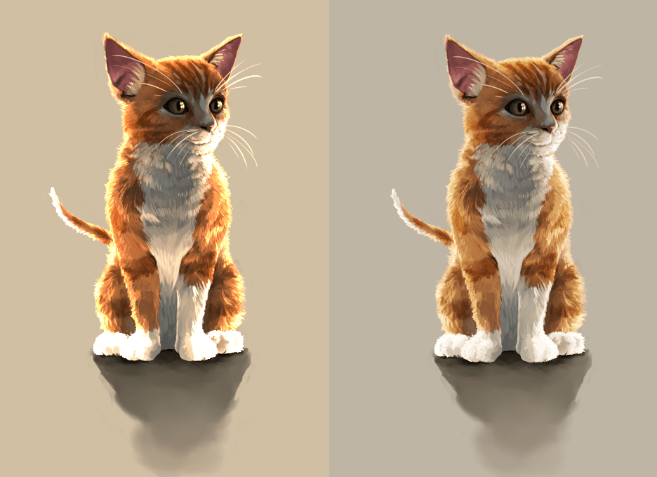
Above, an example of the more naive transform provided by going from scene-linear sRGB to regular sRGB, and to the right a more sophisticated transform coming from the filmic blender OCIO configuration. Look at the difference between the paws. Image by Wolthera van Hövell tot Westerflier, License: CC-BY-SA
Conversely, transforming and interpreting your image’s colors is the only thing OCIO can do, and it can do it with really complex transforms, really fast. It doesn’t understand what your image’s color space is originally, doesn’t understand what CMYK is, and there’s also no such thing as a OCIO color profile. Therefore you will need to switch to an ICC workflow if you wish to prepare for print.
Yes, but what is the point?
The point is making things easier in the long run:
It is easier to keep saturated non-muddy colors in a linear space.
The high bit depth makes it easier to get smoother color mixes.
Filters are more powerful and give nicer results in this space. It is far more easy to get nice blurring and bokeh results.
Simple Blending Modes like Multiply or Addition are suddenly black magic. This is because Scene-Linear is the closest you can get to the physical (as in, physics, not material) model of color where multiplying colors with one another is one of the main ways to calculate the effect of light.
Combining painting with other image results such as photography and physically based rendering is much easier as they too work in such a type of colorspace. So you could use such images as a reference with little qualms, or make textures that play nice with such a renderer.
So the advantages are prettier colors, cooler filter results, more control and easier interchange with other methods.
Okay, but why isn’t this all the rage then?
Simply put, because while it’s easier in the long run, you will also have to drop tools and change habits…
In particular, there are many tools in a digital painter’s toolbox that have hard-coded assumptions about black and white.
A very simple but massive problem is one with inversion. Inverting colors is done code-wise by taking the color for white and subtracting the color you want to invert from it. It’s used in many blending modes. But often the color white is hardcoded in these filters. There’s currently no application out there that allows you to define the value range that inversion is done with, so inverting is useless. And that also means the filters and blending modes that use it, such as (but not limited to)…
Screen (invert+multiply+invert)
Overlay (screens values below midtone-value, in sRGB this would be middle gray)
Color-dodge (divides the lower color with an inversion of the top one)
Color-burn (inverts the lower color and then divides it by the top color)
Hardlight (a different way of doing overlay, including the inversion)
Softlight (uses several inversions along the way)
Conversely Multiply, Linear Dodge/Addition (they’re the same thing), Subtract, Divide, Darker (only compares colors’ channel values), Lighter (ditto), and Difference are fine to use, as long as the program you use doesn’t do weird clipping there.
Another one is HSL, HSI and HSY algorithms. They too need to assume something about the top value to allow scaling to white. HSV doesn’t have this problem. So it’s best to use an HSV color selector.
For the blending modes that use HSY, there’s always the issue that they tend to be hardcoded to sRGB/Rec. 709 values, but are otherwise fine (and they give actually far more correct results in a linear space). So these are not a good idea to use with wide-gamut colorspaces, and due to the assumption about black and white, not with scene linear painting. The following blending modes use them:
Color
Luminosity
Saturation
Darker Color (uses luminosity to determine the color)
Lighter Color (Ditto)
So that is the blending modes. Many filters suffer from similar issues, and in many applications, filters aren’t adjusted to work with arbitrary whites.
Speaking of filters, when using the transform tool, you should also avoid using lanczos3, it’ll give a weird black halo to sharp contrasts in scene-linear. The bilinear interpolation filter will work just fine in this case.
The second big problem is that black doesn’t work quite the same.
If you have mixed pigments before, you will know that black can quite easily overpower the other colors, so you should only add the tiniest amount of it to a mixture. White in contrast gets dirtied quite easily.
In a Scene Linear Color space, this is flipped. White is now more overpowering and black gets washed out super quickly. This relates to the additive nature of digital color theory, that becomes more obvious when working in linear.
This makes sketching a bit different, after all, it’s really difficult to make marks now. To get around this, you can do the following:
Sketch on a mid-gray background. This is recommended anyway, as it serves as a neutral backdrop. For a linear space, 18% or 22% gray would be a good neutral.
Make a special brush that is more opaque than the regular sketching brushes you use.
Or conversely, sketch with white instead.
For painting, block out the shapes with a big opaque brush before you start doing your mixing.
Overall, this is something that will take a little while getting used to, but you will get used to it soon enough.
Finally, there’s the issue of size.
16 bit float per channel images are big. 32 bit float per channel images are bigger. This means that they will eat RAM and that painting and filtering will be slower. This is something that will fix itself over the years, but not many people have such a high-end PC yet, so it can be a blocker.
So the issues are tools, expectations and size.
In Summary
Scene Linear Painting is painting an image in a color space that is linear and has a floating point bit depth. This does not assume anything about the values of black and white, so you can only use tools that don’t assume anything about the values of black and white. It has the advantage of having nicer filter results and better color mixtures as well as better interoperability with other scene-linear output.
To be able to view such an image you use a view transform, also called a display conversion. Which means that if you wish to finalize your image for the web, you make a copy of the image that goes through a display conversion or view transform that then gets saved to PNG, JPEG or TIFF.
Getting to actual painting
Now we’ve covered the theory, let us look at a workflow for painting scene linear.
Setting up the Canvas
Select either a 16bit or 32bit image. By default Krita will select a linear sRGB profile. If you want to create images for HDR display, you will need to make sure that the profile selected is the Rec2020-elle-V4-g10.icc profile. HDR images are standardised to use the Rec. 2020 gamut, which is much larger than sRGB in size, so this ensures you’ve got access to all the colors.
If you’re working on a non-HDR enabled monitor, you should enable OCIO in the LUT docker.
Keep in mind everything mentioned above. Not all filters and not all blending modes work. This will improve in the future. Other than that, everything else is the same.
Picking really bright colors
Picking regular colors is easy, but how do we pick the really bright colors? There are three ways of getting access to the really bright colors in Krita:
By lowering the exposure in the LUT docker. This will increase the visible range of colors in the color selectors. You can even hotkey the exposure in the canvas input settings.
By setting the nits slider in the Small Color Selector higher than 100.
Or simply by opening the internal color selector by double clicking the dual color button and typing in values higher than 1 into the input field.
And finally by picking a really bright color from an image that has such values.
Then paint. It’s recommended to make a bunch of swatches in the corner, at the least, until Krita’s new Palette docker allows you to save the values properly.
Lighting based workflow
So, we have our typical value based workflow, where we only paint the grays of the image so that we can focus on the values of the image. We can do something similar with Scene Linear Painting.
Where with the value based workflow you paint the image as if it were a grayscale of what you intended to paint, with a lighting based workflow you paint as if all the objects are white. The effect of the color of an object can be determined by multiplying its base color with the color of the light. So you could paint objects as if they were white, paint the colors on a separate layer and just use the Multiply blending mode to get the right colors.
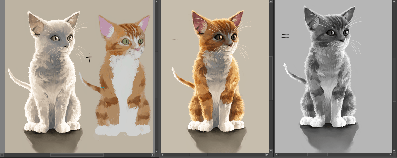
The leftmost image is both the lighting based one and the color layer separate, the middle with the two layers multiplied and the right a luminosity based view. This cat is a nice example as it demonstrates why having textures and lighting separate could be interesting.
You can even combine this with a value based workflow by opening a new view and setting the component to luminosity. That way you can see both the grayscale as well as the lighting based version of the image next to one another.
The keen minded will notice that a lighting based workflow kind of resembles the idea of a light pass and a color pass in 3d rendering. And indeed, it is basically the same, so you can use lighting passes from 3d renders here, just save them as EXR and import them as a layer. One of the examples where scene linear painting simplifies combining methods.
Finishing up
When you are done, you will want to apply the view transform you have been using to the image (at the least, if you want to post the end result on the Internet)… This is called LUT baking and not possible yet in Krita. Therefore you will have to save out your image in EXR and open it in either Blender or Natron. Then, in Blender it is enough to just use the same OCIO config, select the right values and save the result as a PNG.
For saving HDR images, check the HDR Display page.
You can even use some of Blender’s or Natron’s filters at this stage, and when working with others, you would save out in EXR so that others can use those.