
色彩校样
备注
色彩校样仅在启用画布显卡加速时才能生效。
如果我们需要打印 Krita 制作的图像,我们有时会发现屏幕上显示的效果跟打印出来的效果不太一样。有时候颜色深了,有时候颜色浅了,有时候红色会更冲,有时候反差弱化了。如果只是在打印一些简单的文档,这点小事没什么大不了的。然而到了专业印刷场景里这就是印刷事故了,毕竟颜色的偏差可能会严重影响图像的视觉效果。
为什么会发生偏色呢?这是因为显示器使用的 RGB 色彩模型和打印机的 CMYK 模型不同,打印机能够使用的色域往往更小。
有些人会天真地以为:那我们在 CMYK 色彩模型下面工作不就行了嘛!但这种想法其实有三大问题:
在 CMYK 空间下绘画并无法保证颜色就一定能与打印机的输出效果完全一致。因为不同的油墨、纸张和印刷设备的组合会产生无数的色域变化,每个不同组合都会有一个与之匹配的特性文件。
即使你的工作特性文件和打印机的输出特性文件完全一致,CMYK 本身依然是一种难以预测的色彩空间。色彩运算在 CMYK 空间下面的结果要比在其他空间中的要差,混合模式的结果也跟其他空间下面的大不相同。
最后,在一个特定的 CMYK 空间下面工作意味着制作的文件会被限制在该空间狭窄的色域里。如果你要为另一个不同的 CMYK 特性文件作印前准备,由于纸张、打印机和油墨发生了变化,可以使用的色域说不定就变大了,可是你的旧文件却无法发挥新设备的潜力。
所以在理想状况下,你应该在 RGB 空间下面绘制图像,使用你习惯的 RGB 图像工具,然后让计算机随时切换到某个 CMYK 空间下面对颜色进行校对。这种技术早已成为现实,我们把它叫做“色彩校样(电子校样)”。
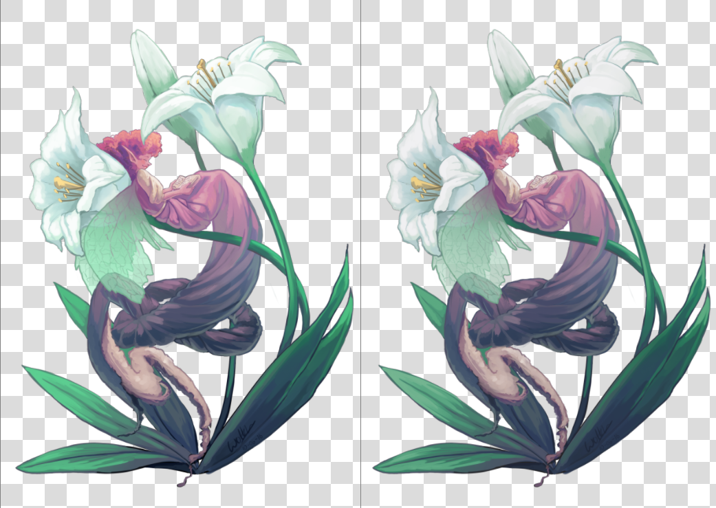
左边的是原图,右边的是一个色彩校样功能启用后的视图。两者的区别相当微妙,这是因为原图并未使用特别明亮的颜色。但我们不难发现在右边的色彩校样视图里,花朵的白色没有原图那么偏青蓝,而叶子的绿色也没有原图那么鲜艳。
您可以使用 Ctrl + Y 快捷键在任意图像上打开/关闭色彩校样。与其他程序不同,Krita 支持为每个视图设置不同的色彩校样,因此您可以并排查看色彩校样开、关状态的两个视图。每个 ``.kra``图像本身也可以保存自己的色彩校样配置,前往主菜单的 页面,启用 存储色彩校样设置到图像 即可。如果不启用该选项,那么 Krita 将使用主菜单的 页面中的全局设置。更多相关信息请参见 此页面 。
备注
启用 存储色彩校样设置到图像 时,Krita 将把整个色彩校样 ICC 特性文件嵌入到 .kra 文件中。某些输出设备的 ICC 特性文件可能体积较大,尤其是 CMYK 特性文件。
色彩校样功能有下列选项:
- 色彩模型、特性文件
这三个选项里只有“特性”一项是特别重要的。特性文件是色彩校样的目标文件。在专业打印流程中,此特性文件应该由印刷公司决定。
- 渲染意图
在此选择色彩校样使用 校样输出设备 特性文件转换图像时的渲染意图,每种意图的具体含义在 色彩管理流程 页面中有详细介绍。此意图应与您的印刷厂使用的印前转换意图一致。如果您的印刷厂内部不进行印前转换,则您应在发送文件给他们之前自行完成转换。
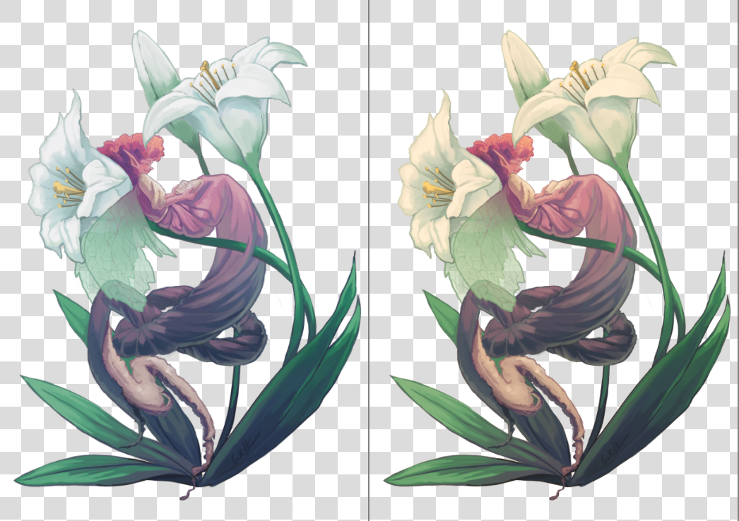
左图:启用绝对色度意图颜色适应的已校样图像;右图:禁用绝对色度意图颜色适应的已校样图像。
- 黑点补偿
在将图像转换到 校样输出设备 特性文件时启用黑点补偿。关闭此选项会将深色值裁剪为屏幕和色彩校样特性文件所能处理的最小值,而开启此选项则会将黑色以屏幕的亮度范围进行缩放,从而呈现图像完整的灰度范围。和 渲染意图 一样,此值应与印刷厂将图像转换到设备特性文件时使用的值一致。
- 显示模式
控制校样空间 (可能经过裁剪) 在屏幕上的呈现方式,即使用何种渲染意图和标志将颜色从 校样输出设备 特性文件转换为 屏幕 特性文件。
使用全局显示设置 指示 Krita 使用在主菜单的 页面设置的全局设置。
模拟纸张白点和黑点 用于在当前显示器上预览纸张的白点 (或“色调”)。换句话说,不管纸张是哑光的、金属光泽的,亦或是带有复古褐色照片的特性,都可以在屏幕上进行模拟。请注意,观察条件的白点仍将调整为屏幕的白点。这意味着您无法直观地比较物理打印件和屏幕显示的图像,除非这三个白点一致:纸张特性文件的白点、显示器特性文件的白点以及照亮您的物理打印件的灯泡的白点。
自定义 允许手动配置最终的转换步骤。您可以根据目标配置转换管线:
- 预览图像的色域 (色彩丰富程度)
渲染意图 –> 相对色度
黑点补偿 –> 启用
备注
如果您想要使用 色域超出警告色 ,最好在此模式下使用它们。
- 预览由纸张颜色导致的对比度下降情况
渲染意图 –> 绝对色度
绝对色度意图颜色适应 –> 启用
警告
如果您正在使用 Wayland 显示合成器,绝对色度意图可能会工作异常 (即使在 XWayland 模式下也是如此)。不仅如此,在不同的版本中,异常的表现形式也可能各不相同。
在 KWin 6.4.x 及更早版本中, 绝对色度 将按照 绝对色度意图颜色适应 被 始终禁用 的状态工作。如果打印机和显示器特性文件的白点 (sigChromaticAdaptationTag) 不一致,这将导致严重的颜色偏移。
在 KWin 6.5.x 及更高版本中, 绝对色度 将按照 绝对色度意图颜色适应 被 始终启用 的状态工作。只要您 保持该复选框被选中 ,该功能将正常工作,并允许您预览对比度降低后的效果,但您将无法获得禁用对显示器空间进行颜色适应所带来的高级效果。
这是 Wayland 协议规范中存在的问题。此问题的修复思路 在此页面 有所讨论。
- 色域超出警告色
设置 色域超出警告色 的颜色。
要更改 Krita 的默认色域超出警告色,请前往菜单栏的 页面进行配置。
为了确保选项配置正确,我们推荐把图像在安装正确的打印机上进行试印,然后把样张跟屏幕色彩校样的效果进行比对,以决定是否进一步调整色彩校样的选项。
超出色域警告
超出色域警告色,也叫做色域警告,是色彩校样的一个附加功能。它使用被指定的警告色来标记那些无法被包含在色彩校样特性文件色域内的颜色。
此功能有助于发现潜在的反差损失,让你可以有针对性地调低图像的色彩反差。
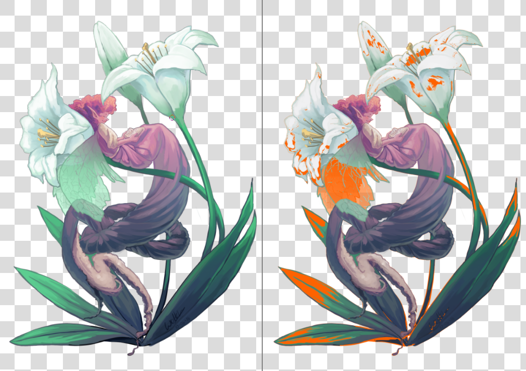
左图:原图视图,右图:启用了色域警告色的色彩校样视图。Krita 会在 KRA 图像的色彩校样选项中保存色域警告色。你可以为你的当前图像选择一种易于发现的警告色。
要激活色域警告色,按 Ctrl + Shift + Y ,但要让此功能完整地工作,你必须同时激活色彩校样功能。
备注
色彩校样在浮点空间下面无法正常工作,会造成错误的色域警告色显示。因此在浮点空间下色彩校样会被禁用。
警告
色域警告色有时候会在线性特性文件下面对暗部颜色给出莫名其妙的警告。这是 LittleCMS 的一个程序缺陷,你可以 在此 阅读相关信息。