
特殊界面控件
数字输入框内计算功能
Krita 可以在数字输入框中直接进行简单的数学计算。除了基本的数字输入框外,选中数字调整框的数字、或者在滑动条上右键点击时也可以激活数字输入功能。目前 Krita 还不能进行单位转换,不过我们计划实现这项功能。
可用函数
- 加法 ( 运算符:+ )
把数字相加。用法:
50+100输出:150- 减法 ( 运算符:- )
用前一个数字减去后一个数字。用法:
50-100输出:50- 乘法 ( 运算符:* )
把各数字相乘。用法:
50*100输出:5000- 除法 ( 运算符:/ )
从前一个数字中除去后一个数字。用法:
50/100输出:0.5- 乘方 ( 运算符:^ )
把后一个数字作为前一个数字的指数并求出结果。用法:
2^8输出:256- 正弦 (运算符:sin() )
求给定角度的正弦值。用法:
sin(50)输出:0.76- 余弦 ( 运算符:cos() )
求给定角度的余弦值。用法:
cos(50)输出:0.64- 正切 ( 运算符:tan() )
求给定角度的正切值。用法:
tan(50)输出:1.19- 反正弦 ( 运算符:asin() )
正弦的反函数,求给定正弦值的角度。用法:
asin(0.76)输出:50- 反余弦 ( 运算符:acos() )
余弦的反函数,求给定余弦值的角度。用法:
acos(0.64)输出:50- 反正切 ( 运算符:atan() )
正切的反函数,求给定正切值的角度。用法:
atan(1.19)输出:50- 绝对值 ( 运算符:abs() )
求给定值的非负值。用法:
abs(75-100)输出:25- 指数函数 ( 运算符:exp() )
求给定值应用到值 e 上的指数函数。用法:
exp(1)输出:2.7183- 自然对数 ( 运算符:ln() )
求给定值的自然对数,它是 exp () 的反函数。用法:
ln(2)输出:0.6931
Krita 在技术上支持下列函数,但存在程序问题:
- 常用对数 ( 运算符:log10() )
求给定值的对数。用法:
log10(50)输出:0.64
运算顺序
Krita 采用国际通用的运算顺序规则。以下面的这条数学表达式为例:
2+3*4
在没有任何规则的情况下,这条表达式可以有两种解读方式。你可以把这条表达式解读为 2+3 = 5,然后 5*4 =20。你也可以把它解读为 3*4 = 12,然后 2+12 = 14。
Krita 的运算顺序是:乘方、乘除、加减。因此在上面的例子中,Krita 会先进行进行乘法运算,然后进行加法运算,得到的结果是 14。
我们还可以使用括号来规定运算的先后顺序。要在上面的例子中得到 20,我们可以对表达式进行如下修改:
( 2+3 )*4
Krita 会在解读表达式时把括号考虑在内,因此会得出 20 的结果。
错误提示
在某些情况下,运算的结果会变成红色。这意味着你的表达式有问题,Krita 无法对其进行解析。点击输入框重新输入即可。
滑动条
Krita 使用滑动条来控制笔刷大小、不透明度、流量、调整色相、饱和度等数值。下面是一个 Krita 滑动条的例子。
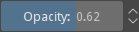
滑动条的整个宽度就是该数值的可调范围,颜色条带是当前值在该范围内的相对位置。点击滑动条的任意位置,当前值就会随之改变。您还可以按 下方向键 或 左方向键 下调数值,按 上方向键 或 右方向键 上调数值。
某些滑动条除了全范围外,还可能带有一个由全范围中最常见的值构成的子范围。当滑动条支持在这两个范围之间切换时,会在升降按钮旁边显示一个带有圆圈图标的按钮。点击该按钮可在全范围和子范围之间切换。
要通过键盘输入特定数字,请在滑动条上  双击左键,或
  单击右键,还可以按任意数字键,这样即可输入精确的数值,按 回车键 提交。此控件同时还是 数学输入框 ,支持输入复杂的数学表达式。要取消编辑且不提交,请按 Esc 键。
按住 Shift 键并拖动滑动条可以进行微调,按住 Ctrl 键拖动滑动条将按照最接近的值步跳跃 (每种滑动条的值步不尽相同)。
在 5.1 版本发生变更: 拖动时按住 Shift 键可以切换到“相对模式”,允许在滑动条外面拖动时以不同的速率调整数值。
角度选择器
Krita 使用这类控件来处理某些角度和旋转。下图列举了 Krita 的各种角度选择器的样式。

角度选择器以度为单位,由三部分组成:一个圆盘控件、一个 数学输入框 和一些用于快速重置、翻转角度的快捷操作按钮。
您可以在圆盘控件上点击鼠标左键并拖动来直观地设置新的角度。新角度是根据光标相对于圆盘中心的相对位置计算得出的,默认情况下,如果鼠标光标远离圆盘,角度将无级调整,甚至包括小数(如果支持),但如果在拖动时鼠标光标始终靠近圆盘,角度将以 15 度的倍数跳跃。这使得仅通过鼠标或触控笔就能以不同方式轻松设置角度。此行为可以通过使用键盘修饰键进行更改,默认操作是:如果在拖动时按住 Ctrl 键,那么无论光标与圆盘的距离远近,角度都将始终以 15 度的倍数跳跃;如果在拖动时按住 Shift 键,则角度将始终无级调整;如果在拖动时同时按下 Ctrl 和 Shift 键,角度将以整数调整 (尽在角度选择器允许小数时有用)。
数学输入框可以直接输入精确角度。
有些角度选择器支持水平、垂直或对角线翻转角度,另一些则支持重置角度 (通常是零度)。不同的角度选择器调用这些操作的方式也不一样。大多数情况下,快速翻转角度操作会被显示为三个按钮。但当用户界面空间不足时,这些按钮可能会被整合到一个下拉菜单中,甚至完全隐藏,只显示圆盘控件和数学输入框。不过,无论显示与否,这些功能始终可以通过右键单击圆盘来调用。此外,在圆盘控件上双击鼠标左键即可重置角度。
曲线编辑器
Krita 通过曲线控制器来编辑控制笔刷、滤镜或者其他工具的某些属性。下图为 Krita 的“曲线 - 颜色调整”滤镜中的曲线编辑器。
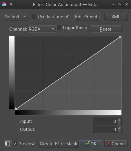
在曲线编辑对话框中,可以在曲线上创建一些锚点来控制曲线的走向。一般情况下,曲线会平滑地 (不产生任何尖角) 穿过所有锚点,除非给定的点被标记为尖角锚点。曲线在经过尖角锚点时不会施加平滑度约束,从而允许曲线走向出现急转弯。
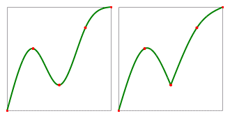
上图演示了一般的平滑锚点与尖角锚点的区别。曲线为绿色,红点是锚点。左图:所有锚点为平滑锚点;右图:第三个锚点改为尖角锚点。
左键点击任意锚点即可选中,拖动则可移动,在没有锚点的地方点击可创建新锚点并自动选中。移动锚点时按 Esc 键可取消编辑,锚点将返回被拖动前的位置。
如果在单击锚点时按住 Ctrl 键,则在平滑锚点和尖角锚点之间切换。选中锚点后按 S 键也可切换。如果在没有锚点的地方按住 Ctrl 键并单击,则创建新的尖角锚点。
如果将锚点拖到曲线控制区域之外,该锚点将被移除。如果在移除后不松开鼠标键,可以将鼠标重新拖回曲线控制区域内以恢复该点。而如果在移除后松开了鼠标键,则该点将无法恢复。您也可以先选中一个锚点,然后按 删除 键或 退格键 键将其移除。
按 A 键可以在曲线的正中间插入一个锚点。
渐变
Krita 的 渐变 的渐变有两种类型:片段渐变 (GIMP) 和色标渐变 (SVG)。它们的具体实现方式有一定区别,但它们的渐变编辑器的用法是相似的。
色标渐变编辑器
下面将展开介绍色标渐变编辑器的界面:
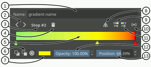
名称输入框 - 你可以在此输入框填写渐变的名称。
色标选择按钮 - 点击左/右箭头按钮可以切换到上一个/下一个色标。
当前色标编号 - 显示当前选中的色标编号。
删除色标按钮 - 点击此按钮将删除当前色标。
渐变滑动条 - 渐变滑动条是此编辑器的核心,它显示了渐变的预览效果,你还可以在滑动条上进行以下操作来调整渐变:
添加色标:在渐变条上左键点击
即可添加一个色标。选择和拖动色标:左键点击
一个色标 (滑动条底部的水滴型图标) 可以选中并拖动它。删除色标:将色标拖到滑动条外可以删除它;点击 删除色标 按钮可以删除当前色标。
修改色标颜色:双击
色标或者按 回车键 可以打开颜色选择对话框,你可以在这里通过多种方式选择想要的颜色。移动色标:鼠标滚轮
 或左、右方向键可以移动当前选中的色标。按住 Shift 时色标的移动幅度会变小。
切换色标:按住 Ctrl + 鼠标滚轮
或者 Ctrl + 左方向键、Ctrl + 右方向键 可以切换到上一个或者下一个色标。
颜色类型 - 你可以在此选择色标的颜色类型 (前景色、背景色、自定义颜色)。
颜色按钮 - 如果当前选中的色标使用的是自定义颜色,点击此按钮即可打开颜色选择对话框。
翻转渐变 - 点击此按钮可以将渐变的色标位置左右翻转。
按明度排序色标 - 点击此按钮将按照颜色的明度对色标进行排序。
平均分布色标 - 点击此按钮将使色标之间的距离相等。
按色相排序色标 - 点击此按钮将按照颜色的色相对色标进行排序。
不透明度滑动条 - 如果选中的色标使用了自定义颜色,你可以使用此滑动条更改颜色的不透明度。
位置滑动条 - 你可以使用此滑动条来对色标的位置进行微调。
片段渐变编辑器
乍看之下,片段渐变编辑器和色标渐变编辑器在外观上非常相似。片段渐变的独特之处在于它可以操作三种要素:片段、色标、中间点。选中其中一种要素后,渐变滑动条和它下面的控件会随之变化,提供不同的控制选项。例如,选中片段时可以更改左侧和右侧颜色 (还有其他操作);选中中间点时则只能更改它的位置。
接下来我们将介绍在选中了不同片段渐变要素时,渐变编辑器将显示的各种选项。
- 片段渐变编辑器界面整体介绍
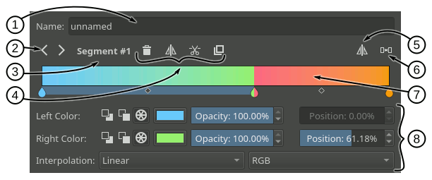
名称输入框 - 你可以在此输入框填写渐变的名称。
要素切换按钮 - 点击左/右箭头按钮可以切换到上一个/下一个要素。
当前要素名称 - 显示当前选中的渐变要素类型以及它的编号。
要素操作按钮 - 按照当前选中的渐变要素类型显示不同的功能按钮。
翻转渐变 - 点击后将左右翻转整段渐变的所有颜色。
平均分布片段 - 点击后将使每个片段的宽度相等。
渐变滑动条 - 此滑动条是渐变编辑器的核心部件。它显示了渐变的颜色预览,你可以在它上面进行一些基本的颜色操作,它的相关功能将在下文展开介绍。你可以使用下列快捷键左右切换渐变要素:按住 Ctrl + 鼠标滚轮
或者按住 Ctrl + 左方向键 and Ctrl + 右方向键。要素属性选项 - 此区域显示了当前所选渐变要素的属性控件,让你可以对要素的属性进行精细控制。
- 片段模式界面介绍
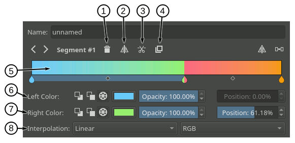
删除片段 - 点击此按钮删除选中的片段 (除非它是整个渐变的唯一片段)。
翻转片段 - 点击此按钮可以左右翻转所选片段的左侧和右侧颜色,以及它的中间点位置。
拆分片段 - 点击此按钮将以中间点为界拆分所选片段。
复制片段 - 点击此按钮将创建所选片段的副本到它的右侧。
渐变滑动条 - 你可以在渐变滑动条上对片段进行下列操作:
选择色标:在色标 (水滴图标) 以外的位置、或者中间点 (菱形图标) 上左键点击
。移动片段:在色标 (水滴图标) 以外的位置、或者中间点 (菱形图标) 上进行拖动。也可以在片段上使用鼠标滚轮
或者 左方向键 和 右方向键。按住 Shift 进行滚轮和键盘移动时移动幅度将会变小。位于渐变最左侧和最右侧的片段不可移动。删除片段:选中一个片段后点击删除按钮,或者按 Delete 键。也可以将片段拖到滑动条外面删除。
拆分片段:按住 Ctrl + 左键点击
片段,这将在点击位置拆分该片段。复制片段:按住 Shift + 左键点击
。
左侧颜色 - 你可以使用这一行选项更改片段起点 (左端点) 的各种属性:
前三个按钮用于切换色标的颜色类型 (前景色、背景色、自定义颜色)。
颜色类型为前景色或背景色时,右侧将显示透明选框。颜色类型为自定义时,右侧将显示颜色选择按钮和不透明度滑动条。
最右边显示了一个位置滑动条,用于微调当前片段的起点 (左端点) 。这将同时调整它的终点 (右端点)。
右侧颜色 - 你可以使用这一行选项更改片段终点 (右端点) 的各种属性。具体功能和左侧颜色中的完全相同。
插值方式 - 这一行选项用于设置片段填充渐变色的插值类型和色彩模型。
- 色标模式界面介绍
提醒:片段渐变由一系列渐变片段组成,它实际不存在色标这一概念。渐变编辑器中显示的色标只是为了编辑方便而已。在修改一个色标的属性时,你实际上在同时修改左侧片段的起点和右侧片段的终点的属性。
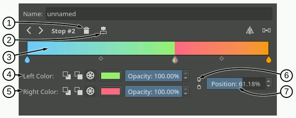
删除色标 - 点击此按钮将删除所选色标。程序的实际操作则是将左右两个片段结合起来,使用左侧片段的起点和右侧片段的终点。
居中色标 - 点击此按钮将把所选色标相对于左侧片段起点和右侧片段终点居中。
渐变滑动条 - 你可以在渐变滑动条上对色标进行下列操作:
选择色标:左键点击
色标 (水滴图标)。移动片段:点击色标 (水滴图标) 进行拖动。也可以先选中一个色标,然后使用鼠标滚轮
或者 左方向键 和 右方向键移动。按住 Shift 进行滚轮和键盘移动时移动幅度将会变小。位于渐变最左侧和最右侧的色标不可移动。删除片段:选中一个色标后点击删除按钮,或者按 Delete 键。也可以将片段拖到滑动条外面删除。
插入色标:按住 Ctrl + 左键点击
渐变滑动条上没有色标或中间点的位置。和前述的拆分片段操作相同。
左侧颜色 - 你可以使用这一行选项更改色标左侧片段的各种属性:
前三个按钮用于切换色标的颜色类型 (前景色、背景色、自定义颜色)。
颜色类型为前景色或背景色时,右侧将显示透明选框。颜色类型为自定义时,右侧将显示颜色选择按钮和不透明度滑动条。
右侧颜色 - 你可以使用这一行选项更改色标右侧片段的各种属性。具体功能和左侧颜色中的完全相同。
链接颜色 - 启用此选项后,色标左右颜色将同步更新。更改左侧颜色属性时将同时更改右侧颜色属性,反之亦然。
位置 - 你可以使用此滑动条微调色标的位置。它将更改左侧片段的终点位置和右侧片段的起点位置。
- 中间点模式界面介绍
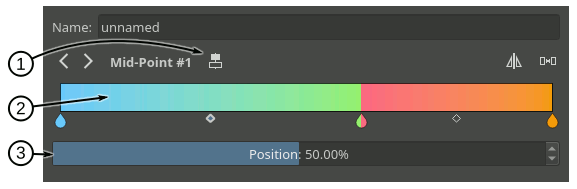
居中中间点 - 点击此按钮将居中所选的中间点。
渐变滑动条 - 你可以在渐变滑动条上对中间点进行下列操作:
选择中间点:左键点击
菱形图标。移动中间点:点击中间点 (菱形图标) 进行拖动。也可以先选中一个中间点,然后使用鼠标滚轮
或者 左方向键 和 右方向键。按住 Shift 进行滚轮和键盘移动时移动幅度将会变小。
位置 - 你可以使用此滑动条微调所选片段的中间点位置。
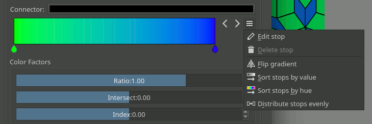
紧凑式渐变编辑器
Krita 会在某些场合显示紧凑式的渐变编辑器,以节省屏幕空间。在紧凑版编辑器中,各个模式的功能按钮将显示在按钮菜单中,如下图所示。
常规渐变编辑器
如果你发现渐变编辑器和渐变预设选择器并列显示,你应该是在使用常规渐变编辑器。此模式可以简化渐变的创建和操作。
它包括以下主要功能:
从渐变选择器加载渐变到编辑器,或者从渐变编辑器保存渐变到选择器。
可以覆盖已有的渐变资源。
按照选中的渐变类型 (色标渐变或者片段渐变) 自动切换编辑器。
在不同渐变类型之间转换。
下面将展开介绍编辑器的界面:
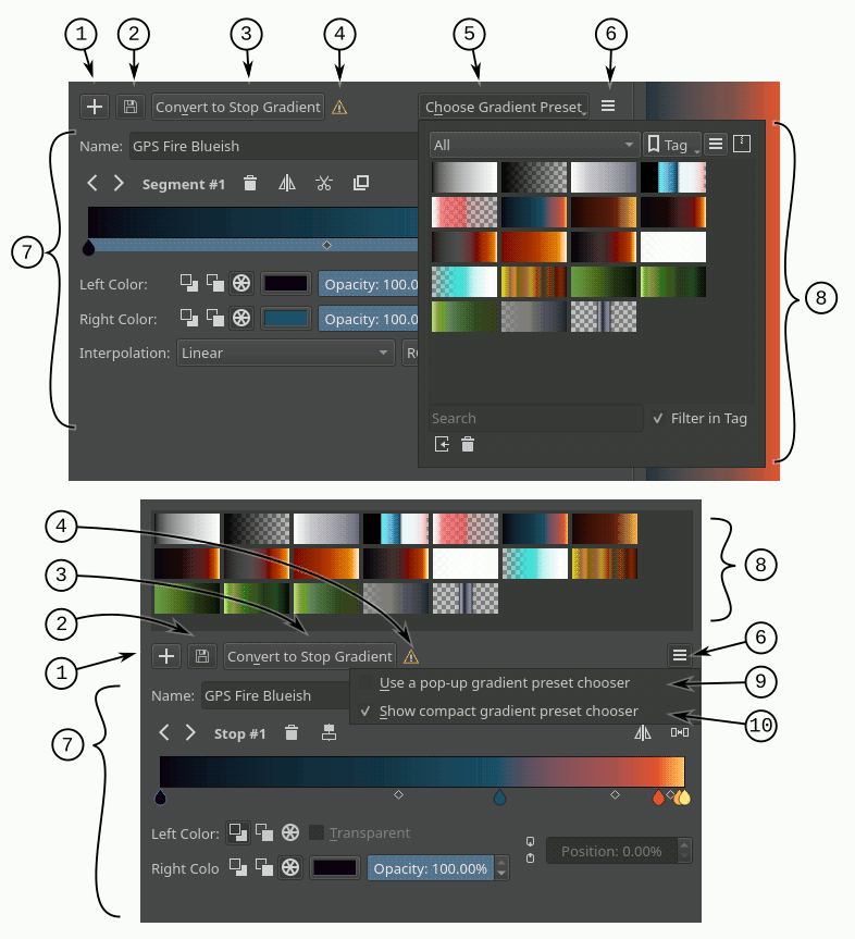
添加渐变按钮 - 点击此按钮可将当前渐变添加为新资源。
更新渐变按钮 - 点击此按钮将用当前渐变覆盖在渐变选择器中选中的渐变资源。两者的渐变类型必须相同才能覆盖。
转换渐变按钮 - 点击此按钮将把当前渐变从色标渐变转换为片段渐变,或者从片段渐变转换为色标渐变。
转换渐变警告 - 如果渐变转换时会损失数据或颜色信息,此图标将会显示。例如在转换片段渐变到色标渐变时。
渐变预设按钮 - 点击此按钮将弹出显示渐变预设选择器,你可以在此选择一个预设进行编辑。此按钮仅在勾选了“使用弹出式渐变预设列表”时显示。
选项按钮 - 点击此按钮将显示选项菜单。
渐变要素编辑器区域 - 此区域会为不同类型的渐变和要素显示对应的选项。这些选项的用法请参见本文之前章节的介绍。
渐变预设选择器 - 显示一系列渐变预设资源和它们的预览图,点击即可将它们加载到编辑器中。
使用弹出式渐变预设列表 - 勾选此项时,渐变预设选择器将通过点击“选择渐变预设”按钮弹出显示。不勾选此项时,渐变预设选择器将显示在编辑器顶部。
使用紧凑式渐变预设列表 - 勾选此项时,渐变预设选择器仅列出渐变预设,不显示任何按钮和选项。不勾选此项时,渐变预设选择器将显示额外的按钮,例如标签过滤或视图选项等。