Heightmap Bristle Brush Tips
When looking at oil paintings, especially the impressionistic ones, it is hard not to be in awe of the effect the visible brush strokes have on the painting. While a digital painting program is a fundamentally different medium from the oil paint one, we can utilize some tricks to get visible brush strokes.
The simplest way to get a visible brush stroke is to select a predefined brush. If you select one with several separate dots, and lower the spacing to 0.02, you can get a sort of brush stroke effect. But we can do better, for example, how about a brush which gives more coverage, the harder you press?

Using the sharpness option.
We can achieve that effect with the sharpness option. Consider the following brush tip. We’ve used the gradient tool to draw two concentric foreground-to-transparent gradients side by side on a white-filled layer. Then we used the elliptical selection tool with to cut out an ellipse shape, and then used the clipboard option in the predefined brush chooser to create a new brush.

By default, this isn’t a very interesting brush. But when selecting the Sharpness option available in the pixel brush engine, it gives a totally different result:

The darker areas of the brush will be drawn first, and the lightest areas of the brush only at very high pressure. By adding more soft dots to the whole, we can get an even more interesting brush:

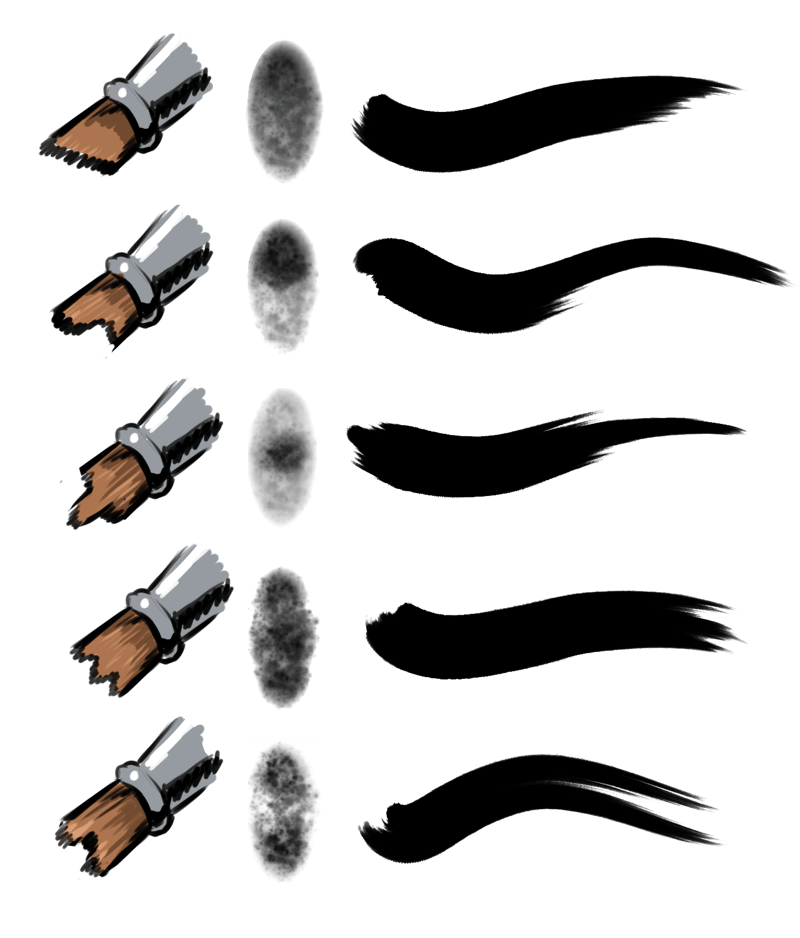
In effect, we are creating a kind of heightmap here. With the darkest dots representing the longest hairs, and the lightest pixels the shortest. With some effort, you can represent a ton of different brushes this way:

By putting the darkest spot into different locations, we can get a variety of strokes.
But we can go even further. For example, how about making this a lightness brush? This can be done by…
Opening the brush in Krita.
Inverting via
Duplicating the layer.
Then using on the topmost layer.
Then select the lowest layer.
 for the context menu, then select .
Finally, to soften the result, you can merge the layer and apply a bit of motion blur. Especially when using together with rotation set to drawing angle or tilt, some plain horizontal motion blur will reduce stray pixel artifacts.
Then select all, copy, and use the clipboard function in the predefined brushes menu, and make sure to untick Create Mask From Color. What we’re effectively doing here is ensuring that the transparency is being used for the sharpness, while having the color be using for the lightness map.
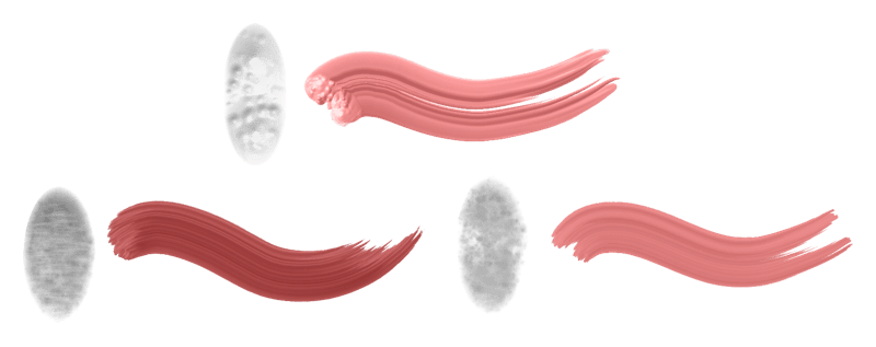
Now select the brush and set the Brush mode to Lightness Map, and draw with a color that isn’t black for the best effect.

A variety of brushes are made with the lightness method. You can adjust the brush by changing the neutral tone, brightness and contrast in the brush settings, or by adjusting these beforehand while making the brush. A good lightness brush has both a bit of darkness and brightness.
Tip
For Step 4 you can also use the edge detection filter (with modes set to ‘top edge’ or ‘bottom edge’) or the emboss filters.
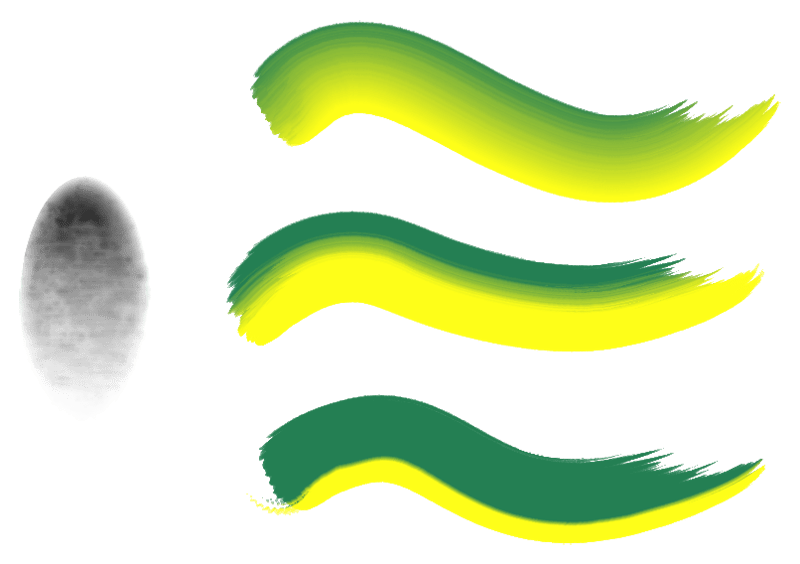
We can also do similar things for the gradient brush tip:

The above effect is all achieved with the same brush tip set to Gradient Map. By increasing the contrast or changing the neutral tone, the center point of the gradient is adjusted, giving different options in the same brush.
However, this sharpness option is not available for the color smudge brush, so what to do there?
Animated pressure brush
You can make brush tips that are animated.
If we take our example brush, and duplicate that layer 16 times or so.
Now, for each layer, start at the top, going to the bottom, you will want to apply the , with different values. Starting from 255, and then each time, decrease the value by 16. So, the topmost layer should be at 255, next layer 240, the layer after that 224 and so forth. Eventually, you should have each layer have less coverage than the one above that. Now, go to the predefined brushes tab, and select Stamp. There select Animated for Style and Pressure for Selection Mode.
If everything went right, you now have a brush-tip that can be used with the color smudge brush. For a brush that uses the gradient map, or the lightness mode, a similar principle applies, except you first  for the context menu, then select , and then only apply the threshold to the transparency mask. A softer result can be made by using the or to isolate the pixels for the given amount of pressure.
