Inking
The first thing to realize about inking is that unlike anatomy, perspective, composition or color theory, you cannot compensate for lack of practice with study or reasoning. This is because all the magic in drawing lines happens from your shoulder to your fingers, very little of it happens in your head, and your lines improve with practice.
On the other hand, this can be a blessing. You don’t need to worry about whether you are smart enough, or are creative enough to be a good inker. Just dedicated. Doubtlessly, inking is the Hufflepuff of drawing disciplines.
That said, there are a few tips to make life easy:
Pose
Notice how I mentioned up there that the magic happens between your shoulders and fingers? A bit weird, not? But perhaps, you have heard of people talking about adopting a different pose for drawing.
You can in fact, make different strokes depending on which muscles and joints you use to make the movement: The Fingers, the wrist and lower-arm muscles, the elbow and upper-arm muscles or the shoulder and back muscles.
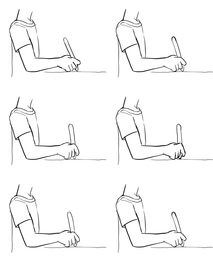
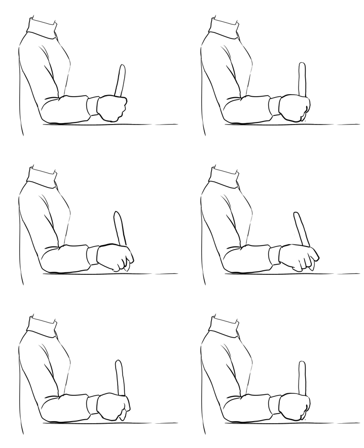
Generally, the lower down the arm the easier it is to make precise strokes, but also the less durable the joints are for long term use. We tend to start off using our fingers and wrist a lot during drawing, because it’s easier to be precise this way. But it’s difficult to make long strokes, and furthermore, your fingers and wrist get tired far quicker.
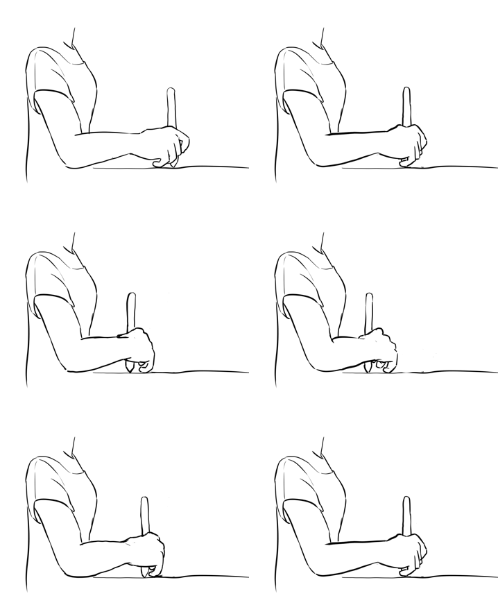
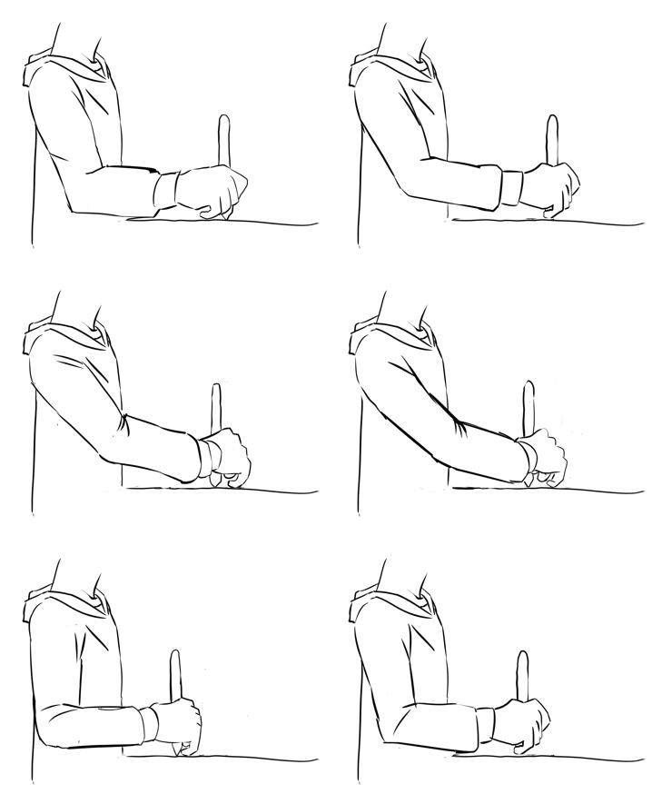
Your shoulders and elbows on the other hand are actually quite good at handling stress, and if you use your whole hand you will be able to make long strokes far more easily. People who do calligraphy need shoulder based strokes to make those lovely flourishes (personally, I can recommend improving your handwriting as a way to improve inking), and train their arms so they can do both big and small strokes with the full arm.
To control pressure in this state effectively, you should press your pinky against the tablet surface as you make your stroke. This will allow you to precisely judge how far the pen is removed from the tablet surface while leaving the position up to your shoulders. The pressure should then be put by your elbow.
So, there are not any secret rules to inking, but if there is one, it would be the following: The longer your stroke, the more of your arms you need to use to make the stroke.
Stroke smoothing
So, if the above is the secret to drawing long strokes, that would be why people having been inking lovely drawings for years without any smoothing? Then, surely, it is decadence to use something like stroke smoothing, a short-cut for the lazy?
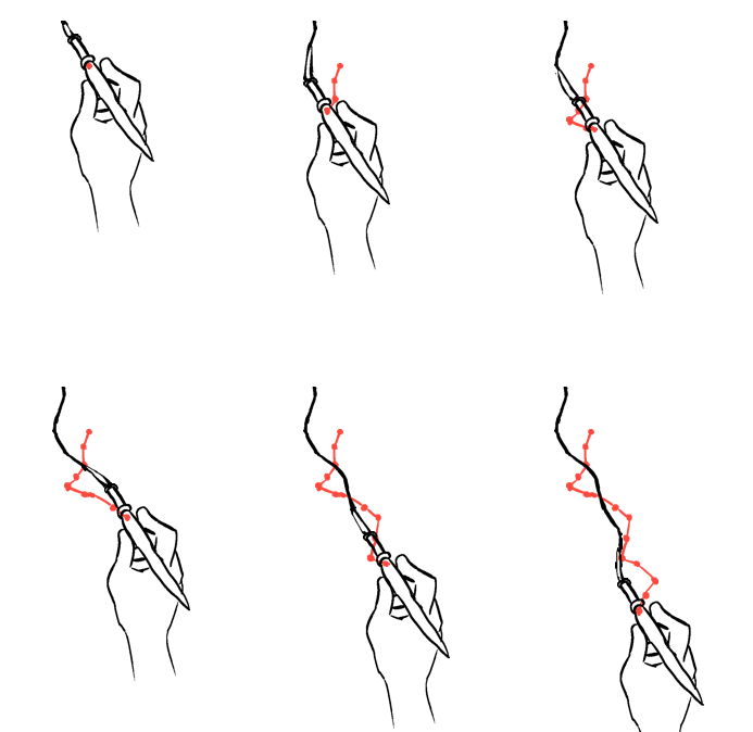
Example of how a rigger brush can smooth the original movement (here in red)
Not really. To both, actually. Inkers have had a real-life tool that made it easier to ink, it’s called a rigger-brush, which is a brush with very long hairs. Due to this length it sorta smooths out shakiness, and thus a favoured brush when inking at three in the morning.
With some tablet brands, the position events being sent aren’t very precise, which is why we having basic smoothing to apply the tiniest bit of smoothing on tablet strokes.
On the other hand, doing too much smoothing during the whole drawing can make your strokes very mechanical in the worst way. Having no jitter or tiny bumps removes certain humanity from your drawings, and it can make it impossible to represent fabric properly.
Therefore, it’s wise to train your inking hand, yet not to be too hard on yourself and refuse to use smoothing at all, as we all get tired, cold or have a bad day once in a while. Stabilizer set to 50 or so should provide a little comfort while keeping the little irregularities.
Bezier curves and other tools
So, you may have heard of a French curve. If not, it’s a piece of plastic representing a stencil. These curves are used to make perfectly smooth curves on the basis of a sketch.
In digital painting, we don’t have the luxury of being able to use two hands, so you can’t hold a ruler with one hand and adjust it while inking with the other. For this purpose, we have instead Bezier curves, which can be made with the Bezier Curve Tool.
You can even make these on a vector layer, so they can be modified on the fly.
The downside of these is that they cannot have line-variation, making them a bit robotic.
You can also make small bezier curves with the Assistant Tool, amongst the other tools there.
Then, in the freehand brush tool options, you can tick Snap to Assistants and start a line that snaps to this assistant.
Presets
So here are some things to consider with the brush-presets that you use:
Anti-aliasing versus jagged pixels
A starting inker might be inclined to always want to use anti-aliased brushes, after all, they look so smooth on the screen. However, while these look good on screen, they might become fuzzy when printing them. Therefore, Krita comes with two default types. Anti-aliased brushes like ink_brush_25 and slightly aliased brushes like ink_tilt, with the latter giving better print results. If you are trying to prepare for both, it might be an idea to consider making the inking page 600dpi and the color page 300dpi, so that the inking page has a higher resolution and the ‘jaggies’ aren’t as visible. You can turn any pixel brush into an aliased brush, by going the F5 key and ticking Sharpness.
Texture
Do you make smooth ‘wet’ strokes? Or do you make textured ones? For the longest time, smooth strokes were preferred, as that would be less of a headache when entering the coloring phase. Within Krita there are several methods to color these easily, the colorize mask being the prime example, so textured becomes a viable option even for the lazy amongst us.
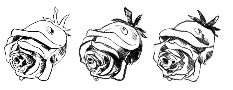
Left: No texture, Center: Textured, Right: Predefined Brush tip.
Pressure curve
Of course, the nicest lines are made with pressure sensitivity, so they dynamically change from thick to thin. However, different types of curves on the pressure give different results. The typical example is a slightly concave line to create a brush that more easily makes thin lines.
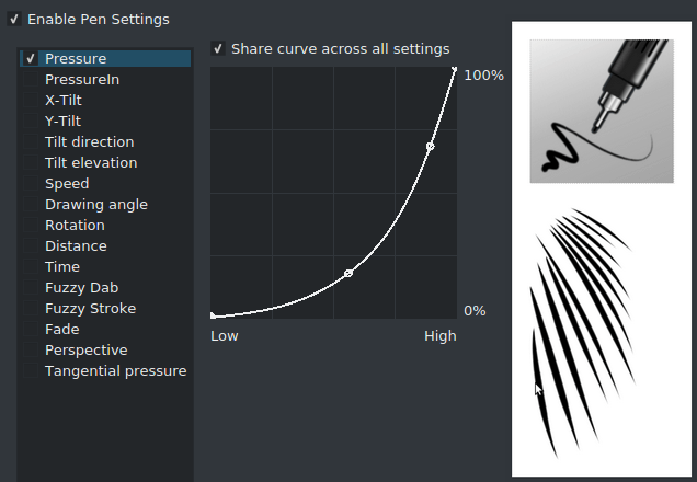
Ink_Gpen_25 is a good example of a brush with a concave pressure curve. This curve makes it easier to make thin lines.
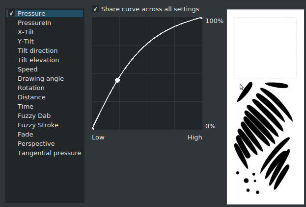
Conversely, here’s a convex brush. The strokes are much rounder.
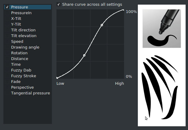
Fill_circle combines both into an s-curve, this allows for very dynamic brush strokes.
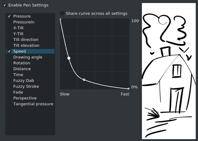
Pressure isn’t the only thing you can do interesting things with, adding an inverse convex curve to speed can add a nice touch to your strokes.
Preparing sketches for inking
So, you have a sketch and you wish to start inking it. Assuming you’ve scanned it in, or drew it, you can try the following things to make it easier to ink.
Opacity down to 10%
Put a white (just press the Backspace key) layer underneath the sketch. Turn down the opacity of the sketch to a really low number and put a layer above it for inking.
Make the sketch colored
Put a layer filled with a color you like between the inking and sketch layer. Then set that layer to ‘screen’ or ‘addition’, this will turn all the black lines into the color! If you have a transparent background, or put this layer into a group, be sure to tick the alpha-inherit symbol!
Make the sketch colored, alternative version
Or,  on the layer, go to layer properties, and untick ‘blue’. This works easier with a single layer sketch, while the above works best with multi-layer sketches.
Super-thin lines
If you are interested in super-thin lines, it might be better to make your ink at double or even triple the size you usually work at, and, only use an aliased pixel brush. Then, when the ink is finished, use the fill tool to fill in flats on a separate layer, split the layer via , and then resize to the original size.
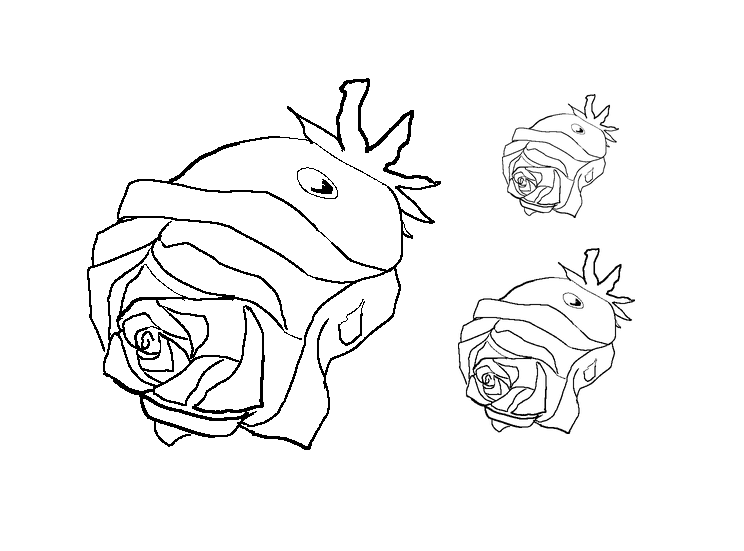
This might be a little of an odd way of working, but it does make drawing thin lines trivial, and it’s cheaper to buy RAM so you can make HUGE images than to spent hours on trying to color the thin lines precisely, especially as colorize mask will not be able to deal with thin anti-aliased lines very well.
Tip
David Revoy made a set of his own inking tips for Krita and explains them in this youtube video.
