
Colors
Okay, so… Let’s talk colors!
Colors are pretty, and they’re also pretty fundamental to painting. When painting, we want to be able to access and manipulate colors easily to do fun stuff like mixing them together or matching them to create visual harmony or contrast. We also want to be able to quickly find our favorite shades of red or favorite tints of blue without thinking or working too hard. All of this becomes even more important the more colors we have access to!
Naturally, the first thing we do is organize the colors, usually based on what we see in nature. For example, we tend to order hues in the order that they appear in a rainbow, and we think about brightness of values as a tonal range from white to black. Of course, nature itself is tied to physics, and the order of hues and the concept of brightness has everything to do with the wavelength and energy of light as it bounces around and eventually enters our eyes.

In the case of traditional media, we order the colors (hues) by how they result from mixes of other colors, starting with the subtractive primary colors: cyan, magenta, yellow. Mixing each primary color with each other reveals three secondary colors: violet, orange, and green. Mixing between those colors creates tertiary colors, and so on - the variations of hues between each named color are practically limitless! Thinking of colors in this way creates a circle of hues that artists call “the color wheel”! Each one of these hues can be made lighter (tint) or darker (shade) by mixing with white or black, respectively, and any color can be made less saturated (more gray or muted) by mixing with another color on the opposite side of the color wheel.

In the digital world of computers color is treated similarly, and we order colors by the way the screen generates them; each pixel of color on our screen is produced by combining super tiny red, green, and blue lights of varying intensities. Unlike mixing paint, where light intensity is subtracted by pigment and mixing all the colors together produces a muddy brown or gray, mixing lights is additive - no light at all is obviously black, and mixing all of the colored lights produces white. As such, we can make a list of possible primary color intensities:

Shown above is a table of different intensities of red light. Our screens can certainly create a lot of shades of red, but we only start to see the power of pixels when we add in the other primary colors, green and blue, and show the colors of light that are produced when they are added together! For example, here’s a table showing various mixes of red and green:

But that’s just red and green, what about blue? I guess we can make even more tables to show what happens when different amounts of blue are added into the mix:

This way of ordering colors is probably familiar to you if you have used some programs for making internet applications, like Flash. In fact, if we had made 6 samples instead of 5 per “channel” (that is, per each primary color), we’d have gotten the 216 websafe colors!
Showing the colors in a bunch of tables just feels wrong, though, doesn’t it? That’s because, while our tables are 2D, as we are mixing three primary colors, color can be thought of as 3D! It’s a bit odd the first time you think about it this way, but you can actually stack these tables based on the amount of blue and they become a cube!
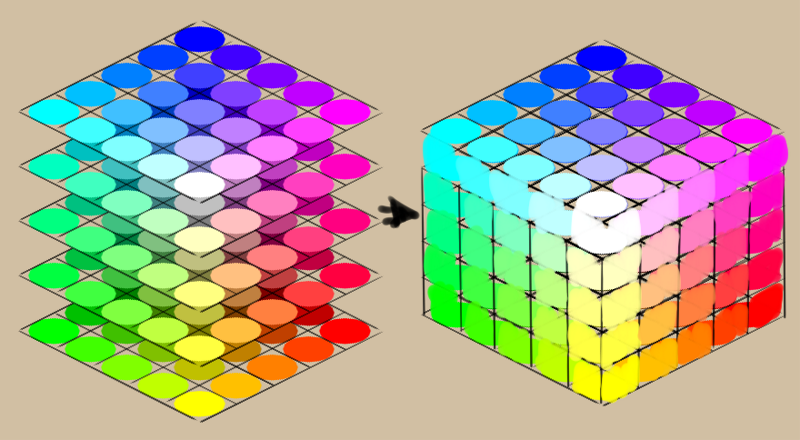
This cube is not filled with water, or sand, or even concrete, but colors! Colors are pretty abstract, and we typically talk about cubes and other 3D objects that represent abstract ideas as spaces, hence we call this cube a color space. Because this particular cube uses red, green, and blue as its axes, we say that our cube is in the RGB color model.
There are many more color models. For example, if we were to balance our cube on the black corner, the white corner would be right under our finger at the very top of the cube. And as geometry and maths would have it, if we were to cut the cube in half as we balanced it, the line from the white point at the top to the black point at the bottom would be the grayscale.
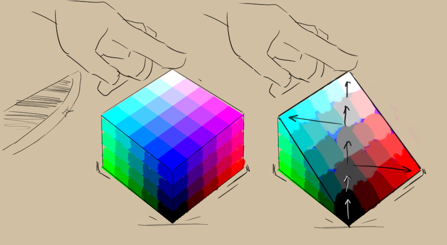
When you think about a strip of grays running through the middle of the cube, as we move farther away from that grayscale towards the outer edges of the cube the colors would begin to become more saturated (colorful and vivid). The circle of colors around that middle axis of gray would then define the hue, with a different color in each direction.
This is the basic idea of the HSV, HSL, HSI, and HSY color models. This particular model is called HSI (hue, saturation, and intensity), because it maps each unique color to the intensity of the primary colored lights that mix to create them.
There are other color models, like L*a*b*, where we look at the corresponding gray value of a color first, and then try to describe it, not it terms of hue and saturation, but by how red, green, blue, and yellow it is. Because our brains cannot really comprehend a color that is both green and red, or yellow and blue, this makes them good polar opposites in a sliding scale. We call this a perceptual model, as it is based on how we see color instead of how the color is generated.
Color models describe color spaces, which, in turn, are all sorts of sizes and shapes as well. Krita allows you to do operations in different models and spaces, and we call this functionality “Color Management”.
Color Management is necessary for CMYK (subtractive) support, but outside of that, not many drawing or painting programs offer the feature, as some developers believe that artists have no need for such functionality. What a pity! Especially because Color Management allows for far more cool tricks than just basic CMYK support, and the ability to manipulate colors like a computer can is perhaps digital painting’s most unique quality!
As Krita is giving almost unprecedented control of color, this unfortunately means that there are little to no articles out there on how to use color management for artists or painters. And so, we made this category and hope to fill it up with relatively short articles explaining color-related concepts in a light-hearted and visual manner.
We recommend going over the color managed workflow page next - even if you don’t plan on using it, it will help make sense out of the many features related to colors and Color Management. Other than that, each article should stand on its own and can be taken in at your own direction and pace!